Responsive Photo Gallery with jQuery and Bootstrap 3
| File Size: | 3.21 MB |
|---|---|
| Views Total: | 248902 |
| Last Update: | |
| Publish Date: | |
| Official Website: | Go to website |
| License: | MIT |
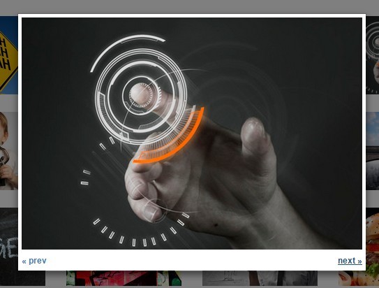
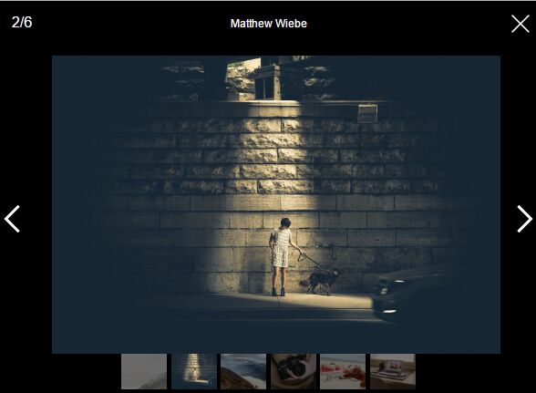
A very simple jQuery plugin helps you create a responsive flexible photo gallery (thumbnail grid) using Bootstrap. When you click on a thumbnail, it will popup a gallery lightbox to present all the large images with next/prev navigation, by using Bootstrap's modal component.
Bootstrap 4 Version is now available here.
How to use it:
1. Load the photo-gallery.js script after you have jQuery library loaded.
<script src="//ajax.googleapis.com/ajax/libs/jquery/1.11.2/jquery.min.js"></script>
<script src="photo-gallery.js"></script>
2. Load the required Bootstrap framework in your document.
<link rel="stylesheet" href="//netdna.bootstrapcdn.com/bootstrap/3.3.2/css/bootstrap.min.css">
<script src="//netdna.bootstrapcdn.com/bootstrap/3.3.2/js/bootstrap.min.js"></script>
3. The Html structure for the photo gallery.
<ul class="row">
  <li class="col-lg-2 col-md-2 col-sm-3 col-xs-4">
    <img class="img-responsive" src="1.jpg">
  </li>
  <li class="col-lg-2 col-md-2 col-sm-3 col-xs-4">
    <img class="img-responsive" src="2.jpg">
  </li>
  <li class="col-lg-2 col-md-2 col-sm-3 col-xs-4">
    <img class="img-responsive" src="3.jpg">
  </li>
  <li class="col-lg-2 col-md-2 col-sm-3 col-xs-4">
    <img class="img-responsive" src="4.jpg">
  </li>
  <li class="col-lg-2 col-md-2 col-sm-3 col-xs-4">
    <img class="img-responsive" src="5.jpg">
  </li>
  <li class="col-lg-2 col-md-2 col-sm-3 col-xs-4">
    <img class="img-responsive" src="6.jpg">
  </li>
  ...
</ul>
4. Create a Bootstrap modal for the gallery lightbox.
<div class="modal fade" id="myModal" tabindex="-1" role="dialog" aria-labelledby="myModalLabel" aria-hidden="true">
  <div class="modal-dialog">
    <div class="modal-content">
      <div class="modal-body"> </div>
    </div>
  </div>
</div>
This awesome jQuery plugin is developed by fearlessflyer. For more Advanced Usages, please check the demo page or visit the official website.