Masonry-style Fluid Image Grid Plugin For jQuery - fluid
| File Size: | 309 KB |
|---|---|
| Views Total: | 5122 |
| Last Update: | |
| Publish Date: | |
| Official Website: | Go to website |
| License: | MIT |

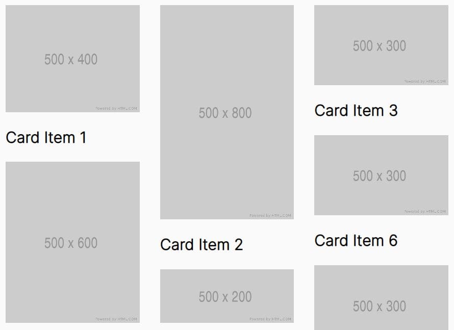
fluid is a simplest jQuery layout plugin that lest you create a Masonry style responsive, fluid image grid layout as you seen on Pinterest.com.
Related Plugins:
- Pinterest Like Glowing Input Fields with CSS3
- Pinterest Like Responsive Dynamic Grid Layout Plugin - Pinto
- Lightweight Responsive Pinterest Layout with jQuery - Waterfall
- Pinterest-Like Dynamic & Responsive Grid Layout Plugin - BlocksIt
- Pinterest-Like Dynamic Grid Layout Plugin with jQuery - Wookmark
- Pinterest-Like Web Layout Plugin
- Yet Another Pinterest Like Layout Plugin For jQuery - waterfall
- Pinterest Style Dynamic Layout jQuery Plugin - Masonry
- Simple Pinterest Like Grid Layout Plugin - Pinbox
- Super Tiny Pinterest Dynamic Grid Layout Plugin with jQuery - Pubu
- Tiny Pinterest Like Image Grid Layout Plugin - Mosaic Flow
Basic usage:
1. Load the necessary jQuery library and the jQuery fluid plugin in the page.
<script src='jquery.min.js'></script>
<script src='fluid.jquery.js'></script>
2. Load the jQuery imageLoaded plugin to check if your images have been loaded.
<script src='jquery.min.js'></script>
<script src='fluid.jquery.js'></script>
3. Insert your images into the grid layout following the html structure like this:
<div class="container">
  <div class="container_inner">
    <div class="item">
      <img src="images/1.jpg" alt="">
    </div>
    <div class="item">
      <img src="images/2.jpg" alt="">
    </div>
    <div class="item">
      <img src="images/3.jpg" alt="">
    </div>
    <div class="item">
      <img src="images/4.jpg" alt="">
    </div>
    <div class="item">
      <img src="images/5.jpg" alt="">
    </div>
    <div class="item">
      <img src="images/6.jpg" alt="">
    </div>
  </div>
  <p class="load">Fetching images</p>
</div>
4. Initialize the plugin.
var fluid

imagesLoaded($('.container_inner'), function() {
  $('.load').css('display', 'none');
  fluid = new $('.container_inner').fluid(OPTIONS);
});
5. Add your own CSS styles to the grid layout.
* {
  margin: 0;
  padding: 0;
  box-sizing: border-box;
}

img {
  max-width: 100%;
  max-height: 100%;
}

.container {
  width: 600px;
  margin: 20px auto;
  background: #334864;
  padding: 10px;
}

.container_inner { position: relative; }

.item {
  position: absolute;
  background: #fff;
  border: 10px solid #fff;
  display: none;
}

.item img {
  width: 100%;
  display: block;
}

.load {
  text-align: center;
  color: #fff;
  font-family: Arial, sans-serif;
}
6. Default plugin options.
$.fluid({

// the amount of grid columns
col: 3,

// the space bewteen items
spacingX: 20,
spacingY: 20

});
This awesome jQuery plugin is developed by knaman2609. For more Advanced Usages, please check the demo page or visit the official website.