Basic Modal & Popup Plugin with jQuery - stepframemodal
| File Size: | 9.19 KB |
|---|---|
| Views Total: | 5133 |
| Last Update: | |
| Publish Date: | |
| Official Website: | Go to website |
| License: | MIT |
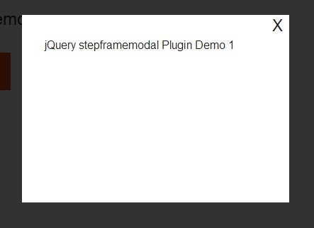
stepframemodal is a simple and fast jQuery plugin to create animated and heavily customizable modals & popups that cover the whole page with a fullscreen overlay.
How to use it:
1. Load the latest version of jQuery and the jQuery stepframeModal plugin at the end of your web page.
<script src="//code.jquery.com/jquery-1.11.1.min.js"></script>
<script src="jquery.stepframemodal.js"></script>
2. Create the modal content.
<div id="demo" class="popup">
  <div class="popup-container">
    <div class="popup-content">
      <span class="message">Modal content goes here</span>
      <div class="popup-close js-popup-close modal-close">X</div>
   </div>
  </div>
</div>
3. Create a toggle element to trigger the modal popup.
<a href="#demo" class="modal-popup">Trigger</a>
4. Add your custom CSS to style the modal popup.
.popup {
  background: none repeat scroll 0 0 rgba(0, 0, 0, 0.8);
  display: none;
  height: 100%;
  left: 0;
  position: fixed;
  top: 0;
  width: 100%;
  z-index: 999;
  vertical-align: middle;
}

.popup-container {
  display: block;
  margin: 0 auto;
  padding: 24px;
  text-align: center;
  text-align: center;
}

.popup-content {
  padding: 2em;
  background-color: #fff;
  text-align: left;
  display: inline-block;
  position: relative;
  min-width: 50%;
  min-height: 200px;
}

.popup-close {
  background: none repeat scroll 0 0 #fff;
  cursor: pointer;
  display: block;
  font-size: 150%;
  line-height: 1.33333em;
  width: 1.3333em;
  height: 1.3333em;
  line-height: 130%;
  position: absolute;
  right: 0;
  text-align: center;
  top: 0;
  z-index: 2;
  color: #222222;
}
5. The Javascript to enable the trigger button to toggle the target modal popup.
$('.modal-popup').setupModal()
6. All the default customization options.
$('.modal-popup').setupModal({

// for multiple modal popups
id: 'popMod',

// debug mode
debug: false,

// transition options
// 'fade', 'slideDown', 'show'
// or a custom function
transition: 'fade',
transitionIn: 'fade',
transitionOut: 'fade',

// css selector for close button
closeSelector: ".modal-close",

// class that will be applied to the modal content when it is opened
modalClassSelect: 'sfModalClass',

// 'slow' or 'fast'
transitionInTime: 'slow',
transitionOutTime: 'fast',

// data attribute name to use to specify modal target
dataAttribute: 'modaltarget',

// whether or not the modal window will close on click
modal: true

})
Change log:
2015-01-03
- update for IE8 support
This awesome jQuery plugin is developed by stepframe. For more Advanced Usages, please check the demo page or visit the official website.