Elegant Flexible jQuery Dialog Popup Plugin - artDialog
| File Size: | 124 KB |
|---|---|
| Views Total: | 2637 |
| Last Update: | |
| Publish Date: | |
| Official Website: | Go to website |
| License: | MIT |
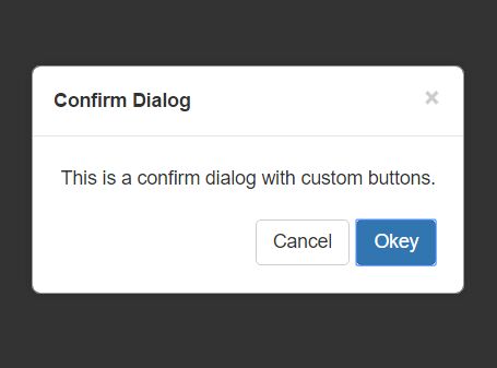
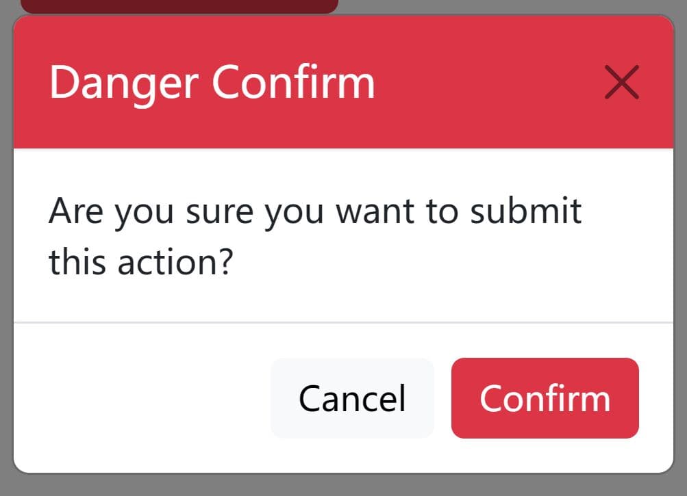
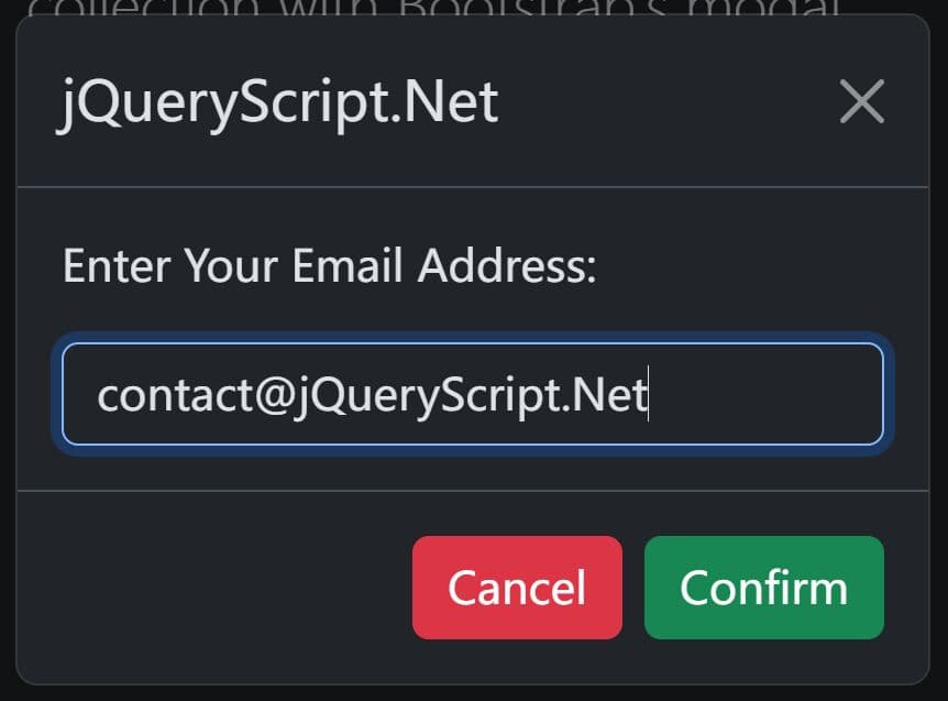
artDialog is a simple, elegant, full-featured jQuery plugin to create responsive, accessible, fully customizable dialog popups for your modern web applications.
Main features:
- Based on HTML5 Dialog API.
- Supports both standard & modal dialog boxes.
- Also allows popover styles.
- ARIA supported.
- User-friendly API.
- Auto resize to fit any screen size.
Install it via NPM:
npm install --save-dev art.dialog
var dialog = require('art.dialog');
How to use it:
1. Add references to the jQuery artDialog plugin's JavaScript and CSS files:
<link href="css/dialog.css" rel="stylesheet" type="text/css">
<script src="https://code.jquery.com/jquery.min.js"></script>
<script src="dist/dialog-plus.js"></script>
2. Create a new dialog object and define your custom title & content as this:
var d = dialog({
    title: 'Welcome',
    content: 'jQuery artDialog Default Demo'
});
3. Show the dialog popup.
d.show();
3. Show the dialog popup as a modal window on the webpage.
d.showModal();
4. Show the dialog popup as a popover appending to a specific element.
p.show(document.getElementById('element'));
5. All possible options to customize the dialog popup.
dialog({
// alignment
align: 'bottom left',
// dialog ID
id: 'demo-1'
// fixed position
fixed: false,
// z-index
zIndex: 1024,
// background color
backdropBackground: '#000',
// background opacity
backdropOpacity: 0.7,
// dialog content
content: '<span class="ui-dialog-loading">Loading..</span>',
// dialog title
title: '',
// status bar content
statusbar: '',
// custon buttons
button: null,
// OK callback
ok: null,
// cancel callback
cancel: null,
// OK text
okValue: 'ok',
// cancel text
cancelValue: 'cancel',
// false = can not be closed
cancelDisplay: true,
// width/height
width: '',
height: '',
// padding
padding: '',
// custom skin
skin: '',
// autoclose by click on the overlay
quickClose: false,
// custom template
innerHTML: '<div i="dialog" class="ui-dialog">' +
'<div class="ui-dialog-arrow-a"></div>' +
'<div class="ui-dialog-arrow-b"></div>' +
'<table class="ui-dialog-grid">' +
'<tr>' +
'<td i="header" class="ui-dialog-header">' +
'<button i="close" class="ui-dialog-close">×</button>' +
'<div i="title" class="ui-dialog-title"></div>' +
'</td>' +
'</tr>' +
'<tr>' +
'<td i="body" class="ui-dialog-body">' +
'<div i="content" class="ui-dialog-content"></div>' +
'</td>' +
'</tr>' +
'<tr>' +
'<td i="footer" class="ui-dialog-footer">' +
'<div i="statusbar" class="ui-dialog-statusbar"></div>' +
'<div i="button" class="ui-dialog-button"></div>' +
'</td>' +
'</tr>' +
'</table>' +
'</div>'
})
6. Callback functions.
dialog({
  onshow: function(){},
  onbeforeremove: function(){},
  onremove: function(){},
  onclose: function(){},
  onfocus: function(){},
  onblur: function(){},
  onreset: function(){},
});
7. API methods.
// show the dialog
d.show([anchor])

// show the modal
d.showModal([anchor])

// close the dialog
d.close([result])

// remove the dialog
d.remove()

// set the content
d.content(html)

// set the title
d.title(text)

// set the width
d.width(value)

// set the height
d.height(value)

// reset the dialog
d.reset()

// set the buttons
d.button(args)

// set the focus
d.focus()

// set the blur
d.blur()

// custom event handler
d.addEventListener(type, callback)

// remove the event handler
d.removeEventListener(type, callback)

// get the ID
d.dialog.get(id)

// get the current dialog
d.dialog.getCurrent()
This awesome jQuery plugin is developed by aui. For more Advanced Usages, please check the demo page or visit the official website.