Responsive and Touch-Enabled CSS Lightbox - CSS Modal
| File Size: | 6.14KB |
|---|---|
| Views Total: | 11316 |
| Last Update: | |
| Publish Date: | |
| Official Website: | Go to website |
| License: | MIT |
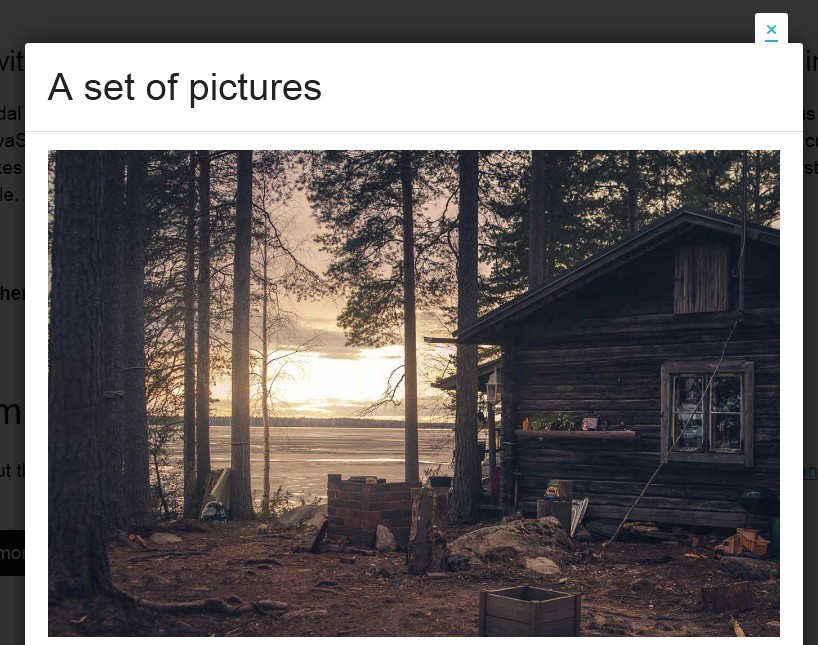
CSS Modal is a responsive and mobile-friendly modal box built only with CSS and a little bit javascript (optional, only for improving the experience). It supports all the html elements like image, text, video, etc...
How to use it:
1. Include modal.css on the web page
<link rel="stylesheet" href="modal.css">
2. Call the modal by clicking this link
<a href="#modal-text" class="call-modal" title="Clicking this link shows the modal">Demo</a>
3. A modal with its content
<section class="semantic-content" id="modal-text" tabindex="-1" role="dialog" aria-labelledby="modal-label" aria-hidden="true"> <div class="modal-inner"> <header> <h2 id="modal-label">Headline</h2> </header> <div class="modal-content"> <p>Content.</p> </div> <footer> <p>Footer</p> </footer> </div> <!-- Use Hash-Bang to maintain scroll position when closing modal --> <a href="#!" class="modal-close" title="Close this modal" data-dismiss="modal">×</a> </section>
4. Include modal.js to improve the experience (optional)
<script src="modal.js"></script>
This awesome jQuery plugin is developed by drublic. For more Advanced Usages, please check the demo page or visit the official website.