jQuery Plugin For Dynamic AJAX Bootstrap Modal - loadmodal.js
| File Size: | 7.21 KB |
|---|---|
| Views Total: | 4855 |
| Last Update: | |
| Publish Date: | |
| Official Website: | Go to website |
| License: | MIT |
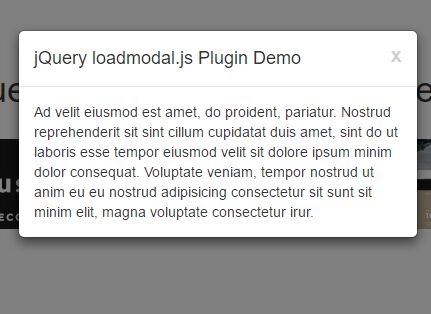
loadmodal.js is a jQuery plugin used to create Bootstrap modal windows with dynamic, custom content served through AJAX request. You can create a modal window with standard Bootstrap, but this plugin makes it easier. It does the <div> structure for you, loads the content, and opens the dialog.
How to use it:
1. Load the necessary jQuery library and Bootstrap framework in the webpage.
<link rel="stylesheet" href="bootstrap.min.css">
<script src="jquery.min.js"></script>
<script src="bootstrap.min.js"></script>
2. Make sure the jquery.loadmodal.js script is loaded after jQuery library.
<script src="jquery.loadmodal.js"></script>
3. Display a Bootstrap modal on page load and load the content from an external file 'ajax.html'.
$.loadmodal('ajax.html');
4. Customize the Bootstrap modal with the following settings.
$.loadmodal({

  // a convenience place to specify the url
  // required unless you specify the url in options.ajax.url.
  url: null,

  // the id of the modal
  id: 'jquery-loadmodal-js',

  // the id of the modal-body (the dialog content)
  idBody: 'jquery-loadmodal-js-body',

  // the element to append the dialog <div> code to.
  // Normally, this should be left as the 'body' element.
  appendToSelector: 'body',

  // the title of the dialog
  title: window.document.title || 'Dialog',

  // 20%, 400px, or other css width
  width: '400px',

  // CSS class(es) to add to the <div class="modal"> main dialog element.  This default makes the dialog fade in.
  dlgClass: 'fade',

  // CSS class(es) to specify the dialog size ('modal-lg', 'modal-sm', '').
  // The default creates a large dialog.
  // See the Bootstrap docs for more info.
  size: 'modal-lg',

  // whether to have an 'X' button at top right to close the dialog
  closeButton: true,


  // set titles->functions to add buttons to the bottom of the dialog
  buttons: {
  },

  // options sent into $().modal (see Bootstrap docs for .modal and its options)
  modal: {
  },

  // options sent into $.ajax (see JQuery docs for .ajax and its options)
  ajax: {
    url: null,
  },

  // This method is called at the beginning of Ajax return handler.  If any callback
  // returns false (an explicit false), the handler stops, the dialog doesn't show,
  // and further callbacks are ignored.
  // If any callback returns a string, it overrides the data, allowing you to change
  // the content of the return.
  // The arguments are the ones returned from $.ajax: data, status, xhr.
  // This can be a single callback or an array of callbacks.
  onSuccess: null,

  // This method is called after the dialog is created by not yet shown.  This allows
  // you to adjust the dialog before it shows.
  // The arguments are the ones returned from $.ajax: data, status, xhr, and "this" is the dialog element.
  // This can be a single callback or an array of callbacks.
  onCreate: null,

  // if set, this function will be called with a reference to the dialog once it has been
  // successfully shown.
  // The arguments are the ones sent to the shown event: event, and "this" is the dialog element.
  // This can be a single callback or an array of callbacks.
  // This is a convenience option - you could also use the Boostrap bs.modal.shown event.
  onShow: null,

  // if set, this function will be called with a reference to the dialog upon close/hide,
  // just before the dialog elements are removed from the DOM.
  // The callback has no arguments, and it sets "this" to the dialog element.
  // This can be a single callback or an array of callbacks.
  // This is a convenience option - you could also use the Boostrap bs.modal.hide event.
  onClose: null,

});
5. Close the modal window manually.
$('#modal_id').modal('hide');
Change log:
2017-03-10
- promise pattern with custom methods now supported!
2017-03-09
- JS update
2016-07-12
- more accessibility keyboard nav stuff
This awesome jQuery plugin is developed by doconix. For more Advanced Usages, please check the demo page or visit the official website.