Modern, Customizable jQuery Modal Plugin for Tailwind CSS
| File Size: | 12 KB |
|---|---|
| Views Total: | 201 |
| Last Update: | |
| Publish Date: | |
| Official Website: | Go to website |
| License: | MIT |

Tailwind-jQuery Modal is a lightweight jQuery modal plugin that creates responsive, modern, customizable modal dialogs for web apps styled with the Tailwind CSS framework.
It combines the utility-first approach of Tailwind CSS with jQuery's DOM manipulation capabilities to provide smooth anf flexible modal experiences across different devices.
Features:
- Multiple Modal Types: Support for standard dialogs, slide panels, and image/video modals.
- Animation Framework: CSS3-powered transitions with customizable timing and effects.
- Media Modal Support: Built-in image zoom and YouTube video embedding capabilities.
- Accessibility Features: Keyboard navigation, focus management, and screen reader compatibility.
- Event System: Callback functions for custom modal behaviors.
- Programmatic Control: Useful API methods for showing, hiding, and managing modals from your code.
How to use it:
1. Load the needed jQuery library and TailwindCSS in the document.
<!-- jQuery is required -->
<script src="/path/to/cdn/jquery.min.js"></script>

<!-- Tailwind 3 -->
<script src="https://cdn.tailwindcss.com"></script>

<!-- OR Tailwind 4+ -->
<script src="https://cdn.jsdelivr.net/npm/@tailwindcss/browser@4"></script>
2. Load the Tailwind-jQuery Modal Plugin's files in the document.
<link rel="stylesheet" href="tailwind-jquery-modal.css">
<script src="tailwind-jquery-modal.js"></script>
3. Create the HTML for your modal window. The modal is a div with a unique ID and the .modal class as follows. The data-size attribute is used to specify the size of your modal window. Available values: 'small', 'medium', 'large'.
<div id="modalExample" class="modal" data-size="large">
  <h3 class="text-2xl font-semibold mb-4">Large Modal</h3>
  <div class="grid grid-cols-1 md:grid-cols-2 gap-6">
    <div>
      <h4 class="font-semibold mb-2">Left Column</h4>
      <p class="text-gray-600 mb-3">Large modals are perfect for complex content and layouts.</p>
      <ul class="list-disc list-inside text-gray-600 space-y-1">
        <li>Feature one</li>
        <li>Feature two</li>
        <li>Feature three</li>
      </ul>
    </div>
    <div>
      <h4 class="font-semibold mb-2">Right Column</h4>
      <div class="bg-gray-100 p-3 rounded">
        <code class="text-sm">$('#largeModal').TailwindModal('show');</code>
      </div>
    </div>
  </div>
  <div class="flex justify-end mt-6">
    <button class="bg-purple-500 text-white px-4 py-2 rounded hover:bg-purple-600" data-modal-close>Close</button>
  </div>
</div>
2. You can also create sidebar modals that slide from the edge of the screen. Ideal for off-canvas navigation and sidebar settings. The 'data-width' attribute is to specify the width of the modal.
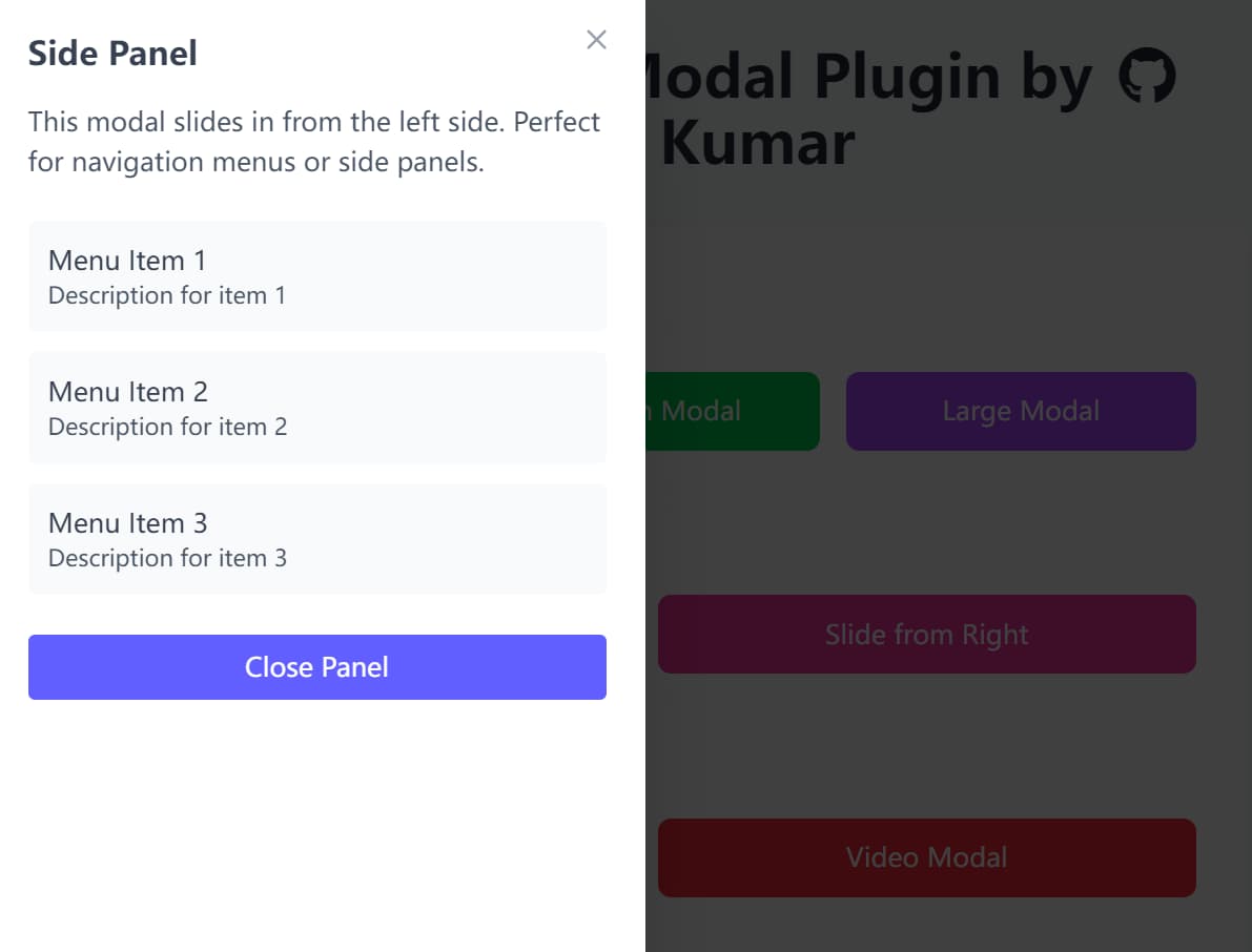
<div id="modalExample" class="modal" data-type="slide-right" data-width="400">
  ... Modal Content Here ...
</div>
<div id="modalExample" class="modal" data-type="slide-left" data-width="360">
  ... Modal Content Here ...
</div>
3. Use the 'data-type' attribute to embed images or Youtube videos into the modal.

<div id="modalExample" class="modal" data-type="image" data-img="1.jpg" data-alt="Image Alt">
</div>

<div id="modalExample" class="modal" data-type="video" data-video="https://www.youtube.com/watch?v=TeBW6euWE6U">
</div>
4. Don't forget to create a trigger button to toggle your modal windows.
<button data-modal-target="#modalExample">
  Launch Modal
</button>
5. Initialize the modal plugin with default options.
$(document).ready(function() {
  $('.modal').TailwindModal();
});
6. Available configuration options to customize your modal windows.
background: Sets the modal's background color.textColor: Defines the text color inside the modal.overlayColor: Changes the color and opacity of the backdrop.animation: A boolean to enable or disable open/close animations.closeButton: Display close button in modal header.closeOnBackdrop: A boolean that determines if a click on the overlay closes the modal. We find this is a user experience must-have.closeOnEscape: A boolean to allow closing the modal with the ESC key.videoAutoplay: A boolean to automatically play videos when the modal opens.imageZoom: A boolean to enable click-to-zoom for image modals.
$(document).ready(function() {
  $('.modal').TailwindModal({
    background: '#ffffff',
    textColor: '#374151',
    overlayColor: 'rgba(0, 0, 0, 0.75)',
    borderRadius: '0.5rem',
    animation: true,
    closeButton: true,
    closeOnBackdrop: true,
    closeOnEscape: true,
    videoAutoplay: true,
    imageZoom: true,
  });
});
7. Callback functions.
$(document).ready(function() {
  $('.modal').TailwindModal({
    onOpen: null,
    onClose: null,
    onShow: null,
    onHide: null
  });
});
8. Control modal windows programmatically using the following JavaScript API:
// Show modal
$('#modalExample').TailwindModal('show');

// Hide modal
$('#modalExample').TailwindModal('hide');

// Toggle visibility
$('#modalExample').TailwindModal('toggle');

// Update configuration
$('#modalExample').TailwindModal('option', 'closeOnBackdrop', false);

// Destroy modal instance
$('#modalExample').TailwindModal('destroy');
FAQs
Q: How do I prevent modal content from scrolling the background page?
A: The plugin automatically adds the overflow-hidden class to the body element when modals open, preventing background scrolling. This behavior is built-in and doesn't require additional configuration. The class is removed when the modal closes.
Q: How do I customize the modal animations?
A: The plugin uses CSS transitions for animations, so you can override the default styles in your CSS file. Target the .modal-backdrop, .modal-content, and type-specific classes like .modal-slide-left to customize animation timing, easing, and effects.
Q: What happens if JavaScript is disabled?
A: The modals won't function without JavaScript, but the content remains accessible as regular page elements. Consider implementing progressive enhancement by placing modal content in a way that makes sense when rendered inline, then using CSS to hide it when JavaScript is available.
Q: Can I open a modal programmatically without a user clicking a button?
A: Yes. Once the plugin is initialized on an element, you can use the JavaScript API to control it. Just call $('#yourModalId').TailwindModal('show'); from your script to open it.
This awesome jQuery plugin is developed by iamitpkumar. For more Advanced Usages, please check the demo page or visit the official website.