Programmatic Bootstrap 5 Modal Windows - jQuery modPopStrap
| File Size: | 6.38 KB |
|---|---|
| Views Total: | 211 |
| Last Update: | |
| Publish Date: | |
| Official Website: | Go to website |
| License: | MIT |

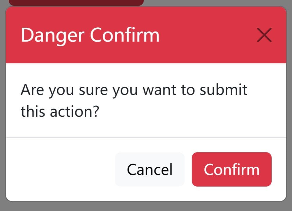
modPopStrap is a lightweight jQuery plugin that creates highly customizable Bootstrap 5 modal windows without writing any modal markup.
This plugin provides a simple API to create and manage Bootstrap 5 modal windows through JavaScript. This approach provides several advantages:
- Dynamic Content Loading: Load modal content from AJAX calls or create it directly with HTML.
- Full Customization: Control every aspect of your modals including size, animations, and button actions.
- Event Handling: Attach custom functions to Bootstrap's standard modal events.
- Clean Code Structure: Create complex modal interactions without cluttering your HTML with multiple modal templates.
How To Use It:
1. To get started, make sure you have the latest jQuery library and Bootstrap framework loaded in the document.
<link rel="stylesheet" href="/path/to/cdn/bootstrap.min.css" />
<script src="/path/to/cdn/jquery.slim.min.js"></script>
<script src="/path/to/cdn/bootstrap.bundle.min.js"></script>
2. Load the latest Bootstrap Icons library if you want to use custom icons in your modals:
<link rel="stylesheet" href="/path/to/bootstrap-icons/bootstrap-icons.min.css">
3. Create a new modPopStrap instance and define the title and content to create a basic modal window:
const myModal = new modPopStrap({
  "title": {
    "text":"modPopStrap Example",
  },
  "content": {
    "contentType":"html",
    "content":"Supports either HTML or Ajax Content"
  },
});
myModal.create("myModal");
4. Trigger the modal window when needed.
myModal.show();
5. All possible configs and events to customize the modal's appearance and behaviors.
- closeable: Controls whether a close button is displayed.
- size: Sets the modal's size (sm, md, lg, xl).
- fade: Determines if the modal fades in and out.
- keyboard: Enables or disables closing the modal with the Esc key.
- backdrop: Configures the backdrop behavior (static prevents closing on click outside).
- focus: Sets whether the modal receives focus when opened.
- title: Customizes the modal title, including an optional icon and color scheme (using Bootstrap's text-bg-* classes).
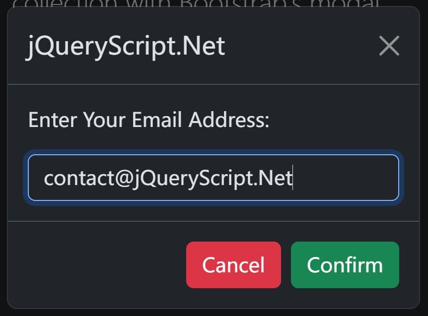
- content: Defines the modal body content. You can use either inline HTML (contentType: "html") or load content from an external file via AJAX (contentType: "file").
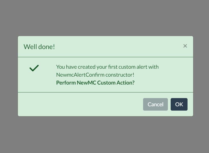
- footer: Sets up the modal footer. You can use either custom HTML or an array of buttons with associated actions.
- events: Allows you to attach custom functions to Bootstrap's modal events (e.g., onshow, onhidden). See the Bootstrap documentation for a full list of events.
{
  "closeable":true,
  "size":"sm",
  "fade":true,
  "keyboard":false,
  "backdrop":"static",
  "focus":true,
  "title":
  {
    "icon":"exclamation-circle",
    "text":"Warning!",
    "colourscheme":"danger"
  },
  "content":
  {
    "contentType":"file",
    "ajaxURL":"ajax.php",
    "ajaxMethod":"POST",
    "ajaxData":{"id":123}
  },
  "footer":
  {
    "type":"buttons",
    "detail":
    [
      {
        "label":"Yes",
        "colour":"success",
        "action":function() { alert("You clicked OK"); }
        },{
        "label":"No",
        "colour":"danger",
        "action":function() {  alert("You clicked No"); }
        },{
        "label":"Cancel",
        "colour":"primary",
        "action":function() {  mymodal.dispose() }
      }
    ]
  },
  "events":
  {
    "onhide":function() { console.log("Hiding"); },
    "onhidden":function() { console.log("Hidden"); },
    "onprevented":function() { console.log("Prevented"); },
    "onshow":function() { console.log("Showing"); },
    "onshown":function() { console.log("Shown"); }
  }
}
6. API methods.
// Show/hide the modal.
myModal.show();
myModal.hide();

// Destroy the instance
myModal.dispose();

// Update the modal dynamically
myModal.title(config);
myModal.content(config);
myModal.footer(config);
How It Works
The modPopStrap class accepts a configuration object and creates modal markup dynamically. The create method verifies a unique ID before adding the modal to the document body. It builds the modal's structure based on options such as fade effects, keyboard control, and backdrop settings.
The title method constructs the header section by inserting an icon and title text, and it adds a close button if enabled. The content method checks the content type and either inserts HTML directly or makes an AJAX request to retrieve content. The footer method generates a footer with buttons or static HTML. Finally, the show, hide, and dispose methods manage modal visibility and removal, while custom event handlers attach functions to Bootstrap events like "show" and "hide" to perform additional actions.
This awesome jQuery plugin is developed by SPBCodes. For more Advanced Usages, please check the demo page or visit the official website.