Create Dynamic Bootstrap 5 Modals with One JS Call - bootstrap5-dialog
| File Size: | 185 KB |
|---|---|
| Views Total: | 432 |
| Last Update: | |
| Publish Date: | |
| Official Website: | Go to website |
| License: | MIT |

bootstrap5-dialog is a jQuery plugin for the latest Bootstrap 5 framework that lets you create and manage Bootstrap modal dialogs programmatically. It's a modern successor to the popular but now-deprecated bootstrap3-dialog plugin, updated for the latest version of Bootstrap.
The main goal of this plugin is to remove the need for writing repetitive modal HTML structures in your markup. Instead, you can trigger fully-featured dialogs with a single, clean JavaScript call.
You no longer need to have hidden modal markup sitting in your DOM, waiting to be triggered. You can generate them on the fly, populate them with dynamic data, and destroy them when they're no longer needed.
Features:
- Simplified API: Create modals with single JavaScript calls instead of writing complex HTML structures.
- Pre-built dialog types: Built-in alert, confirm, and custom dialog methods with consistent styling.
- Flexible customization: Support for custom buttons, icons, sizes, CSS classes, and callback functions.
- Event handling: Complete lifecycle events including onshow, onshown, onhide, and onhidden callbacks.
- Accessibility support: Built-in ARIA attributes and screen reader compatibility options.
- Internationalization ready: Configurable text labels for different languages and locales.
See Also:
How to use it:
1. Load the required Bootstrap 5 and jQuery files in your project, then add the bootstrap5-dialog CSS and JavaScript files:
<!-- jQuery + Bootstrap 5 is required -->
<link rel="stylesheet" href="/path/to/cdn/bootstrap.min.css" />
<script src="/path/to/cdn/jquery.slim.min.js"></script>
<script src="/path/to/cdn/bootstrap.bundle.min.js"></script>

<!-- Bootstrap Icons (OPTIONAL) -->
<link rel="stylesheet" href="/path/to/cdn/bootstrap-icons.min.css">

<!-- bootstrap5-dialog plugin -->
<link rel="stylesheet" href="/dist/css/bootstrap-dialog.css">
<script src="/dist/js/bootstrap-dialog.js"></script>
2. You can then create alert or confirm dialogs with a single line.
// A basic alert dialog
BootstrapDialog.alert('Your operation was successful.');

// A confirm dialog with a callback
BootstrapDialog.confirm('Are you sure you want to delete this item?', function(result){
  if(result) {
    // User clicked 'OK'
    console.log('Item deleted.');
  } else {
    // User clicked 'Cancel' or closed the dialog
    console.log('Deletion canceled.');
  }
});
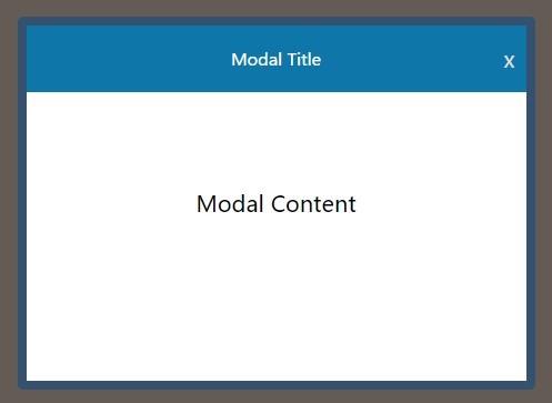
3. For more complex dialogs, use the show() method with a configuration object.
BootstrapDialog.show({
  // required
  message: 'Loading user data...',
  // more options here
});
4. Customize your modal dialogs with the following configuration options.
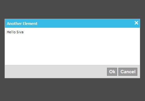
type: Sets the dialog's color scheme. Values correspond to Bootstrap's button colors: 'TYPE_DEFAULT', 'TYPE_INFO', 'TYPE_PRIMARY', 'TYPE_SUCCESS', 'TYPE_WARNING', 'TYPE_DANGER'.size: Controls the modal width. Options areSIZE_NORMAL,SIZE_WIDE, andSIZE_LARGE.cssClass: Adds extra CSS classes to the dialog's main element for custom styling.title: A string or HTML for the dialog header.message: A string or HTML for the dialog body.buttons: An array of objects to define footer buttons. Each object can specify anid,icon,label,cssClass,autospin, and anactioncallback.closable: A boolean (trueby default) that allows closing the dialog via the ESC key, a backdrop click, or the close icon.spinicon: Defines the CSS class for the spinning icon used when a button'sautospinistrue. Defaults tobi bi-asterisk. Requires Bootstrap Icons.data: A key-value object to bind custom data to the dialog instance for later retrieval.autodestroy: A boolean (trueby default) that removes the dialog from the DOM after it's closed. Set tofalseto reuse the same instance.description: A string to set thearia-describedbyattribute for better accessibility.nl2br: A boolean that, iftrue, converts newline characters (\n) in the message to<br>tags.
BootstrapDialog.show({
  type: BootstrapDialog.TYPE_PRIMARY,
  size: BootstrapDialog.SIZE_NORMAL,
  cssClass: '',
  title: null,
  message: null,
  nl2br: true,
  closable: true,
  closeByBackdrop: true,
  closeByKeyboard: true,
  closeIcon: '×',
  spinicon: BootstrapDialog.ICON_SPINNER,
  autodestroy: true,
  draggable: false,
  animate: true,
  description: '',
  tabindex: -1,
  btnsOrder: BootstrapDialog.BUTTONS_ORDER_CANCEL_OK // or ORDER_OK_CANCEL
});
5. Dialog events.
onshow: A function that runs as the dialog begins to appear.onshown: A function that runs after the dialog is fully visible.onhide: A function that runs as the dialog begins to hide.onhidden: A function that runs after the dialog is fully hidden.
BootstrapDialog.show({
  message: 'Your messages here!',
  onshow: function(dialogRef){
    alert(dialogRef.getMessage());
  },
  onshown: function(dialogRef){
    alert('Dialog is shown');
  },
  onhide: function(dialogRef){
    alert('dialogRef.getMessage());
  },
  onhidden: function(dialogRef){
    alert('Dialog is hidden.');
  }
});
6. API methods.
open(): Shows the dialog.close(): Hides the dialog.getModal(): Returns the jQuery object for the outermost.modalcontainer.getModalBody(): Returns the jQuery object for the.modal-bodyelement, which is useful for updating content dynamically.getData(key): Retrieves a specific data value previously set.setData(key, value): Attaches custom data to the dialog instance.enableButtons(boolean): Enables or disables all footer buttons at once.setClosable(boolean): Changes theclosablebehavior after the dialog has been created.realize(): Manually builds the dialog's DOM elements before it is shown.open()calls this automatically, so you rarely need it.
BootstrapDialog.show({
  // required
  message: 'Loading user data...',
  // more options here
});
This awesome jQuery plugin is developed by MrCiny. For more Advanced Usages, please check the demo page or visit the official website.