Advanced jQuery Modal, Lightbox & Slideshow Plugin - jAlert
| File Size: | 1.37 MB |
|---|---|
| Views Total: | 15803 |
| Last Update: | |
| Publish Date: | |
| Official Website: | Go to website |
| License: | MIT |

jAlert is a simple yet feature-rich jQuery plugin used to create fully configurable modals, dialogs, popups, lightboxes, alerts, slideshows (gallery lightboxes) with cool CSS3 animations.
Key Features:
- 12 Built-in Themes - Professional styling with light and dark variants
- Rich Media Support - Images, videos, iframes, and AJAX content
- Advanced Slideshows - Multi-image galleries with navigation controls
- Mobile Responsive - Touch gestures and adaptive sizing
- Keyboard Navigation - Full accessibility with ESC and arrow keys
- Flexible Configuration - Extensive options for customization
- Backward Compatible - Seamless upgrades from older versions
- Performance Optimized - Lightweight with no unnecessary dependencies
How to use it:
1. Download the plugin and load the required stylesheet jAlert.css in the head section of the document.
<link href="dist/jAlert.min.css" rel="stylesheet">
2. Load the latest jQuery library and jAlert's at the end of the document.
<!-- Required -->
<script src="/path/to/cdn/jquery.min.js"></script>
<script src="dist/jAlert.min.js"></script>

<!-- Shortcut Functions (see below) -->
<script src="dist/jAlert-functions.min.js"></script>
3. Basic usage.
// Simple alert
$.jAlert({
title: 'Info Alert',
content: 'An Info Alert',
});
// Image lightbox
$.jAlert({
image: 'path/to/image.jpg',
title: 'My Image'
});
// Gallery Lightbox
$.jAlert({
slideshow: ['image1.jpg', 'image2.jpg', 'image3.jpg'],
slideshowOptions: {
autoAdvance: true,
showArrows: true,
showCounter: 'dots'
}
});
// The following shortcuts require jAlert-functions.min.js
// default alert popup
alert('Hello World!');
// success
successAlert('Success', 'Hello World!');
// error
errorAlert('Error', 'Hello World!');
// info
infoAlert('Info', 'Hello World!');
// warning
warningAlert('Warning', 'Hello World!');
// black warning
blackAlert('Warning', 'Hello World!');
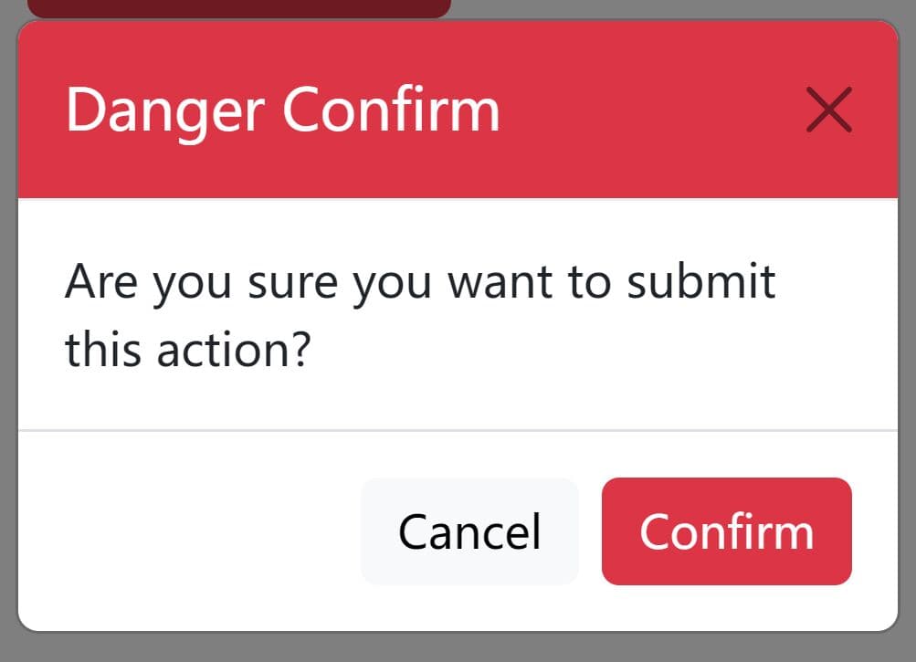
// confirm dialog
confirm(function(e,btn){ //event + button clicked
e.preventDefault();
successAlert('Confirmed!');
}, function(e,btn){
e.preventDefault();
errorAlert('Denied!');
});
4. Full plugin options and callbacks with default values.
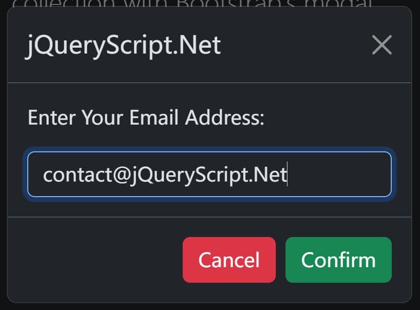
- title (Default:
false): The string for the modal's title. Iffalse, the title bar is not displayed. - content (Default:
false): The HTML string to show in the modal body. Ignored if usingimage,iframe,ajax, orvideo. - noPadContent (Default:
true): A boolean that removes the default padding from the content area. Useful for full-width iframes or images. - fullscreen (Default:
false): A boolean that makes the modal take up the full browser window. - image (Default:
false): A URL string to display an image in a lightbox. - imageWidth (Default:
'auto'): A string to define the image width (e.g.,'50%','200px'). - ajax (Default:
false): A URL string to fetch content via a GET request. - onAjaxFail (Default:
function): A callback function that executes if the AJAX request fails. - iframe (Default:
false): A URL string to embed content in an iframe. - iframeHeight (Default:
false): A string (pxor%) to control the iframe height. Defaults to 90% of the viewport height. - class (Default:
false): A string of one or more custom CSS classes to add to the modal container. - id (Default:
false): A string to set the ID for the modal container. - showAnimation (Default:
'fadeInUp'): The entrance animation. Uses Animate.css classes. - hideAnimation (Default:
'fadeOutDown'): The exit animation. Uses Animate.css classes. - animationTimeout (Default:
500): An integer representing the animation duration in milliseconds. - theme (Default:
'default'): A string that sets the color scheme: 'default', 'red', 'dark_red', 'green',' dark_green', 'blue', 'dark_blue', 'brown', 'gray', 'dark_gray', 'black'. - backgroundColor (Default:
'black'): A string ('black'or'white') for the page overlay color. - blurBackground (Default:
false): A boolean that blurs the page content behind the modal. - size (Default:
'auto'): A string for the modal's width. Options:'xsm','sm','md','lg','xlg','full','auto', or a custom object like{'width': '500px'}. - replaceOtherAlerts (Default:
false): A boolean that, iftrue, closes other open modals before showing the new one. - closeOnClick (Default:
false): A boolean that, iftrue, closes the modal when the background overlay is clicked. - closeOnEsc (Default:
true): A boolean that, iftrue, closes the modal when the Escape key is pressed. - closeBtn (Default:
true): A boolean that controls the visibility of the top-right close button. - closeBtnRound (Default:
true): A boolean that makes the close button round.falseuses the old square style. - closeBtnAlt (Default:
false): A boolean to enable an alternate style for the close button. - btns (Default:
false): An object or array of objects to define buttons. Each button object can havetext,href,theme,class,closeAlert, andonClickproperties. - btnBackground (Default:
true): A boolean that shows or hides the gray background behind the buttons. - autofocus (Default:
false): A string with a DOM selector for an element to focus on when the modal opens. - onOpen (Default:
function): A callback function that runs after the modal has opened and content is loaded. - onClose (Default:
function): A callback function that runs after the modal has closed. - type (Default:
'modal'): A string that can be set to'confirm'to create a pre-configured confirmation dialog. - confirmQuestion (Default:
'Are you sure?'): The question to display for atype: 'confirm'modal. - confirmBtnText (Default:
'Yes'): The text for the confirmation button. - denyBtnText (Default:
'No'): The text for the denial button. - confirmAutofocus (Default:
'.confirmBtn'): The selector for which button to autofocus in a confirmation dialog. - onConfirm (Default:
function): The callback function for when the confirmation button is clicked. - onDeny (Default:
function): The callback function for when the denial button is clicked.
$.jAlert({
  'title': false,
  'content': false,
  'noPadContent': true,
  'fullscreen': false,
  'image': false,
  'imageWidth': 'auto',
  'video': false,
  'ajax': false,
  'onAjaxFail': function(alert, errorThrown) {
    alert.jAlert().closeAlert();
    if (typeof errorAlert === 'function') {
        errorAlert(errorThrown);
    }
  },
  'iframe': false,
  'iframeHeight': false,
  'slideshow': false,
  'slideshowOptions': {
    'autoAdvance': false,
    'autoAdvanceInterval': 3000,
    'keyboardNav': true,
    'pauseOnHover': false,
    'resizeMode': 'fitCurrent', // 'fitCurrent' or 'fitLargest'
    'loop': true,
    'showArrows': true,
    'showCounter': 'numbers', // 'numbers', 'dots', or false
    'arrowButtons': null // Custom arrow buttons DOM elements
  },
  'class': '',
  'classes': '',
  'id': false,
  'showAnimation': 'fadeInUp',
  'hideAnimation': 'fadeOutDown',
  'animationTimeout': 600,
  'theme': 'default',
  'backgroundColor': 'black',
  'blurBackground': false,
  'size': 'auto,
  'replaceOtherAlerts': false,
  'closeOnClick': false,
  'closeOnEsc': true,
  'closeBtn': true,
  'closeBtnAlt': false,
  'closeBtnRound': true,
  'closeBtnRoundWhite': false,
  'btns': false,
  'autoClose': false,
  'btnBackground': true,
  'autofocus': false,
  'onOpen': function(alert) {
    return false;
  },
  'onClose': function(alert) {
    return false;
  },
  'type': 'modal',
  'confirmQuestion': 'Are you sure?',
  'confirmBtnText': 'Yes',
  'denyBtnText': 'No',
  'confirmAutofocus': '.confirmBtn',
  'onConfirm': function(e, btn) {
    e.preventDefault();
    console.log('confirmed');
    return false;
  },
  'onDeny': function(e, btn) {
    e.preventDefault();
    return false;
  }
});
5. Slideshow (gallery lightbox) options.
- autoAdvance (Default:
false): A boolean that, iftrue, automatically advances to the next slide. - autoAdvanceInterval (Default:
3000): A number setting the time in milliseconds between slide transitions. - keyboardNav (Default:
true): A boolean to enable left/right arrow key navigation. - pauseOnHover (Default:
false): A boolean that, iftrue, pauses auto-advance on mouse hover. - imageSize (Default:
'container'): Or 'cover'. - loop (Default:
true): A boolean that, iftrue, loops the slideshow back to the beginning. - showArrows (Default:
true): A boolean that controls the visibility of navigation arrows. - showCounter (Default:
'numbers'): A string to set the counter style. Options are'numbers'(e.g., 1/3),'dots', orfalse. - arrowButtons (Default:
null): Custom DOM elements to use as navigation arrows. - showThumbnails (Default:
true): Shows thumbnail navigation. - thumbnailLocation (Default:
'bottom'): Or 'top'.
$.jAlert({
  'slideshowOptions': {
    'autoAdvance': false,
    'autoAdvanceInterval': 3000,
    'keyboardNav': true,
    'pauseOnHover': false,
    'imageSize': 'container',
    'loop': true,
    'showArrows': true,
    'showCounter': 'numbers', // 'numbers', 'dots', or false
    'arrowButtons': null // Custom arrow buttons DOM elements
    'showThumbnails': true,
    'thumbnailLocation': 'bottom',
  },
});
6. Enhanced HTML5/Youtube/Vimeo video support.
$.jAlert({
  video: {
    src: 'video.mp4',
    embedType: 'html5', // or 'iframe' for Youtube/Vimeo videos
    controls: true,
    autoplay: true,
    muted: true,
    loop: true,
  }
});
7. API methods.
// Instance Methods
const myInstance = $.jAlert({
  // ...
});
myInstance.showAlert();
myInstance.closeAlert();
myInstance.animateAlert('show');
myInstance.autoResize();
myInstance.resizeToFit();
myInstance.resizeModal(width, height);
myInstance.switchSlide(3);

// Global methods
$.autoResize();
$.resizeToFit();
$.resizeModal(height);
$.switchSlide(2);
Changelog:
v6.0.0 (2025-07-04)
- Complete Slideshow System
- Enhanced Video Support
- And more improvement
v5.0.5 (2025-06-28)
- Bug Fixes & Stability Improvements
- CSS & UI Refinements
- Added Dynamic Resize Functionality
- Enhanced Mobile/Tablet Support
v5.0.3 (2025-06-27)
- Added ARIA attributes for better screen reader support
- Implemented semantic HTML with proper roles and labels
- Enhanced keyboard navigation with focus management
- Added descriptive labels for all interactive elements
- Added swipe gestures for slideshow navigation
- Improved touch-friendly controls for mobile devices
- Enhanced responsive design for better mobile experience
- Maintained backward compatibility with existing API
- Perfect Close Button Centering: Fixed the "x" alignment in round close buttons using flexbox and precise vertical transforms
- Smart Title Bar Positioning: Close buttons now properly align within title bars for consistent visual hierarchy
- Button Type Optimization: Different close button styles (round, alt) now have specific positioning for optimal appearance
- Clean Slideshow Dots: Removed borders from slideshow navigation dots to prevent squashing and ensure perfect circular appearance
- Enhanced Markup: Close button "x" is now wrapped in a styled span for better control
- Improved CSS Organization: Better specificity and organization for button positioning
- Build Output Cleanup: CSS now outputs as jAlert.min.css instead of jAlert.css.min.css
v5.0.0 (2025-06-27)
- jAlert has been completely rewritten with modern development practices while maintaining full API compatibility. This release brings significant improvements in performance, browser support, and features.
2020-09-10
- Fix toggleFocusTrap() call locations
v4.9.1 (2019-07-26)
- Cleanup some CSS stuff, improve iframe full height, improve image fullscreen
v4.8.0 & v4.7.0 (2019-07-10)
- Added confirm question as the third param of the confirm() method
- Accepts dom element for content (it'll grab the html automatically)
- Button onClick method now receives 3 params e, btn, alert (so you can quickly alert.closeAlert())
- When you open an image alert using the image param, it will now shrink the popup to fit the image size if it's smaller and disables alert padding
v4.6.5 (2018-08-23)
- fix inability to scroll
2018-08-13
- Bugfix
2016-08-26
- add fullscreen: true/false + tiny adjustment to red alternative close button padding
2016-08-25
- fix dupe button callbacks, add dist folder, autocompile hook instructions, bump version to 4.5
2016-07-20
- added box-shadow back to improve look of white background
2016-05-12
- fix for height
2016-05-11
- v4
2016-05-07
- added dark colors and adjusted each shade
2016-05-06
- adjust round close button
2016-05-04
- added new round button as option, remove borders
2015-11-03
- Fixed or IE8
2015-09-13
- fixed alert variable overriding function.
2015-09-11
- fixed alert variable overriding function.
2015-09-10
- fix for alert.each
2015-09-04
- enhancement: remove focus from the element that initiated the alert
- options were being overriden by each new alert
2015-09-01
- Compatibility of Date.now() for IE8 and 7, opacity of backgrounds in IE8 and 7
2015-07-15
- fix for ie10 iframe
2015-07-13
- Changed default animation to fade.
2015-07-09
- .off fix
2015-07-03
- Fixed on scrolling tall alert, background wasn't position: fixed
2015-06-29
- Fixed body overflow hidden bug
This awesome jQuery plugin is developed by HTMLGuyLLC. For more Advanced Usages, please check the demo page or visit the official website.