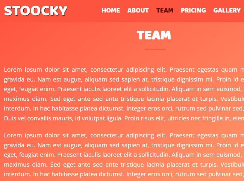
Sticky Header Navigation With Smooth Scroll
| File Size: | 2.73 KB |
|---|---|
| Views Total: | 29354 |
| Last Update: | |
| Publish Date: | |
| Official Website: | Go to website |
| License: | MIT |

A sticky, responsive, mobile-friendly header navigation concept that automatically shrinks itself on scroll down and features smooth scroll functionality which makes it possible to scroll through page sections by clicking on nav links. Built with jQuery, HTML, and CSS/CSS3.
How to use it:
1. Create content sections on the webpage.
<section id="section00">
  <div id="heading"></div>
</section>
<section id="section01">
  <div id="heading"></div>
</section>
<section id="section02">
  <div id="heading"></div>
</section>
<section id="section03">
  <div id="heading"></div>
</section>
... More Sections Here
2. Create the header navigation with a hero section.
<header>
  <nav>
    <div id="brand">
      <div id="logo"></div>
      <div id="word-mark"></div>
    </div>
    <div id="menu">
      <div id="menu-toggle">
        <div id="menu-icon">
          <div class="bar"></div>
          <div class="bar"></div>
          <div class="bar"></div>
        </div>
      </div>
      <ul>
        <li><a href="#section00"></a></li>
        <li><a href="#section01"></a></li>
        <li><a href="#section02"></a></li>
        <li><a href="#section03"></a></li>
      </ul>
    </div>
  </nav>
  <div id="hero-section">
    <div id="head-line"></div>
  </div>
</header>
3. The basic CSS styles for the header navigation.
/*** Navigation Styles ***/

nav {
  width: 100vw;
  height: 160px;
  background: #46B2F0;
  display: grid;
  grid-template-columns: 1fr 1fr;
  position: fixed;
  z-index: 10;
  -webkit-transition: all 0.3s;
  transition: all 0.3s;
}

nav.navShadow {
  -webkit-box-shadow: 0 4px 30px -5px rgba(0, 0, 0, 0.2);
  box-shadow: 0 4px 30px -5px rgba(0, 0, 0, 0.2);
  height: 100px;
}

nav.navShadow #word-mark { opacity: 0; }

#brand, #menu, ul {
  display: -webkit-box;
  display: -ms-flexbox;
  display: flex;
  -webkit-box-align: center;
  -ms-flex-align: center;
  align-items: center;
}

#brand { padding-left: 40px; }

#logo {
  width: 55px;
  height: 55px;
  background: #fff;
  border-radius: 50%;
  cursor: pointer;
}

#word-mark {
  width: 120px;
  height: 20px;
  background: #fff;
  border-radius: 90px;
  margin-left: 20px;
  opacity: 1;
  -webkit-transition: all 0.3s;
  transition: all 0.3s;
}

/*** Menu Styles ***/

#menu {
  -webkit-box-pack: end;
  -ms-flex-pack: end;
  justify-content: flex-end;
  padding-right: 40px;
}

li { margin-left: 20px; }

li a {
  width: 80px;
  height: 20px;
  background: #fff;
  display: block;
  border-radius: 90px;
}

#menu-toggle {
  width: 55px;
  height: 55px;
  background: #2ea8ee;
  display: -webkit-box;
  display: -ms-flexbox;
  display: flex;
  -webkit-box-pack: center;
  -ms-flex-pack: center;
  justify-content: center;
  -webkit-box-align: center;
  -ms-flex-align: center;
  align-items: center;
  border-radius: 50%;
  cursor: pointer;
  display: none;
}

#menu-toggle:hover .bar { width: 25px; }

#menu-toggle.closeMenu .bar { width: 25px; }

#menu-toggle.closeMenu .bar:first-child {
  -webkit-transform: translateY(7px) rotate(45deg);
  transform: translateY(7px) rotate(45deg);
}

#menu-toggle.closeMenu .bar:nth-child(2) {
  -webkit-transform: scale(0);
  transform: scale(0);
}

#menu-toggle.closeMenu .bar:last-child {
  -webkit-transform: translateY(-7px) rotate(-45deg);
  transform: translateY(-7px) rotate(-45deg);
}

.bar {
  width: 25px;
  height: 2px;
  background: #fff;
  -webkit-transition: 0.3s ease-in-out;
  transition: 0.3s ease-in-out;
}

.bar:nth-child(2) {
  width: 20px;
  margin: 5px 0;
}

.bar:last-child { width: 15px; }
4. Make the header navigation responsive for small screen devices.
@media screen and (max-width: 767px) {

#menu-toggle {
  display: -webkit-box;
  display: -ms-flexbox;
  display: flex;
}

ul {
  display: inline-block;
  width: 100vw;
  height: 0;
  background: #79EDFC;
  position: absolute;
  top: 160px;
  -webkit-transform: translate(, );
  transform: translate(, );
  -webkit-box-shadow: 0 5px 30px -4px rgba(0, 0, 0, 0.2);
  box-shadow: 0 5px 30px -4px rgba(0, 0, 0, 0.2);
  -webkit-transition: all 0.3s;
  transition: all 0.3s;
}

ul.showMenu { height: 250px; }

ul.showMenu li {
  height: 80px;
  opacity: 1;
  visibility: visible;
}

li {
  width: 50%;
  height: 80px;
  float: left;
  padding-left: 40px;
  opacity: 0;
  visibility: hidden;
  margin-left: 0;
  -webkit-transition: all 0.3s 0.1s;
  transition: all 0.3s 0.1s;
}

li:first-child, li:nth-child(2) { margin-top: 80px; }

#head-line {
  -webkit-transform: scale(0.8);
  transform: scale(0.8);
}
}
5. Insert the latest version of jQuery JavaScript library into the document.
<script src="https://code.jquery.com/jquery-3.3.1.min.js" integrity="sha384-tsQFqpEReu7ZLhBV2VZlAu7zcOV+rXbYlF2cqB8txI/8aZajjp4Bqd+V6D5IgvKT" crossorigin="anonymous"></script>
6. The JavaScript to enable the sticky header navigation & smooth scroll.
$( () => {

  //On Scroll Functionality
  $(window).scroll( () => {
    var windowTop = $(window).scrollTop();
    windowTop > 100 ? $('nav').addClass('navShadow') : $('nav').removeClass('navShadow');
    windowTop > 100 ? $('ul').css('top','100px') : $('ul').css('top','160px');
  });

  //Click Logo To Scroll To Top
  $('#logo').on('click', () => {
    $('html,body').animate({
      scrollTop: 0
    },500);
  });

  //Smooth Scrolling Using Navigation Menu
  $('a[href*="#"]').on('click', function(e){
    $('html,body').animate({
      scrollTop: $($(this).attr('href')).offset().top - 100
    },500);
    e.preventDefault();
  });

  //Toggle Menu
  $('#menu-toggle').on('click', () => {
    $('#menu-toggle').toggleClass('closeMenu');
    $('ul').toggleClass('showMenu');

    $('li').on('click', () => {
      $('ul').removeClass('showMenu');
      $('#menu-toggle').removeClass('closeMenu');
    });
  });

});
This awesome jQuery plugin is developed by Praveen Bisht. For more Advanced Usages, please check the demo page or visit the official website.