Arrow Indicator For Tabbed Content - jQuery ArrowTabs
| File Size: | 61.5 KB |
|---|---|
| Views Total: | 3526 |
| Last Update: | |
| Publish Date: | |
| Official Website: | Go to website |
| License: | MIT |
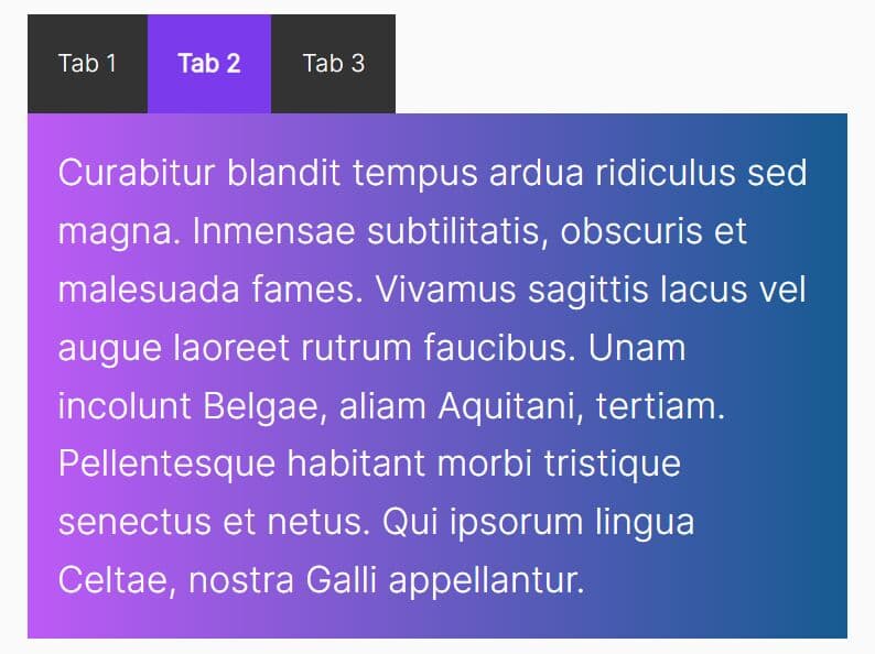
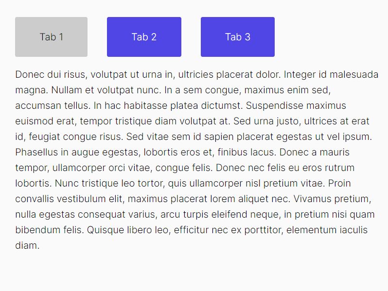
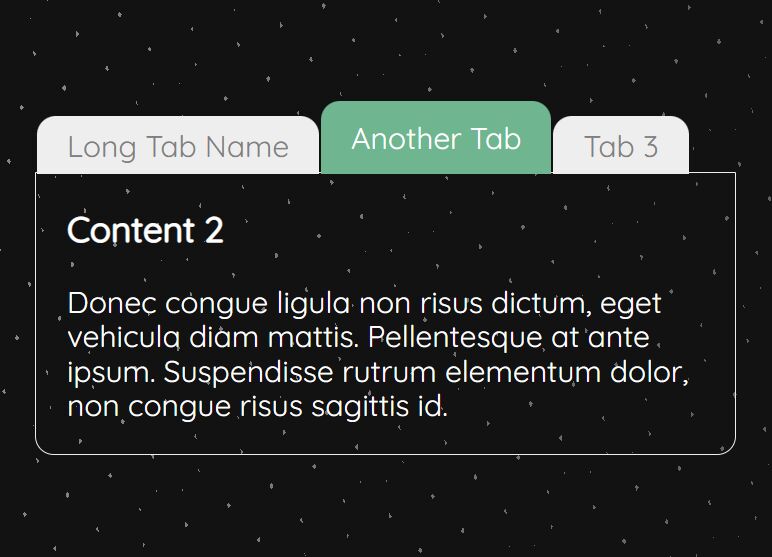
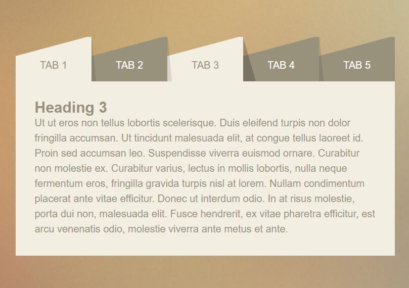
The jQuery ArrowTabs script lets you create a tabs interface that comes with fade in/out animations and has an arrow indicator pointing to the activated tabbed content.
How to use it:
1. Create the HTML for the tabs interface.
<div class="arrow-tabs ui-tabs ui-widget ui-widget-content ui-corner-all">

  <ul class="ui-tabs-nav ui-helper-reset ui-helper-clearfix ui-widget-header ui-corner-all" role="tablist">

    <li class="ui-state-default ui-corner-top ui-tabs-active" role="tab">
      <a href="#tab1" class="ui-tabs-anchor" role="presentation">
        <span>Tab 1</span>
      </a>
    </li>

    <li class="ui-state-default ui-corner-top" role="tab">
      <a href="#tab2" class="ui-tabs-anchor" role="presentation">
        <span>Tab 2</span>
      </a>
    </li>

    <li class="ui-state-default ui-corner-top" role="tab">
      <a href="#tab3" class="ui-tabs-anchor" role="presentation">
        <span>Tab 3</span>
      </a>
    </li>

  </ul>

  <div class="contents">
    <div id="tab1" class="ui-tabs-panel ui-widget-content ui-corner-bottom" role="tabpanel">
      <h2>Tab 1 Content</h2>
    </div>

    <div id="tab2" class="ui-tabs-panel ui-widget-content ui-corner-bottom" role="tabpanel" style="display: none;">
      <h2>Tab 2 Content</h2>
    </div>

    <div id="tab3" class="ui-tabs-panel ui-widget-content ui-corner-bottom" role="tabpanel" style="display: none;">
      <h2>Tab 3 Content</h2>
    </div>
  </div>

</div>
2. The necessary CSS/CSS3 styles for the tabs interface & arrow indicator.
.arrow-tabs {
  width: 90%;
  min-width: 360px;
  margin: auto;
  padding: 50px;
}

.arrow-tabs > ul {
  text-align: center;
  font-weight: 500;
  padding: 0;
  position: relative;
  border-bottom: 1px solid rgba(0, 0, 0, 0.2);
  z-index: 1;
}

.arrow-tabs > ul > li {
  display: inline-block;
  background: #fafafa;
  padding: 0.6em 0;
  position: relative;
  width: 33%;
  margin: 0 0 0 -4px;
}

.arrow-tabs > ul > li:before, .arrow-tabs > ul > li:after {
  opacity: 0;
  transition: 0.3s ease;
}

.arrow-tabs > ul > li.ui-tabs-active:before, .arrow-tabs > ul > li.ui-tabs-active:after {
  opacity: 1;
}

.arrow-tabs > ul > li.ui-tabs-active a {
  color: #009994;
}

.arrow-tabs > ul > li:hover:before, .arrow-tabs > ul > li:hover:after, .arrow-tabs > ul > li:focus:before, .arrow-tabs > ul > li:focus:after {
  opacity: 1;
}

.arrow-tabs > ul > li:before, .arrow-tabs > ul > li.ui-state-active:hover:before, .arrow-tabs > ul > li.ui-state-active:focus:before {
  content: "";
  position: absolute;
  z-index: -1;
  box-shadow: 0 2px 3px rgba(0, 153, 148, 0.5);
  top: 50%;
  bottom: 0px;
  left: 5px;
  right: 5px;
  border-radius: 100px / 10px;
}

.arrow-tabs > ul > li:after, .arrow-tabs > ul > li.ui-state-active:hover:after, .arrow-tabs > ul > li.ui-state-active:focus:after {
  content: "";
  background: #fafafa;
  position: absolute;
  width: 12px;
  height: 12px;
  left: 50%;
  bottom: -6px;
  margin-left: -6px;
  transform: rotate(45deg);
  box-shadow: 3px 3px 3px rgba(0, 153, 148, 0.5), 1px 1px 1px rgba(0, 0, 0, 0.3);
}
.arrow-tabs > ul > li:hover:before, .arrow-tabs > ul > li:focus:before {
  box-shadow: 0 2px 3px rgba(0, 0, 0, 0.2);
}

.arrow-tabs > ul > li:hover:after, .arrow-tabs > ul > li:focus:after {
  box-shadow: 3px 3px 3px rgba(0, 0, 0, 0.2), 1px 1px 1px rgba(0, 0, 0, 0.3);
}

.arrow-tabs > ul > li:focus {
  outline: none;
}

.arrow-tabs > ul > li a {
  color: #444;
  text-decoration: none;
}

.arrow-tabs > ul > li a:focus {
  outline: none;
  text-decoration: none;
}

.arrow-tabs > ul > li a span {
  position: relative;
  top: -0.5em;
}
3. Include the necessary jQuery JavaScript library at the bottom of the page.
<script src="https://code.jquery.com/jquery-1.12.4.min.js" integrity="sha384-nvAa0+6Qg9clwYCGGPpDQLVpLNn0fRaROjHqs13t4Ggj3Ez50XnGQqc/r8MhnRDZ" crossorigin="anonymous"></script>
4. The jQuery script to activate the tab interface.
$('.arrow-tabs a').click(function (e) {
  e.preventDefault()
  var selectedTab = $(this).parent();
  var ul = selectedTab.parent();
  ul.find("li").removeClass("ui-tabs-active ui-state-active ui-state-hover").attr("aria-selected", false);
  selectedTab.addClass("ui-tabs-active ui-state-active").attr("aria-selected", true);

  // show/hide content
    var content = ul.parent().find(".contents .ui-tabs-panel");
    content.hide();
    ul.parent().find($(this).attr("href")).fadeIn(200);
})
This awesome jQuery plugin is developed by bezzad. For more Advanced Usages, please check the demo page or visit the official website.