Mobile Friendly Responsive Bootstrap Tabs Plugin with jQuery
| File Size: | 5.02 KB |
|---|---|
| Views Total: | 3177 |
| Last Update: | |
| Publish Date: | |
| Official Website: | Go to website |
| License: | MIT |
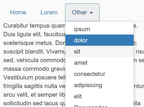
Just another jQuery plugin for responsive Bootstrap tabs component that stacks tab navigation items into a dropdown menu when they overflow in mobile view.
How to use it:
1. Download the plugin and then include the script responsivetab.js script after jQuery JavaScript library.
<link rel="stylesheet" href="bootstrap.min.css">
<script src="jquery.min.js"></script>
<script src="bootstrap.min.js"></script>
<script src="js/responsivetab.js"></script>
2. Call the responsivetab() method on your Bootstrap tabs component.
$('#responsivetab').responsivetab();
3. Re-initialize the plugin on window resize.
$(window).on('resize', function() {
  $('#responsivetab').responsivetab();
});
4. Change the default title text for dropdown menu.
$('#responsivetab').responsivetab({
  text: 'Other',
});
This awesome jQuery plugin is developed by yigitaybuga. For more Advanced Usages, please check the demo page or visit the official website.