jQuery Plugin To Trigger Events or Alter Classes On Window Resize - widthWatch.js
| File Size: | 4.79 KB |
|---|---|
| Views Total: | 738 |
| Last Update: | |
| Publish Date: | |
| Official Website: | Go to website |
| License: | MIT |
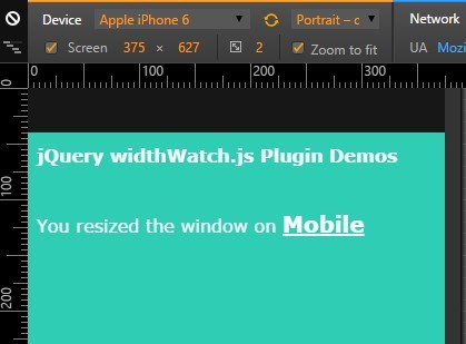
widthWatch.js is a lightweight jQuery plugin which can be used as an alternative to the CSS3 media queries. The plugin dynamically changes the CSS classes or executes a specific callback events when the window's size changes. Great for use in your responsive web project to show different styles & behaviors on desktop, tablet or mobile devices..
How to use it:
1. Include jQuery library and the jQuery widthWatch plugin on the html page.
<script src="//code.jquery.com/jquery-1.11.3.min.js"></script>
<script src="jquery.widthwatch.min.js"></script>
2. Call the function as displayed below and change the default options values as per you need.
$('body').widthWatch({

  // default screen width
  pc_bp : 950,
  tb_bp : 768,
  retina_bp : 640,
  iphn6 : 375,
  sp_bp1 : 480,
  sp_bp2 : 320,

  // default CSS classes
  pcClass : 'pc-style',
  tabClass : 'tab-style',
  retinaClass : 'retina-style',
  iphn6Class : 'iphn6-style',
  spClass : 'sp-style',
  androidClass : 'android-style',
  iOSClass: 'iOS-style',

  // enable a timer
  timer : false,

});
3. Apply custom CSS styles to your webpage on window resize.
body.pc-style { ... }

body.tab-style { . }

body.retina-style { ... }

...
4. Callback functions.
resizeOn_pc: function() { return true; },
resizeOn_tb: function() { return true; },
resizeOn_sp: function() { return true; }
Change log:
2016-02-15
- v1.2 fixed
This awesome jQuery plugin is developed by munehiroKABUHARA. For more Advanced Usages, please check the demo page or visit the official website.