Creating Responsive Mobile-friendly Tables with jQuery - Table Mobilize
| File Size: | 15.4 KB |
|---|---|
| Views Total: | 1933 |
| Last Update: | |
| Publish Date: | |
| Official Website: | Go to website |
| License: | MIT |
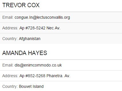
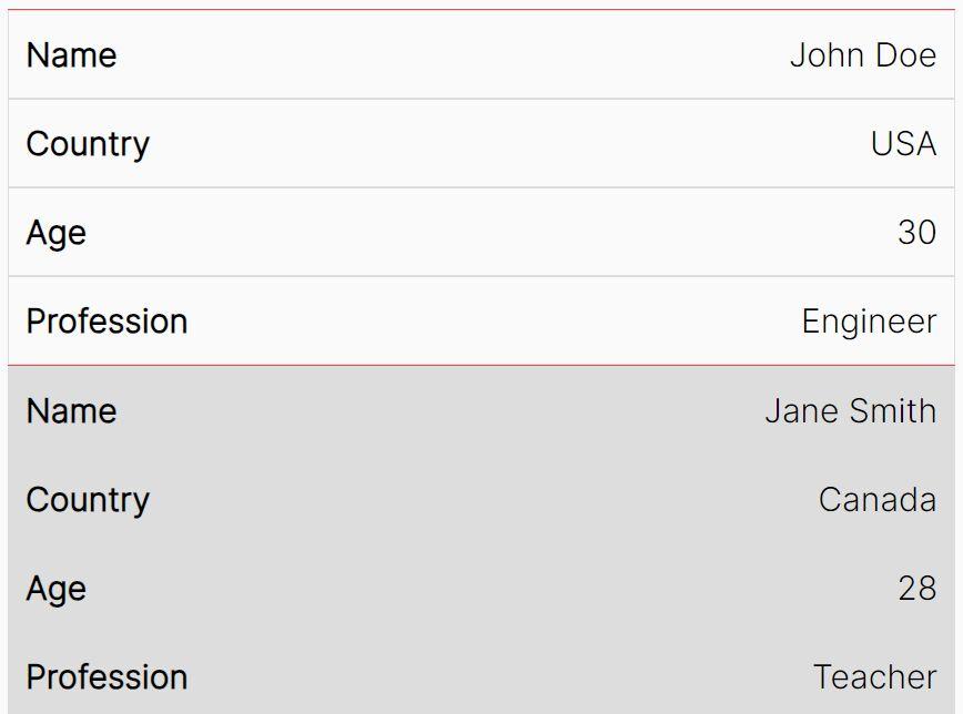
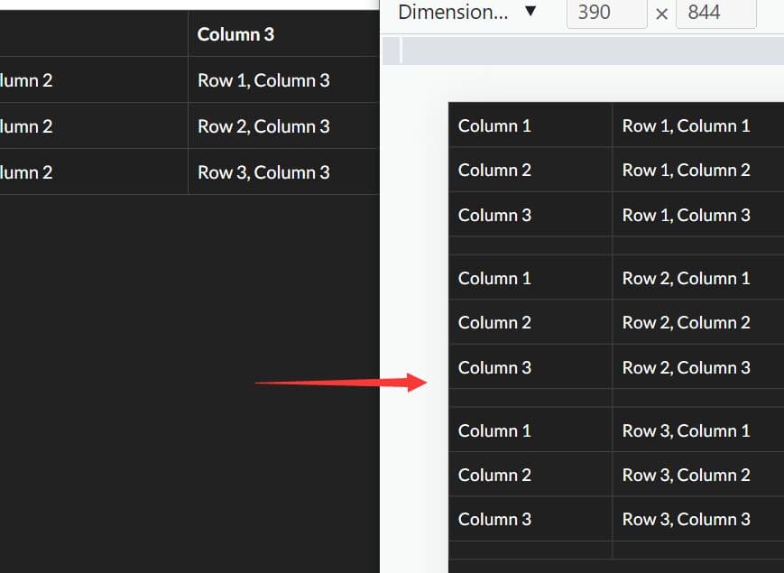
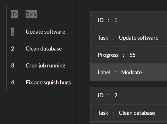
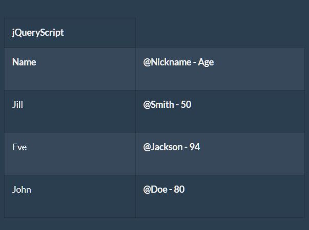
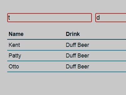
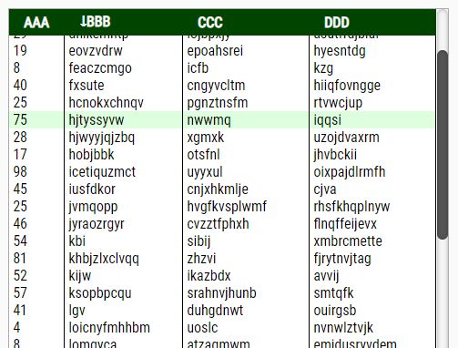
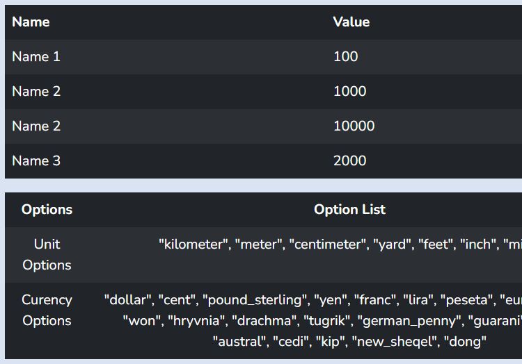
Table Mobilize is a jQuery responsive table solution that changes the table cells into grouped blocks to make your table more readable in mobile view. Based on CSS3 media queries.
How to use it:
1. Include a CSS theme to style your tables on desktop and mobile devices.
<link rel="stylesheet" href="css/theme-default.min.css">
2. Load jQuery library and the jQuery table mobilize plugin at the end of the document.
<script src="jquery.min.js"></script>
<script src="js/jquery.tableMobilize.min.js"></script>
3. Add the CSS class 'tableMobilize' to existing tables on your web page.
<table class="tableMobilize table-striped">
  ...
</table>
4. Initialize the plugin and done.
$('table').tableMobilize();
This awesome jQuery plugin is developed by Lukas238. For more Advanced Usages, please check the demo page or visit the official website.