jQuery Plugin For Mobile-friendly Responsive Table - RWD Tables
| File Size: | 14.7 KB |
|---|---|
| Views Total: | 2774 |
| Last Update: | |
| Publish Date: | |
| Official Website: | Go to website |
| License: | MIT |
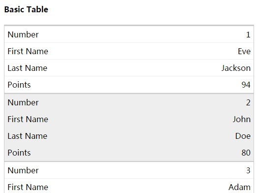
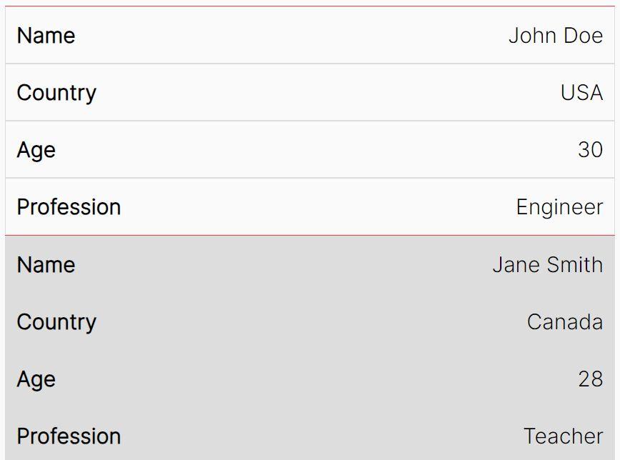
RWD Tables is a dead simple way that uses jQuery and CSS/CSS3 to make your html tables more readable on small screens like mobile devices. It will automatically transform a regular html table into a vertical single-column table based on a specified breakpoint set in CSS3 media queries.
How to use it:
1. Download and include jQuery library and the jQuery RWD Tables plugin on your web page.
<link rel="stylesheet" href="css/rwd-tables.css">
<script src="//code.jquery.com/jquery-1.11.2.min.js"></script>
<script src="js/jquery.rwd-tables.js"></script>
2. Call the plugin on your existing tables and done.
$( "table" ).rwdTables();
3. Change the breakpoints in the CSS.
@media only screen and (max-width: 760px),
(min-device-width: 768px) and (max-device-width: 1024px)  {

...

}
This awesome jQuery plugin is developed by rossmc. For more Advanced Usages, please check the demo page or visit the official website.