Minimal jQuery Responsive Table Plugin For Bootstrap
| File Size: | 4.8 KB |
|---|---|
| Views Total: | 3907 |
| Last Update: | |
| Publish Date: | |
| Official Website: | Go to website |
| License: | MIT |
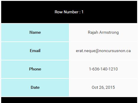
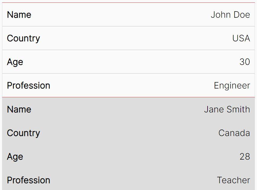
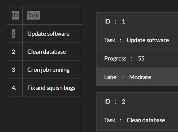
Just another jQuery responsive table plugin which makes your Bootstrap table more readable on small screen devices.
How it works:
- append row number before each data
- select all table rows except table header row
- append the header for row number to the small table
- select all table data
- for each td get it's equivalent header and append header text to the small table header div
- for each td get it's text and append it to the small table data div
- make all headers height equal data height
How to use it:
1. Be sure that you have jQuery and Bootstrap installed properly in the html page.
<link rel="stylesheet" href="/path/to/bootstrap.min.css">
<script src="//code.jquery.com/jquery.min.js"></script>
2. Load the jQuery responsive-table plugin' script after jQuery library.
<script src="js/js.js"></script>
3. Call the function on the target html table.
responsiveTable ('#table-id');
4. Call the balance() function that will make all headers height equal data height.
balanceSize();
This awesome jQuery plugin is developed by yasser-mas. For more Advanced Usages, please check the demo page or visit the official website.