Simple jQuery & CSS3 Based Responsive Table Plugin
| File Size: | 3.36 KB |
|---|---|
| Views Total: | 1598 |
| Last Update: | |
| Publish Date: | |
| Official Website: | Go to website |
| License: | MIT |
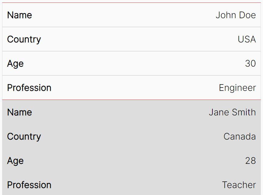
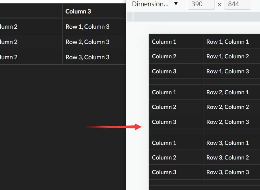
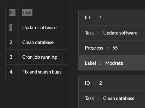
A jQuery plugin used to make your normal tables more human-readable on small screen devices. It makes use of CSS3 media queries to convert a wide table into a 2-column value format in mobile view.
How to use it:
1. Add the following CSS3 media query rules into your CSS file.
@media  only screen and (max-width: 915px), (min-device-width: 768px) and (max-device-width: 1024px)
{
  /* Force table to not be like tables anymore */
  table.resp_table, table.resp_table thead, table.resp_table tbody, table.resp_table th, table.resp_table td, table.resp_table tr {
    display: block;
  }

  /* Hide table headers (but not display: none;, for accessibility) */
  table.resp_table thead tr {
    position: absolute;
    top: -9999px;
    left: -9999px;
  }

  table.resp_table tr { border: 1px solid #ccc; }

  table.resp_table tr td {
    /* Behave  like a "row" */
    border: none;
    border-bottom: 1px solid #eee;
    position: relative;
    padding-left: 50%;
    width: calc(55% - 30px) !important;
    text-align: left !important;
  }

  table.resp_table tr td:before {
    /* Now like a table header */
    position: absolute;
    /* Top/left values mimic padding */
    top: 12px;
    left: 6px;
    width: 45%;
    padding-right: 10px;
    white-space: nowrap;
    text-align: left !important;
    font-weight: bold;

    content: attr(data-th) ": ";
  }
}
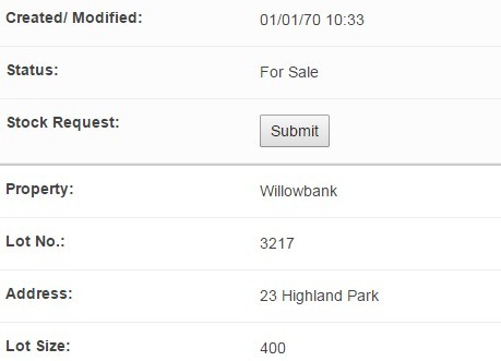
2. Add CSS class 'resp_table' to your table. And then add data-th to each td of the table.
<table class="resp_table demo">
  <thead>
    <tr>
      <th>Name</th>
      <th>Address</th>
      <th>Email</th>
      <th>Status</th>
    </tr>
  </thead>
  <tbody>
    <tr>
      <td data-th="Name">Lorem ipsum</td>
      <td data-th="Address">Donec volutpat eget tortor sit amet interdum</td>
      <td data-th="Email">[email protected]</td>
      <td data-th="Status">For Sale</td>
    </tr>
    <tr>
      <td data-th="Name">Lorem ipsum</td>
      <td data-th="Address">Donec volutpat eget tortor sit amet interdum</td>
      <td data-th="Email">[email protected]</td>
      <td data-th="Status">For Sale</td>
    </tr>
    <tr>
      <td data-th="Name">Lorem ipsum</td>
      <td data-th="Address">Donec volutpat eget tortor sit amet interdum</td>
      <td data-th="Email">[email protected]</td>
      <td data-th="Status">For Sale</td>
    </tr>
    <tr>
      <td data-th="Name">Lorem ipsum</td>
      <td data-th="Address">Donec volutpat eget tortor sit amet interdum</td>
      <td data-th="Email">[email protected]</td>
      <td data-th="Status">For Sale</td>
    </tr>
  </tbody>
</table>
3. Load the needed jQuery library at the end of your web page.
<script src="//ajax.googleapis.com/ajax/libs/jquery/2.1.3/jquery.min.js"></script>
4. The core JS function for the responsive table.
(function ( $ ) {
  $.fn.responsiveTables = function( options ) {
    var settings = $.extend({
    }, options ),
      wrapper = $(this),
      thead_th = [],
      count = 0;

    wrapper.each(function(){
      $(this).find('thead th').each(function(){
      thead_th.push( $(this).html() );
      });

      $(this).find('tr').each(function(){
      count = 0;
      $(this).find('td').each(function(){
        $(this).attr('data-th', thead_th[count]);
        count = count + 1;
      });
      });
    });
  }
}( jQuery ));
5. Call the function on the table and done.
$('.demo').responsiveTables();
This awesome jQuery plugin is developed by mcnamee. For more Advanced Usages, please check the demo page or visit the official website.