Simplest jQuery Responsive Table Solution - respTables
| File Size: | 4.44 KB |
|---|---|
| Views Total: | 3457 |
| Last Update: | |
| Publish Date: | |
| Official Website: | Go to website |
| License: | MIT |
Yet another jQuery & CSS3 based responsive table solution that makes your html table with multiple columns more readable in small screens.
How to use it:
1. Download and put the jQuery respTables.js script after you've loaded jQuery JavaScript library.
<script src="//code.jquery.com/jquery-1.12.0.min.js"></script>
<script src="respTables.js"></script>
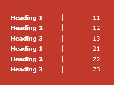
2. Wrap your html table into a DIV element named 'tableWrapper'.
<div class="tableWrapper">
  <table>
    <thead>
      <tr>
        <th> Heading 1 </th>
        <th> Heading 2 </th>
        <th> Heading 3 </th>
      </tr>
    </thead>
    <tbody>
      <tr>
        <td> 11 </td>
        <td> 12 </td>
        <td> 13 </td>
      </tr>
      <tr>
        <td> 21 </td>
        <td> 22 </td>
        <td> 23 </td>
      </tr>
    </tbody>
  </table>
</div>
3. The required CSS styles and CSS3 media queries.
.tableWrapper {
  float: left;
  width: 100%;
}

.tableWrapper table { width: 100%; }

.tableWrapper table td:before { font-weight: bold; }

.tableWrapper table th {
  border-bottom: 1px solid black;
  padding: 5px;
}

.tableWrapper table td {
  padding: 5px;
  text-align: center;
}
@media all and (max-width: 768px) {

.tableWrapper table th { display: none; }

.tableWrapper table td {
  width: 50%;
  padding-left: 50%;
}

.tableWrapper table td, .tableWrapper table tr { display: block; }

.tableWrapper table td:before {
  content: attr(data-before);
  border-right: 1px solid black;
  width: 50%;
  position: absolute;
  left: 0;
}
}
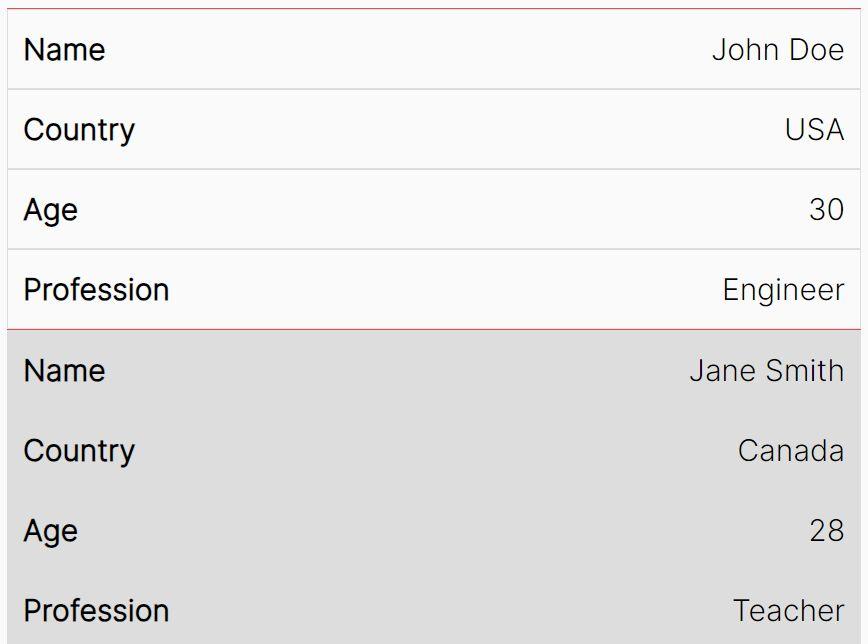
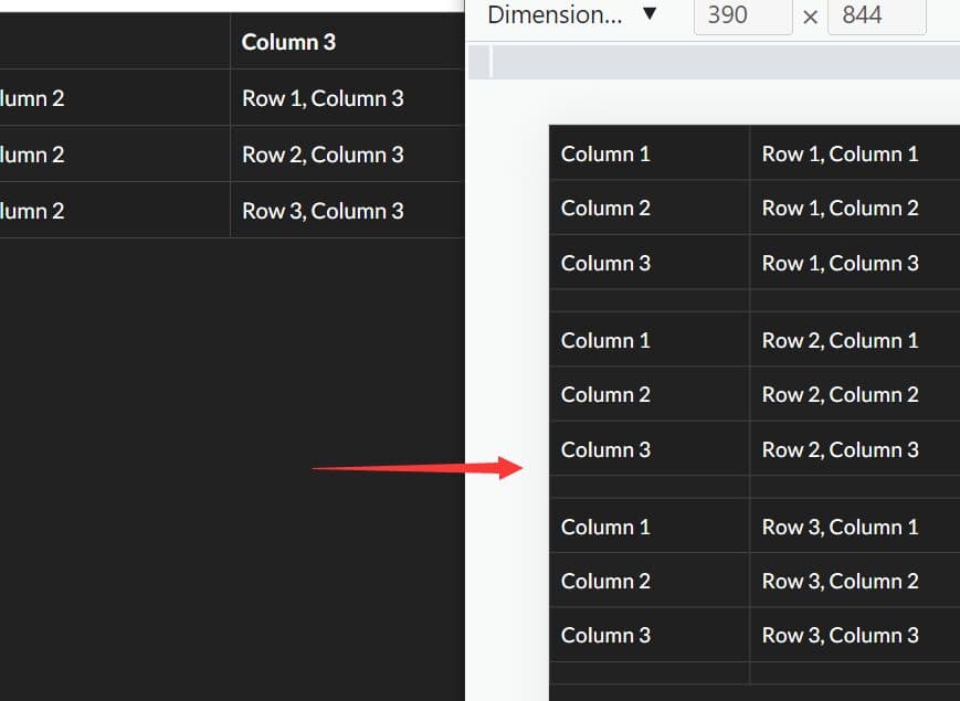
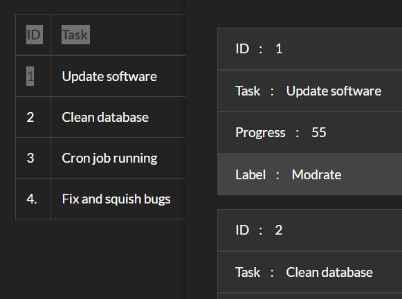
4. Call the function on the table wrapper and the plugin will convert the html table into a 2-column horizontal table layout in mobile view (screen size < 729px).
$('.tableWrapper').respTables();
This awesome jQuery plugin is developed by vaskort. For more Advanced Usages, please check the demo page or visit the official website.