Small Responsive Table Plugin with jQuery and CSS3 - Stacked Rows
| File Size: | 231 KB |
|---|---|
| Views Total: | 1619 |
| Last Update: | |
| Publish Date: | |
| Official Website: | Go to website |
| License: | MIT |
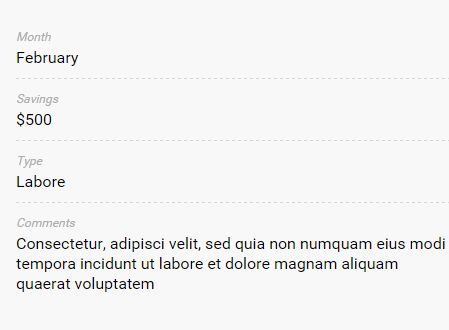
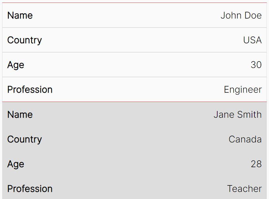
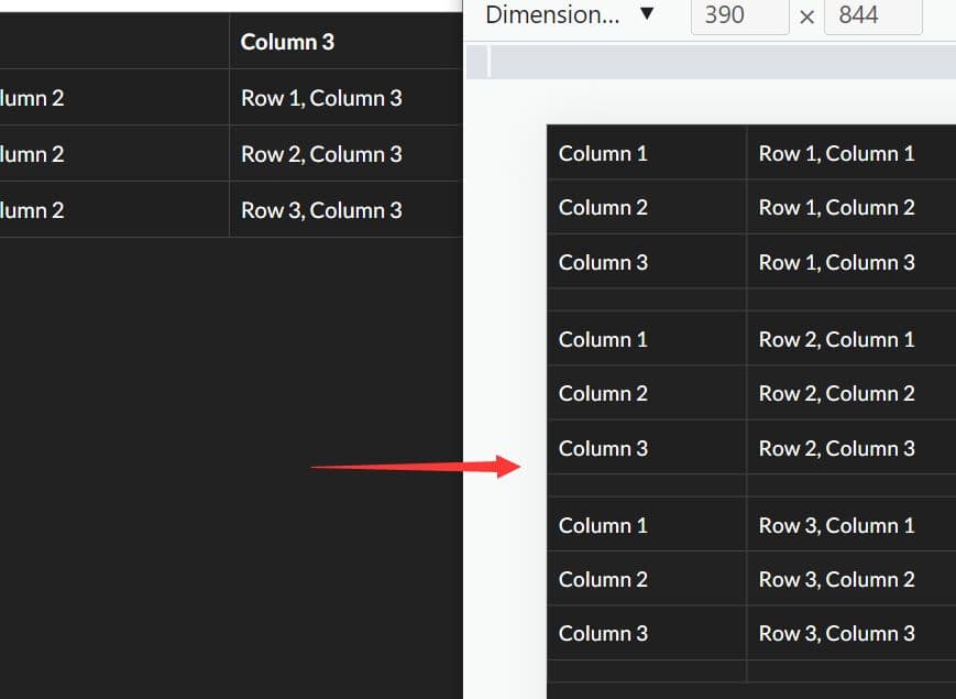
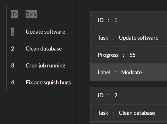
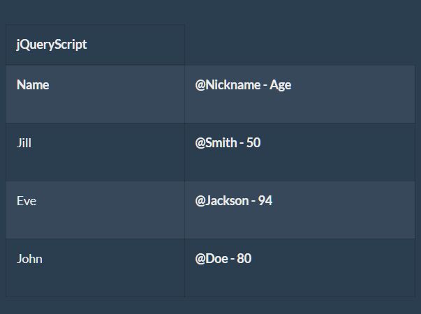
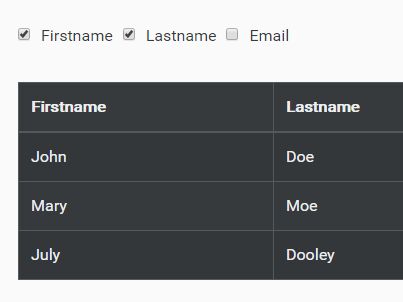
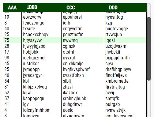
Just another jQuery based responsive table solution for converting your table rows and column into block elements that are stacked for a better view in mobile or tablet devices. The trigger breakpoint can be controlled via CSS3 media queries in your own CSS (Default is 767px).
How to use it:
1. Include jquery.stackedrows.css inside your head tag and jquery.stackedrows.js just before the closing body tag. Make sure to have jQuery library installed as well.
<script src="/code.jquery.com/jquery-1.11.3.min.js"></script>
<link href="jquery.stackedrows.css" rel="stylesheet">
<script src="jquery.stackedrows.js"></script>
2. Call the function stackedRows() on the table to active the plugin.
$('table').stackedRows();
3. Modify the CSS breakpoint in the jquery.stackedrows.css.
@media (max-width: 767px) {

.sr-hide,  .sr-header { display: none; }

.sr-table-div { display: block; }

}
4. Configuration options
$('table').stackedRows({

  // class prefix for CSS styling
  classPrefix: "sr",

  // does first row of table a heading?
  firstRowHeader : true,

  // show labels (column names) in mobile
  showLabels : true,

  // add a class for alternating rows
  altRowStyle : true

});
This awesome jQuery plugin is developed by michaelsoriano. For more Advanced Usages, please check the demo page or visit the official website.