jQuery Plugin To Make Your HTML Table Mobile Friendly - rt Responsive Tables
| File Size: | 9.31 KB |
|---|---|
| Views Total: | 3346 |
| Last Update: | |
| Publish Date: | |
| Official Website: | Go to website |
| License: | MIT |

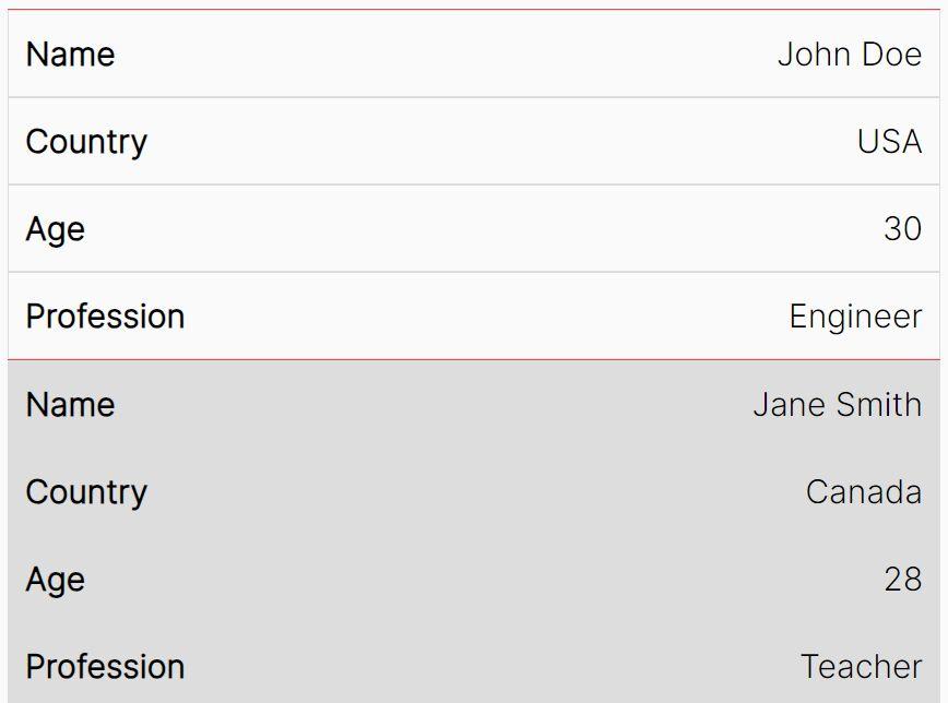
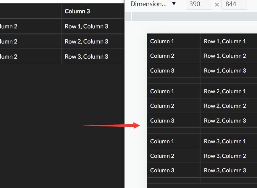
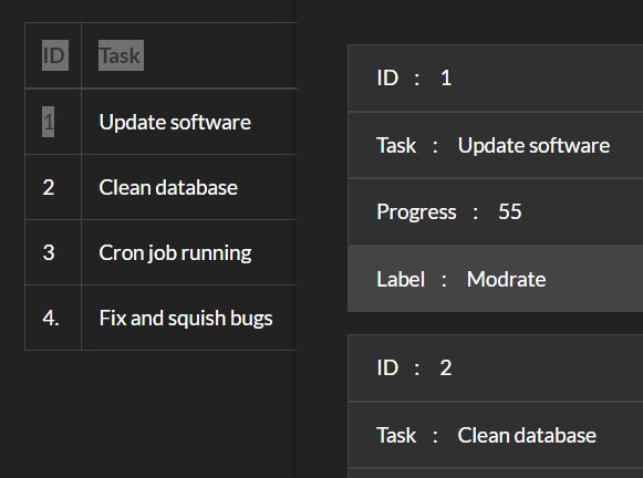
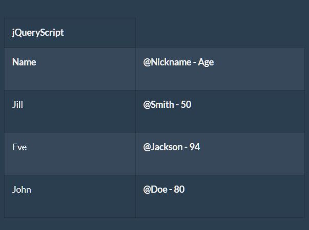
Just another jQuery responsive table solution which re-formats your html tables to make them more readable in mobile view. The goal is to make the regular table header vertical and change the related table cells into grouped blocks at specified CSS media queries.
Basic usage:
1. Load the stylesheet jquery.rtResponsiveTables.min.css in the head section and the JavaScript jquery.rtResponsiveTables.min.js at the end of the webpage. Note that you must have jQuery library installed.
<link rel="stylesheet" href="jquery.rtResponsiveTables.css">
<script src="//code.jquery.com/jquery-2.2.2.min.js"></script>
<script src="jquery.rtResponsiveTables.min.js"></script>
2. Make sure your html table have th and tbody tags.
<table>
  <thead>
    <tr>
      ...
    </tr>
  </thead>
  <tbody>
    <tr>
      ...
    </tr>
  </tbody>
</table>
3. Call the function on the table element and you'll see the plugin in action in mobile view.
$("table").rtResponsiveTables();
4. Override the containerBreakPoint option to force the vertical mode at a certain pixel width of its container, in the case when a table may technically fit but you'd prefer the vertical mode.
$("table").rtResponsiveTables({
  containerBreakPoint: 360
});
5. You can also pass the containerBreakPoint option via 'data-rtContainerBreakPoint' attribute directly on the table element.
<table data-rtContainerBreakPoint="360">
Changelog:
2020-01-14
- Accessibility and Bug Fixes
This awesome jQuery plugin is developed by stazna01. For more Advanced Usages, please check the demo page or visit the official website.