Compact and Highly Configurable jQuery Datepicker Plugin - Zebra_Datepicker
| File Size: | 109 KB |
|---|---|
| Views Total: | 27578 |
| Last Update: | |
| Publish Date: | |
| Official Website: | Go to website |
| License: | MIT |
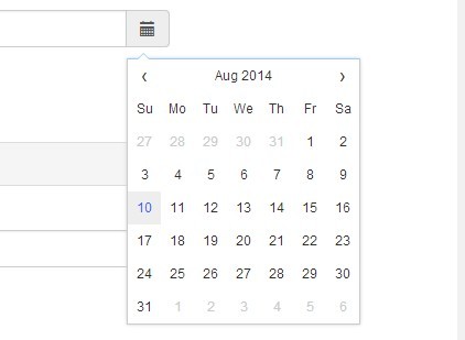
Zebra_Datepicker is a lightweight, cross-browser, and highly customizable jQuery Datepicker Plugin. Zebra_Datepicker works by wrapping an input element and adding a calendar button inside the wrapper and opening a datepicker on clicked.
More Examples:
Related plugins:
- jQuery Date and Time Picker Plugin - Simple Datetimepicker
- jQuery Plugin for Simple Date Picker Widget - simpledatepicker
- Android-Style Date Picker For jQuery Mobile - Mobi Pick
- Customizable jQuery Timepicker Plugin - timepicker
- Cool Time Picker For Twitter Bootstrap
- Simple Date Picker for Bootstrap
- Date Range Picker For Twitter Bootstrap
- Lightweight jQuery Date Input Picker - pickadate
- Customizable and Lightweight Date Picker Plugin For jQuery - glDatePicker
Features:
- Custom date format
- Event callback supported
- Easy to navigate through months and years
- Custom view modes.
- Custom date direction
- Support for disabled dates
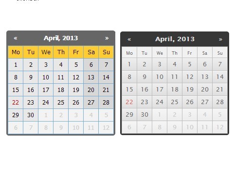
- 3 themes.
Basic Usage:
1. Include jQuery library and Zebra_Datepicker plugin on your web page
<script src="/path/to/jquery.min.js"></script>
<script src="/path/to/zebra_datepicker.js"></script>
2. Create a normal input field for the date picker.
<input id="datepicker-example1" type="text">
3. Include the jQuery Zebra Datepicker plugin's stylesheet in the header of the webpage.
<!-- Bootstrap theme -->
<link rel="stylesheet" href="/path/to/bootstrap/zebra_datepicker.css">

<!-- Default theme -->
<link rel="stylesheet" href="/path/to/default/zebra_datepicker.css">

<!-- Metallic theme -->
<link rel="stylesheet" href="/path/to/metallic/zebra_datepicker.css">
4. Attach a default date picker to the input field.
$('#datepicker-example1').Zebra_DatePicker();
5. All default plugin options.
// setting this property to a jQuery element, will result in the date picker being always visible, the indicated
// element being the date picker's container;
//
// setting this to boolean TRUE will keep will result in the date picker not closing when selecting a
// date but only when the user clicks outside the date picker.
//
// note that when a date format is used that also involves time, this property will be automatically
// set to TRUE!
//
// default is FALSE
always_visible: false,
// by default, the date picker is injected into the <body>; use this property to tell the library to inject
// the date picker into a custom element - useful when you want the date picker to open at a specific position
//
// must be a jQuery element
//
// default is $('body')
container: $('body'),
// dates that should have custom classes applied to them
// an object in the form of
// {
// 'myclass1': [dates_to_apply_the_custom_class_to],
// 'myclass2': [dates_to_apply_the_custom_class_to]
// }
// where "dates_to_apply_the_custom_class_to" is an array of dates in the same format as required for
// "disabled_dates" property.
//
// custom classes will be applied *only* in the day picker view and not on month/year views!
// also note that the class name will have the "_disabled" suffix added if the day the class is applied to
// is disabled
//
// in order for the styles in your custom classes to be applied, make sure you are using the following syntax:
//
// .Zebra_DatePicker .dp_daypicker td.myclass1 { .. }
// .Zebra_DatePicker .dp_daypicker td.myclass1_disabled { .. }
//
// default is FALSE, no custom classes
custom_classes: false,
// days of the week; Sunday to Saturday
days: ['Sunday', 'Monday', 'Tuesday', 'Wednesday', 'Thursday', 'Friday', 'Saturday'],
// by default, the abbreviated name of a day consists of the first 2 letters from the day's full name;
// while this is common for most languages, there are also exceptions for languages like Thai, Loa, Myanmar,
// etc. where this is not correct; for these cases, specify an array with the abbreviations to be used for
// the 7 days of the week; leave it FALSE to use the first 2 letters of a day's name as the abbreviation.
//
// default is FALSE
days_abbr: false,
// the position of the date picker relative to the element it is attached to. note that, regardless of this
// setting, the date picker's position will be automatically adjusted to fit in the viewport, if needed.
//
// possible values are element_top_right, element_bottom_right, element_top_left, element_bottom_left, icon_top_right, icon_bottom_right, icon_top_left, icon_bottom_left
//
// default is "above"
default_position: 'icon_top_right',
// direction of the calendar
//
// a positive or negative integer: n (a positive integer) creates a future-only calendar beginning at n days
// after today; -n (a negative integer); if n is 0, the calendar has no restrictions. use boolean true for
// a future-only calendar starting with today and use boolean false for a past-only calendar ending today.
//
// you may also set this property to an array with two elements in the following combinations:
//
// - first item is boolean TRUE (calendar starts today), an integer > 0 (calendar starts n days after
// today), or a valid date given in the format defined by the "format" attribute, using English for
// month names (calendar starts at the specified date), and the second item is boolean FALSE (the calendar
// has no ending date), an integer > 0 (calendar ends n days after the starting date), or a valid date
// given in the format defined by the "format" attribute, using English for month names, and which occurs
// after the starting date (calendar ends at the specified date)
//
// - first item is boolean FALSE (calendar ends today), an integer < 0 (calendar ends n days before today),
// or a valid date given in the format defined by the "format" attribute, using English for month names
// (calendar ends at the specified date), and the second item is an integer > 0 (calendar ends n days
// before the ending date), or a valid date given in the format defined by the "format" attribute, using
// English for month names and which occurs before the starting date (calendar starts at the specified
// date)
//
// [1, 7] - calendar starts tomorrow and ends seven days after that
// [true, 7] - calendar starts today and ends seven days after that
// ['2013-01-01', false] - calendar starts on January 1st 2013 and has no ending date ("format" is YYYY-MM-DD)
// [false, '2012-01-01'] - calendar ends today and starts on January 1st 2012 ("format" is YYYY-MM-DD)
//
// note that "disabled_dates" property will still apply!
//
// default is 0 (no restrictions)
direction: 0,
// an array of disabled dates in the following format: 'day month year weekday' where "weekday" is optional
// and can be 0-6 (Saturday to Sunday); the syntax is similar to cron's syntax: the values are separated by
// spaces and may contain * (asterisk) - (dash) and , (comma) delimiters:
//
// ['1 1 2012'] would disable January 1, 2012;
// ['* 1 2012'] would disable all days in January 2012;
// ['1-10 1 2012'] would disable January 1 through 10 in 2012;
// ['1,10 1 2012'] would disable January 1 and 10 in 2012;
// ['1-10,20,22,24 1-3 *'] would disable 1 through 10, plus the 22nd and 24th of January through March for every year;
// ['* * * 0,6'] would disable all Saturdays and Sundays;
// ['01 07 2012', '02 07 2012', '* 08 2012'] would disable 1st and 2nd of July 2012, and all of August of 2012
//
// default is FALSE, no disabled dates
//
// DISABLING ALL DATES AND NOT SPECIFYING AT LEAST ONE ENABLED DATE WILL SEND THE SCRIPT INTO AN INFINITE
// LOOP SEARCHING FOR AN ENABLED DATE TO DISPLAY!
disabled_dates: false,
// an array of enabled dates in the same format as required for "disabled_dates" property.
// to be used together with the "disabled_dates" property by first setting the "disabled_dates" property to
// something like "[* * * *]" (which will disable everything) and the setting the "enabled_dates" property to,
// say, "[* * * 0,6]" to enable just weekends.
enabled_dates: false,
// an array of selectable am/pm.
// allowed values are ['am'], ['pm'], or ['am', 'pm']
// default is FALSE, both are always selectable.
// note that this only applies when the date format includes am/pm (a or A)
// even when only one is enabled, onChange() will still be triggered when clicking the up/down buttons next to AM/PM on the timepicker
enabled_ampm: false,
// an array of selectable hours.
// default is FALSE, all hours are selectable.
enabled_hours: false,
// an array of selectable minutes.
// default is FALSE, all minutes are selectable.
enabled_minutes: false,
// an array of selectable seconds.
// default is FALSE, all seconds are selectable.
enabled_seconds: false,
// week's starting day
//
// valid values are 0 to 6, Sunday to Saturday
//
// default is 1, Monday
first_day_of_week: 1,
// format of the returned date
//
// accepts the following characters for date formatting: d, D, j, l, N, w, S, F, m, M, n, Y, y, h, H,
// g, G, i, s, a, A borrowing the syntax from PHP's "date" function.
//
// note that when setting a date format without days ('d', 'j'), the users will be able to select only years
// and months, and when setting a format without months and days ('F', 'm', 'M', 'n', 'd', 'j'), the
// users will be able to select only years; likewise, when setting a date format with just months ('F', 'm',
// 'M', 'n') or just years ('Y', 'y'), users will be able to select only months and years, respectively.
//
// setting a format that also involves time (h, H, g, G, i, s, a, A) will automatically enable the time
// picker.
//
// also note that the value of the "view" property (see below) may be overridden if it is the case: a value of
// "days" for the "view" property makes no sense if the date format doesn't allow the selection of days.
//
// default is Y-m-d
format: 'Y-m-d',
// captions in the datepicker's header, for the 3 possible views: days, months, years
//
// for each of the 3 views the following special characters may be used borrowing from PHP's "date" function's
// syntax: m, n, F, M, y and Y; any of these will be replaced at runtime with the appropriate date fragment,
// depending on the currently viewed date. two more special characters are also available Y1 and Y2 (upper
// case representing years with 4 digits, lowercase representing years with 2 digits) which represent
// "currently selected year - 7" and "currently selected year + 4" and which only make sense used in the
// "years" view.
//
// even though any of these special characters may be used in any of the 3 views, you should use m, n, F, M
// for the "days" view and y, Y, Y1, Y2, y1, y2 for the "months" and "years" view or you may get unexpected
// results!
//
// Text and HTML can also be used, and will be rendered as it is, as in the example below (the library is
// smart enough to not replace special characters when used in words or HTML tags):
//
// header_captions: {
// 'days': 'Departure:<br>F, Y',
// 'months': 'Departure:<br>Y',
// 'years': 'Departure:<br>Y1 - Y2'
// }
//
// Default is
//
// header_captions: {
// 'days': 'F, Y',
// 'months': 'Y',
// 'years': 'Y1 - Y2'
// }
header_captions: {
days: 'F, Y',
months: 'Y',
years: 'Y1 - Y2'
},
// the left and right white-space around the icon
// if the "inside" property is set to TRUE then the target element's padding will be altered so that
// the element's left or right padding (depending on the value of "icon_position") will be 2 x icon_margin
// plus the icon's width
// if the "inside" property is set to FALSE, then this will be the distance between the element and the icon.
// leave it to FALSE to use the element's existing padding
//
// default is FALSE
icon_margin: false,
// icon's position
// accepted values are "left" and "right"
// if the "inside" property is set to TRUE, this will always be "right"
//
// default is "right"
icon_position: 'right',
// should the icon for opening the datepicker be inside the element?
// if set to FALSE, the icon will be placed to the right of the parent element, while if set to TRUE it will
// be placed to the right of the parent element, but *inside* the element itself
//
// default is TRUE
inside: true,
// the caption for the "Clear" button
lang_clear_date: 'Clear date',
// months names
months: ['January', 'February', 'March', 'April', 'May', 'June', 'July', 'August', 'September', 'October', 'November', 'December'],
// by default, the abbreviated name of a month consists of the first 3 letters from the month's full name;
// while this is common for most languages, there are also exceptions for languages like Thai, Loa, Myanmar,
// etc. where this is not correct; for these cases, specify an array with the abbreviations to be used for
// the months of the year; leave it FALSE to use the first 3 letters of a month's name as the abbreviation.
//
// default is FALSE
months_abbr: false,
// HTML to be used for previous/next and up/down buttons, in that order
//
// default is ['◀', '▶', '▲', '▼']
navigation: ['◀', '▶', '▲', '▼'],
// the offset, in pixels (x, y), to shift the date picker's position relative to the top-right of the icon
// that toggles the date picker or, if the icon is disabled, relative to the top-right corner of the element
// the plugin is attached to.
//
// note that this only applies if the position of element relative to the browser's viewport doesn't require
// the date picker to be placed automatically so that it is visible!
//
// default is [5, -5]
offset: [5, -5],
// set whether the date picker should be shown *only* when interacting with the icon
// note that if you also set the "show_icon" property to FALSE, you will not be able to show the date picker anymore!
//
// default is FALSE
open_icon_only: false,
// set this property to TRUE if you want the date picker to be shown when the parent element (if
// "open_icon_only" is not set to FALSE) or the associated calendar icon (if "show_icon" is set to TRUE)
// receive focus.
//
// default is FALSE
open_on_focus: false,
// if set as a jQuery element with a Zebra_DatePicker attached, that particular date picker will use the
// current date picker's value as starting date
// note that the rules set in the "direction" property will still apply, only that the reference date will
// not be the current system date but the value selected in the current date picker
// default is FALSE (not paired with another date picker)
pair: false,
// should the element the calendar is attached to, be read-only?
// if set to TRUE, a date can be set only through the date picker and cannot be entered manually
//
// default is TRUE
readonly_element: true,
// should days from previous and/or next month be selectable when visible?
// note that if the value of this property is set to TRUE, the value of "show_other_months" will be considered
// TRUE regardless of the actual value!
//
// default is FALSE
select_other_months: false,
// should the "Clear date" button be visible?
//
// accepted values are:
//
// - 0 (zero) - the button for clearing a previously selected date is shown only if a previously selected date
// already exists; this means that if the input the date picker is attached to is empty, and the user selects
// a date for the first time, this button will not be visible; once the user picked a date and opens the date
// picker again, this time the button will be visible.
//
// - TRUE will make the button visible all the time
//
// - FALSE will disable the button
//
// default is "0" (without quotes)
show_clear_date: 0,
// Should a calendar icon be added to the elements the plugin is attached to?
//
// Set this property's value to boolean false if you don't want the calendar icon.
//
// Note that the text is not visible by default since text-indentation is set to a big negative value in the CSS, so you might want to change that in case you want to make the text visible.
//
// When not set to boolean false the plugin will attach a calendar icon to the elements the plugin is attached to.
show_icon: 'Pick A Date',
// should days from previous and/or next month be visible?
//
// default is TRUE
show_other_months: true,
// should the "Today" button be visible?
// setting it to anything but boolean FALSE will enable the button and will use the property's value as
// caption for the button; setting it to FALSE will disable the button
//
// default is "Today"
show_select_today: 'Today',
// should an extra column be shown, showing the number of each week?
// anything other than FALSE will enable this feature, and use the given value as column title
// i.e. show_week_number: 'Wk' would enable this feature and have "Wk" as the column's title
//
// default is FALSE
show_week_number: false,
// a default date to start the date picker with
// must be specified in the format defined by the "format" property, or it will be ignored!
// note that this value is used only if there is no value in the field the date picker is attached to!
//
// default is FALSE
start_date: false,
// should default values, in the input field the date picker is attached to, be deleted if they are not valid
// according to "direction" and/or "disabled_dates"?
//
// default is FALSE
strict: false,
// how should the date picker start; valid values are "days", "months" and "years"
// note that the date picker is always cycling days-months-years when clicking in the date picker's header,
// and years-months-days when selecting dates (unless one or more of the views are missing due to the date's
// format)
//
// also note that the value of the "view" property may be overridden if the date's format requires so! (i.e.
// "days" for the "view" property makes no sense if the date format doesn't allow the selection of days)
//
// default is "days"
view: 'days',
// days of the week that are considered "weekend days"
// valid values are 0 to 6, Sunday to Saturday
//
// default values are 0 and 6 (Saturday and Sunday)
weekend_days: [0, 6],
// when set to TRUE, day numbers < 10 will be prefixed with 0; set to FALSE if you don't want that
//
// default is TRUE
zero_pad: false,
// callback function to be executed whenever the user changes the view (days/months/years), as well as when
// the user navigates by clicking on the "next"/"previous" icons in any of the views
//
// the callback function called by this event takes 2 arguments - the first argument represents the current
// view (can be "days", "months" or "years"), the second argument represents an array containing the "active"
// elements (not disabled) from the view, as jQuery elements, allowing for easy customization and interaction
// with particular cells in the date picker's view
//
// the "this" keyword inside the callback function refers to the element the date picker is attached to,
// as a jQuery object
//
// for simplifying searching for particular dates, each element in the second argument will also have a
// "date" data attribute whose format depends on the value of the "view" argument:
// - YYYY-MM-DD for elements in the "days" view
// - YYYY-MM for elements in the "months" view
// - YYYY for elements in the "years" view
//
// the "this" keyword inside the callback function refers to the element the date picker is attached to!
onChange: null,
// callback function to be executed when the user clicks the "Clear" button
//
// the callback function takes no arguments; the "this" keyword inside the callback function refers to
// the element the date picker is attached to, as a jQuery object
onClear: null,
// callback function to be executed when the date picker is shown
//
// the callback function takes no arguments; the "this" keyword inside the callback function refers to
// the element the date picker is attached to, as a jQuery object
onOpen: null,
// callback function to be executed when the date picker is closed, but only when the "always_visible"
// property is set to FALSE
//
// the callback function takes no arguments; the "this" keyword inside the callback function refers to
// the element the date picker is attached to, as a jQuery object
onClose: null,
// callback function to be executed when a date is selected
// the callback function takes 3 arguments:
// - the date in the format specified by the "format" attribute;
// - the date in YYYY-MM-DD format
// - the date as a JavaScript Date object
//
// the "this" keyword inside the callback function refers to the element the date picker is attached to,
// as a jQuery object
onSelect: null
6. API methods.
var datepicker = $('element').data('Zebra_DatePicker');

// Updates configuration options at run-time, and recalculates date picker’s icon position relative to the parent element.
// You should call this method whenever you show/hide/reposition the parent element, or alter the parent element’s dimensions;
datepicker.update();

// destroy the date picker
datepicker.destroy();

// show the date picker
datepicker.show();

// hide the date picker
datepicker.hide();

// clear the selected date
datepicker.clear_date();

// set the value of the element the date picker is attached to, to the specified date
datepicker.set_date(date)
Changelog:
v2.2.0 (2024-11-01)
- minor visual improvements on mobile devices
- minor (non-visible) updates to the CSS files because of how the latest SASS works
- bugfixes
v2.1.0 (2024-09-25)
- Fixed colors
2024-05-11
- the default_position property now takes more options; the previous valid values are still going to work for backward compatibility;
- fixed an issue where the plugin could run in an infinite loop in a configuration where no selectable dates were available;
2024-04-30
- Minified using latest packages
v2.0.0 (2023-09-30)
- Removed some legacy code and makes it incompatible with Internet Explorer version 6, 7 and 8
- Removed code that is deprecated in newer versions of jQuery
- A reference to the actual datepicker DOM element is now available in the plugin's properties
- Bugfixes
v1.9.19 (2022-09-14)
- the library will now allow days/months both with and without leading zeros for d, j, m and n;
- Custom text can now be set in the icon (button) element
- fixed a minor issue with the HTML markup
v1.9.18 (2021-12-31)
- fixed bug where certain scenarios involving disabled_dates and enabled_dates would send the script into an infinite loop
v1.9.17 (2020-12-24)
- added enabled_ampm option
- fixed bug where updating container was not working
- case of am/pm in the time picker now respects date format (will be AM/PM if A is used, and am/pm if a is used)
v1.9.16 (2020-10-14)
- fixed an issue where abbreviations of days and months were incorrectly handled unless these were exactly the first 3 letters of full days/month names
v1.9.15 (2020-07-20)
- Fixed an issue where time was not selected if left to default
- Removed unnecessary semicolo
v1.9.14 (2020-04-27)
- fixed an issue where time was not selected if left to default
- fixed Firefox bug that broke the timepicker
v1.9.13 (2019-09-27)
- The onChange event is now also triggered when switching to the time view
- Fixed an issue where English ordinal suffixes for 11th, 12th, and 13th where incorrectly shown as 11st, 12nd, and 13rd.
- Fixed an issue where specifying enabled_hours, enabled_minutes and enabled_seconds as strings rather than integers would break the time picker
- Calling the update method now repaints the date picker
- Allows time intervals to change while mouse button is being pressed
- Fixed an issue where, when having the year selector as the only available pane, the selected date would incorrectly be set to February instead of January
- Applied correct fix
v1.9.13beta (2019-05-31)
- allows time intervals to change while mouse button is being pressed
- Fixed date formats with short years ("y")
- the onChange event is now also triggered when switching to the time view
- calling the update method now repaints the date picker
- Fixed bug that broke the time picker in Firefox
- v1.9.12 stable version is available here
v1.9.12 (2018-10-28)
- added support for RTL languages
- fixed an issiue where, when resizing the window, the onClose event would fire multiple times
- fixed a bug when dynamically changing enabled/disabled dates
- the hour in the time picker now respects the given format regarding the leading zeroes
- added a new property called fast_navigation which, when set to false, disables the default behavior that allows the users to quickly navigate through months and years by clicking on the date picker's top label
- added a new property called current_date which, when set to a date in the format of YYYY-MM-DD overrides the value of Today
- fixed a bug where when having a or A the time's format (indicating a 12-hour time) but the hour's format is H or G (indicating a 24-hour time), time picking was not working correctly; these will now be automatically replaced with h and g respectively
- adjusted font size for the time picker and fixed spacing issues when having a time format with hours, minutes, seconds and am/pm
v1.9.11 (2018-09-04)
- where, when resizing the window, the onClose event would fire multiple times
v1.9.10 (2018-08-10)
- The "start_date" property can now be specified also as a JavaScript Date object
- Adjusted position of "AM/PM"
- CSS optimized and minified by clean-css
v1.9.9 (2018-07-08)
- global defaults can now be set;
- setting the readonly_element property to FALSE will now unset the readonly attribute from the element, if present;
- fixed a bug where on pages with multiple time pickers, selecting a time on one would select the time on all other time pickers that are empty;
- added a new disable_time_picker property for explicitly disabling the time picker even if format includes time-related characters;
- fixed an issue on Android devices;
- allow accented chars in weekday name;
- added version number as a public property - useful to find out the version number even if all you have is the minified source code;
2018-07-06
- Global defaults can now be set.
2018-06-28
- Allow accented chars in weekday name
- Setting "readonly_element" to FALSE will now unset the "readonly" attribute from the element, if present;
v1.9.8 (2018-04-09)
- fixed some issues because of which the date picker was not working in IE6, 7 & 8
- fixed an issue where on iOS and Microsoft Edge the next and previous buttons in the header were rendered as emoji characters
- fixed some issues with the icon's positioning if the target element was explicitly positioned and/or it had margins; the icon's position now depends on the element's padding but can also be set via the newly added icon_marginproperty
- for touch-enabled devices, when readonly_element is set to FALSE, wait for the virtual keyboard to appear before positioning the date picker; previously the date picker was being closed on this event
- the date picker is not closing anymore when the screen is dragged (on touch devices)
- fixed issue with the onSelect event being triggered multiple times if the time picker was enabled and not returning time when it should
- improved user experience in examples
- some documentation updates
v1.9.7 (2017-12-13)
- the date picker now also works as a time picker by setting time-related parts in the format property
- the date picker can now also be shown when the parent element and/or the associated icon is focused by setting the newly add open_on_focus property to TRUE;
- fixed a bug where clearing a date would not return focus to the parent element
- fixed memory leaks, see #81, thanks to @sszabolcs
- fixed value of "today" being cached; see #83, thanks to @CJDennis
- fixed possible issues by adding more randomness for each date picker's internally used ID;
- rewrote the SCSS for all the 3 themes and improved theming by introducing variables
- all the themes are now using a single sprite image instead of multiple images
- source code updates and tweaks because of which the plugin is now compatible with jQuery 1.7.0+ (previously it was compatible with jQuery 1.5.2+)
- improved user experience in examples
- some documentation updates
- Fixed an issue where Microsoft Edge is changing ◀ and ▶ with emoji characters
- The icon's position now depends on the element's padding but can also be set via the newly added "icon_margin" property
- The date picker is not closing anymore when the screen is dragged
- For touch-enabled devices, when "readonly_element" is set to FALSE, wait for the virtual keyboard to appear before positioning the date picker
v1.9.6 (2017-11-27)
- Replaced instances of old "delegate" with "on" and minor optimizations
- Fixed: Value of "today" is cached
- Fixed bug where clearing a date would not return focus to the parent element
- Fixed a bug where "00" was not considered a valid time
- Custom valid hours, minutes and seconds can now be specified
- Removed unused argument
- Fixed bug where, when the timepicker was the only available view, clicking on the confirmation button was not selecting the current time
- Fixed minor bug where the width and height of the month/year picker was sometimes one pixel less than the daypicker's
- Using same font and size for all themes for more consistency
v1.9.5 (2017-06-14)
- fixed a bug when parent elements were having the "display" property set to "block
- fixed a bug with updating a dependent picker;
- added verification if custom class is defined or not, and added extra checks before traversing it; also if mootools is also present, it modifies arrays prototypes so they are not handled well with normal jquery methods if null;
- fixed some memory leaks when destroying the plugin;
- fixed a bug with custom classes not working anymore;
- optimized images size
v1.9.4 (2016-01-25)
- Icon position can now be also set to the left of the element
- Added possibility to easily apply custom classes to date ranges
v1.9.3 (2016-01-11)
- Fixed a bug where "header_navigation", "lang_clear_date" and "show_select_today" properties could not be updated via the "update" method;
v1.9.2 (2015-05-01)
- update and bug fixes
v1.9.1 (2015-04-15)
- update
2015-04-11
- Fixed issue with NaN instead of values for date pickers that were never shown;
2015-03-25
- Increased zIndex value to 1200
- Added a warning about disabling all dates
v1.8.9 (2014-11-14)
- update
v1.8.9 (2013-11-29)
- update
v1.8.7 (2013-11-29)
- added a new “header_navigation” property allowing custom HTML for the next/previous months buttons;
- fixed a minor bug with paired date pickers;
- minor performance tweaks;
v1.8.5 (2013-09-22)
- Properties can now be set via data attributes
- Added example on using data attributes
v1.8.4 (2013-08-12)
- added a “destroy” method; thanks TeckniX;
- date picker now disappears upon window resize; previously it would remain in the same position upon window resize, even though the parent element could be repositioned in the process; thanks hanneslinder;
- fixed a position bug that appearing in newer versions of Firefox where Firefox sets the “display” property of <input> elements to “inline” instead of “inline-block” as do the other browsers; thanks to discotizer;
This awesome jQuery plugin is developed by stefangabos. For more Advanced Usages, please check the demo page or visit the official website.