Mobile-friendly Sliding Mega Menu Plugin With jQuery
| File Size: | 110 KB |
|---|---|
| Views Total: | 9160 |
| Last Update: | |
| Publish Date: | |
| Official Website: | Go to website |
| License: | MIT |

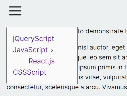
The Mobile Mega Menu jQuery plugin will automatically converts your nested html list into a mobile-friendly, drill down nav-style mega menu for your content-rich website.
How to use it:
1. Download and load the Mobile Mega Menu jQuery plugin's files in the webpage. Make sure you first have jQuery library installed.
<link rel="stylesheet" href="jquery-mobile-mega-menu-min.css">
<script src="//code.jquery.com/jquery.min.js"></script>
<script src="jquery-mobile-mega-menu-min.js">
2. Create the mega menu from a nested nav list containing tons of sub menu items.
<div class="main-menu mobile-mega-menu">
<nav>
<ul>
<li><a href="#">Home</a>
<ul>
<li><a href="#">Services</a></li>
<li><a href="#">Products</a></li>
<li><a href="#">Products</a></li>
<li><a href="#">Products</a></li>
<li><a href="#">Privacy Policy</a></li>
<li><a href="#">Additional Details</a>
<ul>
<li><a href="#">Hello World</a></li>
<li><a href="#">Hello World</a>
<ul>
<li><a href="#">A</a></li>
<li><a href="#">C</a></li>
<li><a href="#">B</a></li>
<li><a href="#">D</a></li>
</ul>
</li>
</ul>
</li>
</ul>
</li>
<li><a href="#">About Us</a>
<ul>
<li><a href="#">Help</a></li>
<li><a href="#">About</a></li>
<li><a href="#">What Ever</a></li>
</ul>
</li>
<li><a href="#">Products</a></li>
<li><a href="#">Medical Services</a>
<ul>
<li><a href="#">Cardiovascular</a></li>
<li><a href="#">Vascular</a></li>
<li><a href="#">Orthopedics</a></li>
<li><a href="#">Women's Health</a></li>
<li><a href="#">Cancer</a>
<ul>
<li><a href="#">Corp</a></li>
<li><a href="#">Inner</a></li>
<li><a href="#">Cardiovascular</a></li>
<li><a href="#">Vascular</a></li>
<li><a href="#">Orthopedics</a></li>
<li><a href="#">Women's Health</a></li>
<li><a href="#">Cardiovascular</a></li>
<li><a href="#">Vascular</a></li>
<li><a href="#">Orthopedics</a></li>
<li><a href="#">Cardiovascular</a></li>
<li><a href="#">Vascular</a></li>
<li><a href="#">Orthopedics</a></li>
<li><a href="#">Women's Health</a></li>
<li><a href="#">Cardiovascular</a></li>
<li><a href="#">Vascular</a></li>
</ul>
</li>
<li><a href="#">Cardiovascular</a></li>
<li><a href="#">Vascular</a></li>
<li><a href="#">Orthopedics</a></li>
<li><a href="#">Women's Health</a></li>
<li><a href="#">Cardiovascular</a></li>
<li><a href="#">Vascular</a></li>
<li><a href="#">Orthopedics</a></li>
<li><a href="#">Women's Health</a>
<ul>
<li><a href="#">1</a></li>
<li><a href="#">2</a></li>
<li><a href="#">3</a></li>
<li><a href="#">4</a></li>
</ul>
</li>
<li><a href="#">Cardiovascular</a></li>
<li><a href="#">Vascular</a></li>
<li><a href="#">What</a>
<ul>
<li><a href="#">1</a></li>
<li><a href="#">2</a></li>
<li><a href="#">3</a></li>
<li><a href="#">4</a></li>
<li><a href="#">Corp</a></li>
<li><a href="#">Inner</a></li>
<li><a href="#">Cardiovascular</a></li>
<li><a href="#">Vascular</a></li>
<li><a href="#">Orthopedics</a></li>
<li><a href="#">Women's Health</a></li>
<li><a href="#">Cardiovascular</a></li>
<li><a href="#">Vascular</a></li>
<li><a href="#">Orthopedics</a></li>
<li><a href="#">Cardiovascular</a></li>
<li><a href="#">Vascular</a></li>
<li><a href="#">Orthopedics</a></li>
<li><a href="#">Women's Health</a></li>
<li><a href="#">Cardiovascular</a></li>
<li><a href="#">Vascular</a></li>
</ul>
</li>
<li><a href="#">Orthopedics</a></li>
<li><a href="#">Women's Health</a></li>
</ul>
</li>
<li><a href="#">Health & Wellness</a></li>
</ul>
</nav>
<div class="widget-region">
<p>This has been appended to the bottom of the first ul of the mobile mega menu.</p>
<input type="" value="Search">
</div>
</div>
3. You need to create a trigger element to toggle the mega menu.
<a href="#" class="menu-toggle">Open Menu</a>
4. Active the mega menu with default options.
$( '.main-menu' ).mobileMegaMenu();
5. You're able to customize the mega menu with the following options.
$( '.main-menu' ).mobileMegaMenu({

  // change the text of the toggle element
  changeToggleText: false,

  // Specify a div element with class of widget-region then place other items within that region to then have it appear below the first unordered list item.
  // This can be search fields, social media links, or any valid HTML.
  enableWidgetRegion: false,

  // Add a close button at the top of the menu
  prependCloseButton: false,

  // preverve the current menu level
  stayOnActive: true,

  // Text for close button
  toogleTextOnClose: 'Close Menu',

  // CSS class of trigger element
  menuToggle: 'toggle-menu'

});
Change log:
2017-06-02
- Adjust button class names and associated styles
2017-04-21
- Added min-height update on window resize
This awesome jQuery plugin is developed by Blake-C. For more Advanced Usages, please check the demo page or visit the official website.