Responsive jQuery Off-canvas Menu For Bootstrap
| File Size: | 54.6 KB |
|---|---|
| Views Total: | 3955 |
| Last Update: | |
| Publish Date: | |
| Official Website: | Go to website |
| License: | MIT |
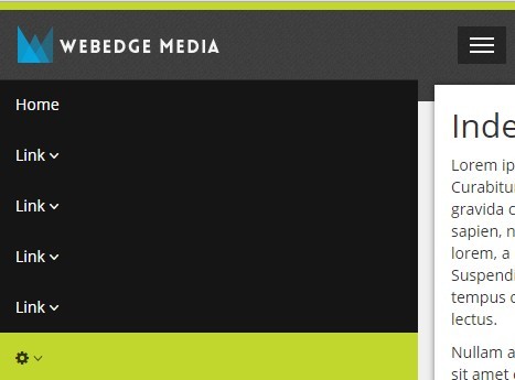
A jQuery & CSS approach to turning the default Bootstrap navigation into a responsive, toggleable off-canvas menu.
How to use it:
1. Make sure you have jQuery library installed in your Bootstrap project.
<script src="path/to/jquery.min.js"></script>
<script src="path/to/bootstrap.min.js"></script>
2. Replace the default Bootstrap Navbar styles with follows:
.navbar-collapse.collapse {
  border: none;
  display: block;
  background: #151515;
  position: absolute;
  left: -100%;
  top: 70px;
  width: 80%;
  max-height: none;
  -webkit-transition: left 0.5s ease;
  -moz-transition: left 0.5s ease;
  -o-transition: left 0.5s ease;
  transition:  left 0.5s ease;
}

.navbar-collapse.collapse.in {
      left: 15px;
}

@media (min-width: 768px) {
  .navbar-collapse.collapse {
    width: auto;
    background: none;
    position: relative;
    left: auto;
    top: auto;
    padding: 0px;
    margin: 25px 0 35px 50px;
  }
}
3. The jQuery script to enable the off-canvas menu.
$('document').ready(function () {
  $('.navbar-toggle').on('click', function () {
      $('.collapse, #mainContainer').toggleClass('in');
  });
});

$(window).resize(function () {
  if ($(window).width() > 768) {
      $('.collapse, #mainContainer').removeClass('in');
  };
});
This awesome jQuery plugin is developed by webedge. For more Advanced Usages, please check the demo page or visit the official website.