Android-style Offcanvas Sidebar Navigation with jQuery and CSS3
| File Size: | 14.6 KB |
|---|---|
| Views Total: | 22222 |
| Last Update: | |
| Publish Date: | |
| Official Website: | Go to website |
| License: | MIT |
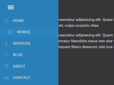
Yet another off-canvas menu system that helps you create a toggleable sidebar navigation that behaves like a native side navigation as you seen on Android apps.
How to use it:
1. Create an element to toggle the sidebar navigation.
<div id="mobile-nav"></div>
2. Create the sidebar navigation from a nav list.
<nav>
  <ul class="menu">
    <li><a href="#">Home</a></li>
    <li><a href="#">Works</a></li>
    <li><a href="#">Services</a></li>
    <li><a href="#">Blog</a></li>
    <li><a href="#">About</a></li>
    <li><a href="#">Contact</a></li>
  </ul>
</nav>
3. The basic CSS styles for the sidebar navigation.
.menu {
  list-style: none;
  line-height: 42px;
  margin: auto;
  padding-left: 0;
  width: 15em;
}

.menu a {
  background: url(icons.png) no-repeat left top;
  color: #ddd;
  text-decoration: none;
  text-transform: uppercase;
  display: block;
  padding-left: 3em;
  width: 100%;
}

.menu a:hover {
  margin-left: 1em;
  -webkit-transition: all .5s;
  -o-transition: all .5s;
  transition: all .5s;
}

.menu li {
  box-shadow: 3px 0 rgba(52,152,219,.2) inset;
  margin-bottom: 5px;
  padding-left: .5em;
  -webkit-transition: all .5s;
  -o-transition: all .5s;
  transition: all .5s;
}
4. Style the active / inactive state of the sidebar navigation.
nav {
  background: rgba(41,128,185,1);
  padding-right: .25em;
  position: absolute;
  left: -18em;
  top: 0;
  padding-top: 5em;
  box-sizing: border-box;
  z-index: 20;
  height: 100%;
  -webkit-transition: all .3s;
  -o-transition: all .3s;
  transition: all .3s;
}

nav.active { left: 0; }
5. The JavaScript to show / hide the sidebar navigation by toggling the 'active' class. Add the following JavaScript snippet after jQuery library and done.
$('#mobile-nav').click(function(event) {
  $('nav').toggleClass('active');
});
This awesome jQuery plugin is developed by opplyst. For more Advanced Usages, please check the demo page or visit the official website.


