Simple Mobile-Friendly Responsive Tabs Plugin For jQuery
| File Size: | 41.6 KB |
|---|---|
| Views Total: | 3681 |
| Last Update: | |
| Publish Date: | |
| Official Website: | Go to website |
| License: | MIT |
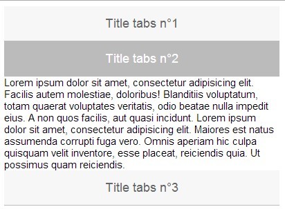
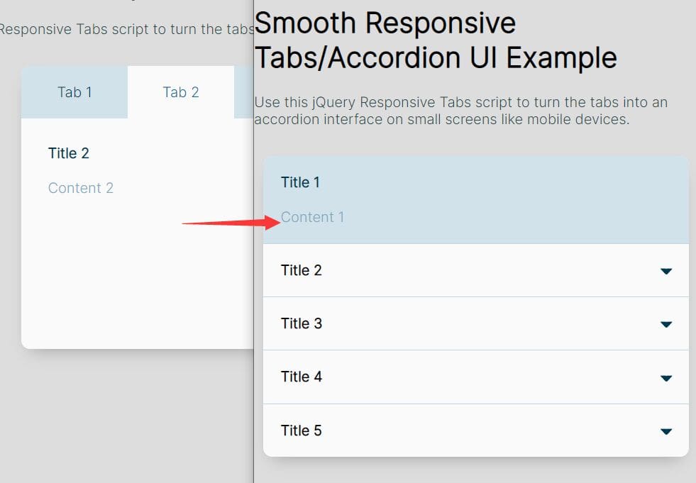
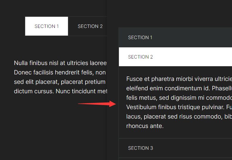
Yet another jQuery responsive tabs plugin which turns the tabbed content into accordion-like toggleable panels on mobile devices. For small devices, all tabs are closed by default. For large devices, the first tab is active.
Basic Usage:
1. Include the necessary stylesheet in the head section of your web page.
<link rel="stylesheet" href="css/jquery.responsiveTabs.css">
2. Create tab menus using Html unordered list.
<ul class="tab-menu clearfix">
  <li> <a href="#tab-one" class="tab-menu--trigger">Title tabs1</a> </li>
  <li> <a href="#tab-two" class="tab-menu--trigger">Title tabs 2</a> </li>
  <li> <a href="#tab-three" class="tab-menu--trigger">Title tabs 3</a> </li>
</ul>
3. Create tabbed content as follows.
<div id="jsAccordionToTabs" class="tab-container">
  <section id="tab-one" class="tab-container--section"> <a href="#tab-one" class="tab-menu-mobile" data-tab-label="Title tabs 1"></a>
    <div class="tab-container--inner"> Content 1 </div>
  </section>
  <section id="tab-two" class="tab-container--section"> <a href="#tab-two" class="tab-menu-mobile" data-tab-label="Title tabs 2"></a>
    <div class="tab-container--inner cf"> Content 2 </div>
  </section>
  <section id="tab-three" class="tab-container--section"> <a href="#tab-three" class="tab-menu-mobile" data-tab-label="Title tabs 3"></a>
    <div class="tab-container--inner"> Content 3 </div>
  </section>
</div>
4. Initialize the plugin and set the breakpoint for small screen devices.
var $tabs = $('.tab-container').accordionToTabs({
  breakpoint: '600px'
});
Change log:
2015-09-09
- Check if link is a anchor before process
This awesome jQuery plugin is developed by laurentperroteau. For more Advanced Usages, please check the demo page or visit the official website.