Versatile Content Toggle Plugin For jQuery - contentToggle
| File Size: | 37.1 KB |
|---|---|
| Views Total: | 4153 |
| Last Update: | |
| Publish Date: | |
| Official Website: | Go to website |
| License: | MIT |
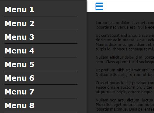
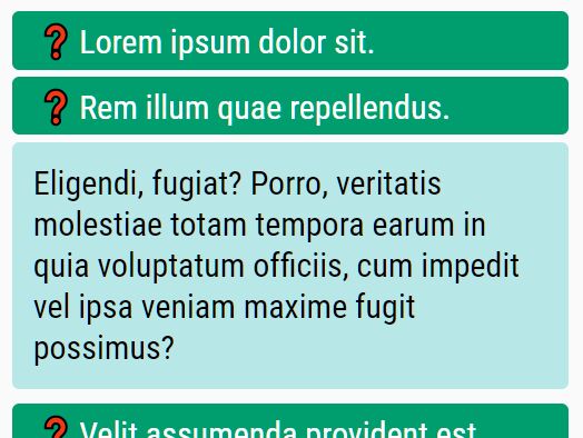
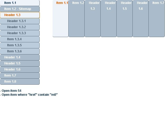
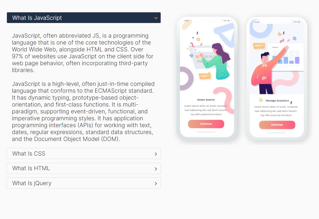
An accessible, cross-browser and multi-functional jQuery content toggle plugin which allows to show or hide or toggle some HTML content with custom trigger elements. A great solution for dropdown / off-canvas menus, tabs, and accordions, and spoilers.
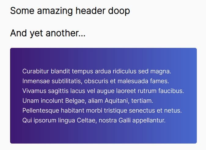
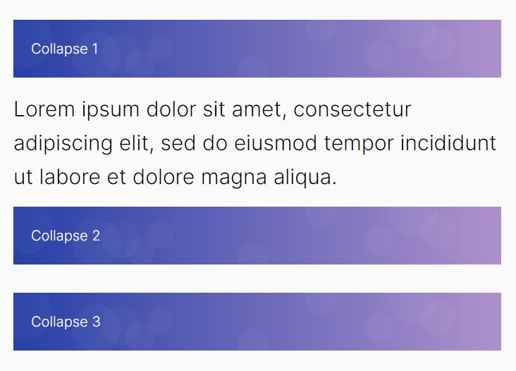
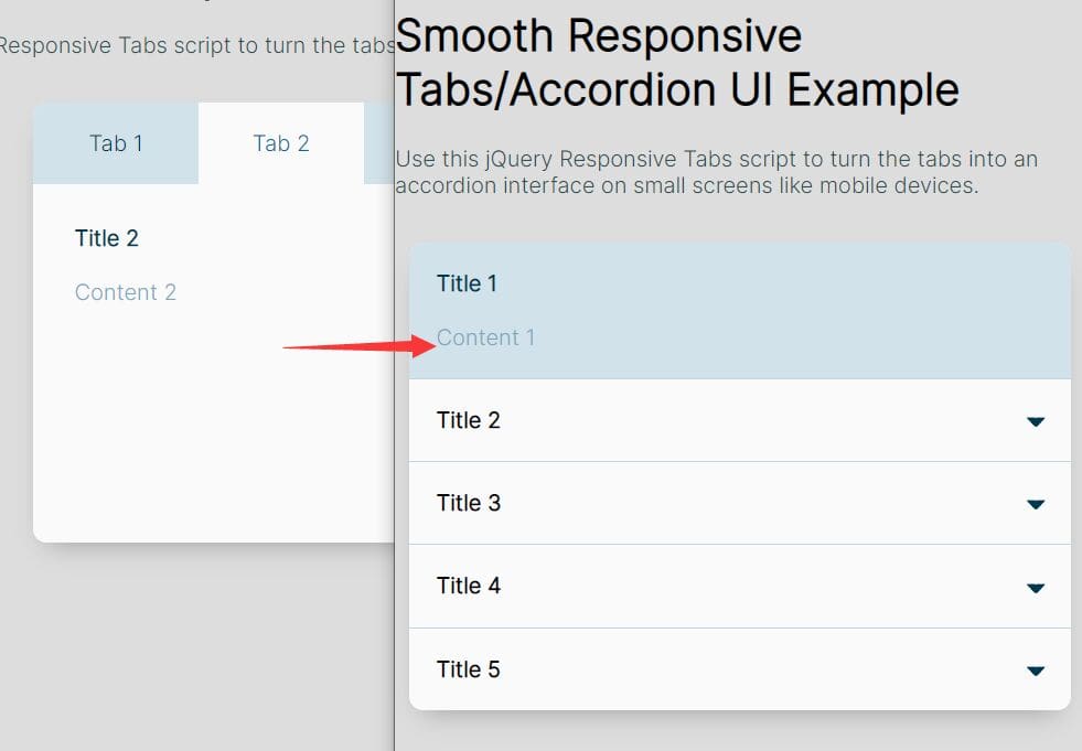
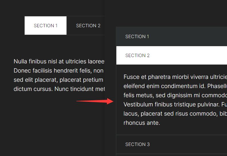
More Examples:
How to use it:
1. To get started, include the jQuery contentToggle plugin after you've added jQuery library in the document.
<script src="//code.jquery.com/jquery-1.11.3.min.js"></script>
<script src="jquery.contenttoggle.js"></script>
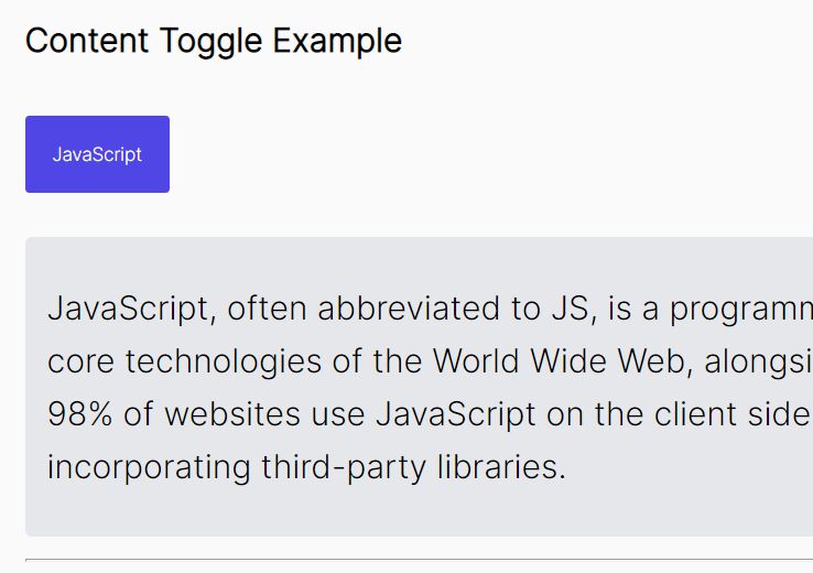
2. Add trigger elements and toggleable content to your webpage. In this case, we're going to create a basic vertical accordion UI using the jQuery contentToggle plugin.
<ul class="accordion">
  <li class="accordion__item js-contentToggle">
    <button class="accordion__trigger js-contentToggle__trigger" type="button">Item 1</button>
    <div class="accordion__content is-hidden js-contentToggle__content">
      <p>Content 1</p>
    </div>
  </li>
  <li class="accordion__item js-contentToggle">
    <button class="accordion__trigger js-contentToggle__trigger" type="button">Item 2</button>
    <div class="accordion__content is-hidden js-contentToggle__content">
      <p>Content 2</p>
    </div>
  </li>
  <li class="accordion__item js-contentToggle">
    <button class="accordion__trigger js-contentToggle__trigger" type="button">Item 3</button>
    <div class="accordion__content is-hidden js-contentToggle__content">
      <p>Content 3</p>
    </div>
  </li>
</ul>
3. Call the function and we're done.
$( ".js-contentToggle" ).contentToggle();
4. Config the plugin with the following default options.
$( ".js-contentToggle" ).contentToggle({

  // enforce the default state of an element
  // 'open' or 'close'
  defaultState: null,

  // When setting this option to true a click event listener will be added to the document with the associated action of closing all elements.
  globalClose: false,

  // If elements inside a group are independent, it breaks the rule of having only one visible content at the same time for a group.
  independent: false,

  // If true the element will not close if the close request comes from itself.
  noSelfClosing: false,

  // A function to be called before an action (toggle, open or close).
  beforeCallback: null,

  // It prevents the content to close itself when the user click inside.
  stopPropagation: true,

  // The selector of the triggers.
  triggerSelector: ".js-contentToggle__trigger",

  // If true the main element will be used as context for the query selector
  triggerSelectorContext: true,

  // The selector of the labels.
  labelSelector: null,

  // Same as triggerSelectorContext but for labels.
  labelSelectorContext: true,

  // The selector of the contents.
  contentSelector: ".js-contentToggle__content",

  // Same as triggerSelectorContext but for contents.
  contentSelectorContext: true,

  // A class that will be added to the main element when its state is open.
  elementClass: "is-open",

  // A class that will be added to the active trigger.
  triggerClass: "is-active",

  // If not null, the labels will be updated with that value when the state is opened (HTML allowed).
  openedLabel: null,

  // If not null, the labels will be updated with that value when the state is closed (HTML allowed).
  closedLabel: null,

  // An array of CSS properties to be toggled.
  // Available properties : height, width and opacity with the toggle value.
  toggleProperties: [ "height" ],

  // The options object to be used as second argument of the jQuery animate(properties, options) function.
  toggleOptions: {
    duration: 0
  }

});
5. You can also pass the options to the plugin using HTML5 data-* attributes like this:
<div class="js-contentToggle" data-default-state="open"></div>
Change log:
2016-10-13
- JS update
2016-07-07
- Correction for IE8.
- Add new stopPropagation option.
This awesome jQuery plugin is developed by tonai. For more Advanced Usages, please check the demo page or visit the official website.