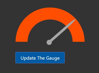
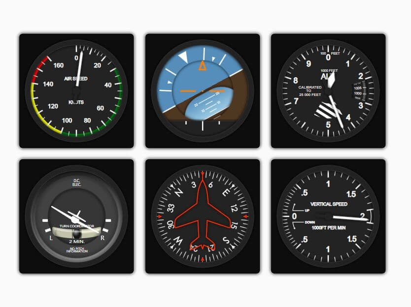
Customizable & Animated jQuery / HTML5 Gauge Meter Plugin
| File Size: | 27.7 KB |
|---|---|
| Views Total: | 72850 |
| Last Update: | |
| Publish Date: | |
| Official Website: | Go to website |
| License: | MIT |
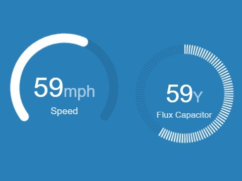
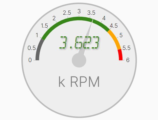
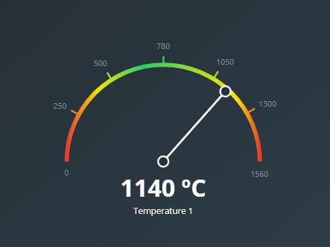
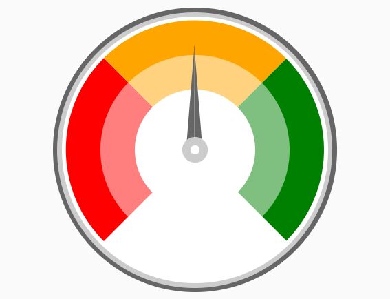
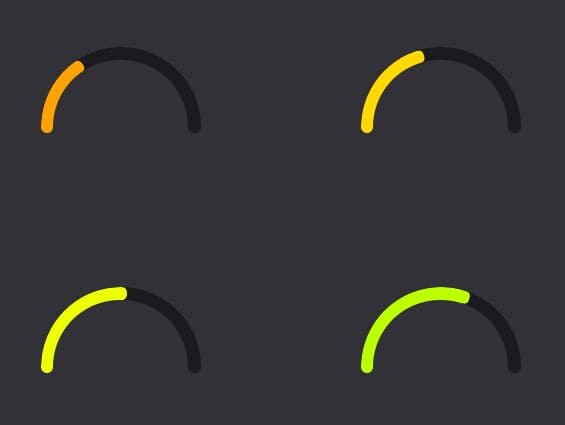
GaugeMeter.js is a versatile jQuery gauge plugin which takes advantage of HTML5 canvas to render animated gauge meters and dials with plenty of customization options.
Main features:
- Canvas based. No png or jpg required.
- Simple and lightweight (~6kb).
- Highly customizable and styleable.
- 16 built-in themes.
- Custom legends & labels.
- Displays either a full circle, semi-circle or an arched-circle.
Basic usage:
1. Place the jQuery GaugeMeter.js plugin after the latest version of jQuery JavaScript library.
<script src="//code.jquery.com/jquery-2.1.4.min.js"></script>
<script src="jquery.AshAlom.gaugeMeter-2.0.0.min.js"></script>
2. Create a basic gauge meter with plain html and html5 data attributes.
<div class="GaugeMeter"
     data-percent="60"
     data-label="Percent"
     >
</div>
3. Apply custom CSS styles to the gauge meter.
.GaugeMeter {
  position: Relative;
  text-align: Center;
  overflow: Hidden;
  cursor: Default;
  display: inline-block;
}

.GaugeMeter SPAN, .GaugeMeter B {
  width: 54%;
  position: Absolute;
  text-align: Center;
  display: Inline-Block;
  color: RGBa(0,0,0,.8);
  font-weight: 100;
  font-family: "Open Sans", Arial;
  overflow: Hidden;
  white-space: NoWrap;
  text-overflow: Ellipsis;
  margin: 0 23%;
}

.GaugeMeter[data-style="Semi"] B {
  width: 80%;
  margin: 0 10%;
}

.GaugeMeter S, .GaugeMeter U {
  text-decoration: None;
  font-size: .60em;
  font-weight: 200;
  opacity: .6;
}

.GaugeMeter B {
  color: #000;
  font-weight: 200;
  opacity: .8;
}
4. Initialize the plugin and done.
$(".GaugeMeter").gaugeMeter();
5. All html5 data attributes.
data-percent: Any positive integer, between 0 to 100. The value to set the gauge meter to.data-used: Any positive integer. Display a percentage of a value that overrides any data-percent defined count.data-total: Any positive integer. Display a percentage of a value that overrides any data-percent defined count.data-text: Any short string. Replaces the data-percent count in the center of the gauge.data-prepend: Any string (2 bytes max). Adds this text before the percent count in the center of the gauge.data-append: Any string (2 bytes max). Adds this text after the percent count in the center of the gauge. Typical use would be a "%" symbol.data-size: Any positive integer. Width & height of the gauge meter in pixels.data-width: Any positive integer. Thickness of the gauge meter progress bar in pixels.data-style: Full, Semi or Arch Displays either a full circle, semi-circle or an arched-circle.data-color: Hex values (#FFFFFF), Red-Green-Blue-Alpha color space (RGBa(255,255,255,1.0)) or HTML color-name (Red) The foreground-color of the gauge meter's progress bar.data-back: Hex values (#FFFFFF), Red-Green-Blue-Alpha color space (RGBa(255,255,255,1.0)) or HTML color-name (Green) The background-color of the gauge meter's progress bar.data-theme: Red-Gold-Green, Red-Gold-Green, Green-Gold-Red, Green-Red, Red-Green, DarkBlue-LightBlue, LightBlue-DarkBlue, DarkRed-LightRed, LightRed-DarkRed, DarkGreen-LightGreen, LightGreen-DarkGreen, DarkGold-LightGold, LightGold-DarkGold, White, Blackdata-animationstep: Step width used for animation when gauge bargraph is drawn. Higher number results in higher animation speed. 0 stops animation.data-animate_gauge_colors: 0 or 1. When enabled, the foreground-color of the gauge meter's progress bar will cycle according to the color value, as directed by the data-theme.If enabled, this overrides any values specified by the data-color.data-animate_text_colors: 0 or 1. When enabled, the percentage text color of the gauge meter will cycle according to the color value, as directed by the data-theme. If enabled, this overrides any values specified by the data-label_color.data-label: Any short string. Supplemental text label that can appear below the central percentage or text of the gauge meter.data-label_color: Hex values (#FFFFFF), Red-Green-Blue-Alpha color space (RGBa(255,255,255,1.0)) or HTML color-name (Blue) The foreground text color of the supplemental text label.data-stripe: Any positive integers. Show the gauge meter's progress bar in solid form or stripe form. If the value is greater than 0, the gauge meter's progress bar changes from a solid to a stripe, where the value is the thickness of the stripes.data-showvalue: Whether to show value instead of percent.data-text_size: Text size. Default: 0.22
Changelog:
2023-11-28
- Minor code fixes.
2023-09-10
- Added back up counting of value label depending on given options.
2019-03-23
- Supports negative values.
2018-07-18
- Additional option text_size to scale indicated value or text in gauge center.
2018-07-18
- Fixed: parseInt for options where integer is expected but string is given.
2018-06-10
- New option "showvalue". Label will show value instead of percent.
2018-06-07
- Bug fix not showing value text when setting data "used" and "total".
2018-02-11
- Bugfix
This awesome jQuery plugin is developed by Mictronics. For more Advanced Usages, please check the demo page or visit the official website.