Flexbox Based Responsive Justified Layout With jQuery - Flex Gallery
| File Size: | 17.2 MB |
|---|---|
| Views Total: | 12279 |
| Last Update: | |
| Publish Date: | |
| Official Website: | Go to website |
| License: | MIT |

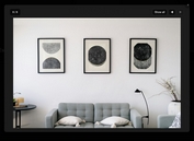
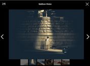
Flex Gallery is a jQuery plugin which makes use of CSS3 Flexible Box to create a responsive, justified grid layout and gallery for showcasing your images in a Google Photos-like fashion.
How to use it:
1. Import the jQuery Flex Gallery plugin and other required resources into your html document.
<script src="//code.jquery.com/jquery.min.js"></script>
<script src="flex-gallery.js"></script>
<link rel="stylesheet" href="flex-gallery.css">
2. Define an object containing images and links to be presented in the responsive and justified gallery.
media = {
  images: ['1.jpg', '2.jpg', '3.jpg'],
  links: ['1-original.jpg', '2-original.jpg', '3-original.jpg']
}
3. Create a container in which you want to display the image gallery.
<div id="container"></div>
4. Import the images into the gallery.
// * @param {Array} imgs - the image list to be displayed
// * @param {Boolean} shuffling - whether to shuffle the image list or not
$('#container').addFlexImages(media, true)
5. Activate the plugin and done.
$('#container').addFlexImages(media_list, true).flexGallery({
  // options here
});
6. You can also insert the images to the gallery in the HTML:
<div id="container">
  <a href="1.jpg">
    <img src="1-original.jpg">
  </a>
  <a href="2.jpg">
    <img src="2-original.jpg">
  </a>
  <a href="3.jpg">
    <img src="3-original.jpg">
  </a>
</div>
7. All possible plugin options with default values.
$('#container').addFlexImages(media_list, true).flexGallery({
  margin: '0.5vmin',
  minHeightRatioWindow: null,
  minHeightRatioScreen: null
  fadeInDuration: 1000,
  checkPeriod: 100,
  autoAdjust: true
});
Changelog:
2019-04-30
- Fix ordered indices
2019-03-11
- JS & CSS update
2019-03-09
- Supports image descriptions
2019-03-05
- Make it accept images and links
2019-03-04
- Auto adjusts min height for responsive design.
This awesome jQuery plugin is developed by elvisyjlin. For more Advanced Usages, please check the demo page or visit the official website.


