Responsive Justified Image Gallery with jQuery and CSS3 Flex
| File Size: | 564 KB |
|---|---|
| Views Total: | 5849 |
| Last Update: | |
| Publish Date: | |
| Official Website: | Go to website |
| License: | MIT |
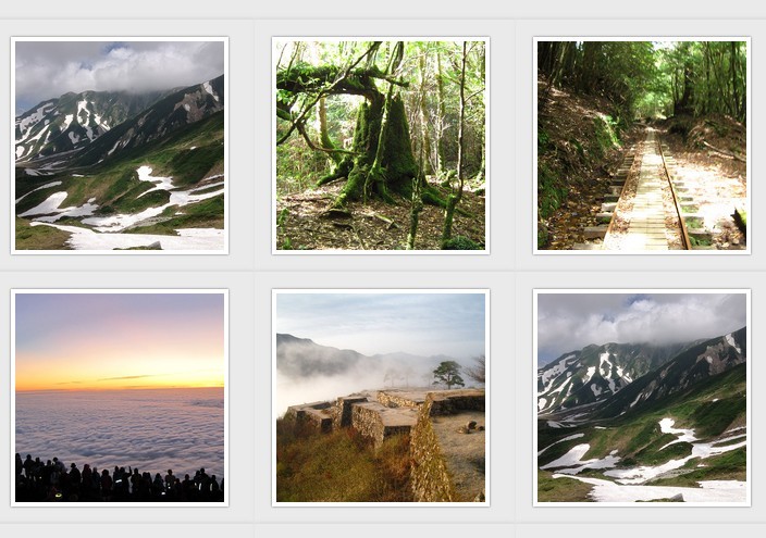
A lightweight jQuery plugin used to resize & arrange your images in a responsive justified gallery by using CSS3 flex properties.
How to use it:
1. Include jQuery library and the jquery.gallery.js script at the bottom of the web page.
<script src="//ajax.googleapis.com/ajax/libs/jquery/2.1.3/jquery.min.js"></script>
<script src="jquery.gallery.js"></script>
2. Wrap your images into DIV elements like this:
<div class="gallery">
  <div><img src="1.jpg" alt=""></div>
  <div><img src="2.jpg" alt=""></div>
  <div><img src="3.jpg" alt=""></div>
  <div><img src="4.jpg" alt=""></div>
  <div><img src="5.jpg" alt=""></div>
  ...
</div>
3. Call the plugin on the parent element.
//$fn.gallery(ToBoxWidth);
$('.gallery').gallery(240);
4. Required CSS styles for the image gallery.
.gallery {
  padding: 0;
  display: flex;
  flex-wrap: wrap;
  justify-content: center;
  background-color: #d4d4d4;
}

.gallery > div {
  background-color: #eaeaea;
  padding: 16px;
  flex: 1 1 240px;
  width: 240px;
  max-width: 240px;
  box-shadow: 0 -2px 2px #ddd;
}

.gallery img {
  max-width: 200px;
  width: 200px;
  transition: all 1s;
  border: 4px solid #fff;
  box-shadow: 0 0 2px #666;
}
This awesome jQuery plugin is developed by akifo. For more Advanced Usages, please check the demo page or visit the official website.