Morphing Material Design Modal with jQuery and CSS3
| File Size: | 2.82 KB |
|---|---|
| Views Total: | 5949 |
| Last Update: | |
| Publish Date: | |
| Official Website: | Go to website |
| License: | MIT |
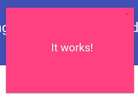
A Google Material Design inspired floating action button that uses jQuery and CSS3 to morphs into a responsive, centered modal popup on clicked.
How to use it:
1. Create a floating action button on your webpage.
<a href="#" class="btn btn-float">
  <i class="mdi-content-add"></i>
</a>
2. Style the floating button.
.btn {
  transition: all 0.5s;
  max-width: 1000px;
  max-height: 1000px;
  position: absolute;
  right: 10px;
  bottom: 100px;
}

.btn-float {
  width: 55.5px;
  height: 55.5px;
  background: #FF4081;
  border: none;
  outline: 0;
  border-radius: 50%;
  color: #eee;
  text-align: center;
  letter-spacing: 0.5px;
  padding: 0;
  line-height: 56px;
  box-shadow: 0 2px 5px 0 rgba(0, 0, 0, 0.16), 0 2px 10px 0 rgba(0, 0, 0, 0.12);
}
3. Create the modal popup.
<div class="modal">
  <a href="#" class="close">
    <i class="mdi-navigation-close"></i>
  </a>
  <div class="modal-content">
    <h3>Modal content here</h3>
  </div>
</div>
4. Style the modal popup.
.modal {
  z-index: 20;
  display: none;
  position: relative;
  top: -100%;
  width: 100%;
  height: 100%;
  color: #eee;
  background-color: #FF4081;
  box-shadow: 0px 2px 5px rgba(0,0,0,0.4);
}

.modal>.close {
  display: inline-block;
  position: relative;
  margin: 10px;
  right: 10px;
  width: 100%;
  text-align: right;
  float: right;
  font-size: 1.6rem;
  line-height: 37px;
  color: rgba(0,0,0,0.37);
}

.modal>.close:hover { cursor: pointer; }

.modal>.modal-content {
  width: 100%;
  height: 100%;
  padding: 10px;
}

.modal>.modal-content>h3 {
  font-size: 52px;
  text-align: center;
  padding-top: 150px;
}
5. Create the morphing animations.
@-webkit-keyframes
slide {  0% {
width:70px;
height: 56px;
}
 5% {
width:100px;
height: 56px;
margin-right:20%;
}
 10% {
width:130px;
height: 56px;
margin-right:30%;
}
 20% {
width:70px;
height: 56px;
margin-right:40%;
}
 25% {
width:56px;
height: 56px;
margin-bottom:0px;
margin-right:40%;
}
 100% {
width:200%;
height:200%;
margin-bottom:-50%;
margin-right:-40%;
}
}

.slide {
  position: relative;
  -webkit-animation-name: slide;
  -webkit-animation-duration: 1s;
  -webkit-animation-fill-mode: forwards;
}
6. Load the latest version of jQuery library in the document.
<script src="//code.jquery.com/jquery-2.1.3.min.js"></script>
7. The Javascript.
$(function() {
  $('body').on('click', '.btn-float', function(event) {
    event.preventDefault();
    var ele = $(this);
    $(this).parent().addClass('open');
    $(this).addClass('slide');
    setTimeout(function() {
      ele.parent().siblings().fadeIn();
      setTimeout(function() {
        ele.parent().removeClass('open');
        ele.removeClass('slide');
      }, 500)
    }, 600);
  });

  $('body').on('click', '.close', function(event) {
    event.preventDefault();
    $(this).parent().fadeOut();
  });
});
This awesome jQuery plugin is developed by moso. For more Advanced Usages, please check the demo page or visit the official website.