Elegant Multifunctional Popup Plugin For jQuery - Focus.js
| File Size: | 130 KB |
|---|---|
| Views Total: | 2221 |
| Last Update: | |
| Publish Date: | |
| Official Website: | Go to website |
| License: | MIT |
Focus.js is a lightweight, flexible, elegant jQuery popup plugin which helps you create modals, dialog boxes, alert notifications, and other popup-style windows on the web app.
More features:
- CSS3 based smooth animations.
- Easy to style using your own CSS.
- Allows to implement in pure JavaScript.
- Supports jQuery events.
How to use it:
1. Include the main popup style sheet popup.css in the head of the html document.
<link href="css/popup.css" rel="stylesheet">
2. Include jQuery JavaScript library and the jQuery Focus.js script at the end of the html document.
<script src="//code.jquery.com/jquery-3.2.1.min.js"></script>
<script src="focus.js"></script>
3. Create the html for the popup window.
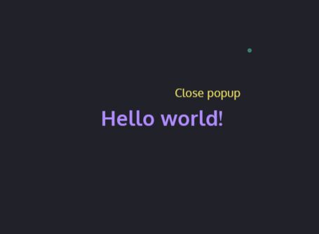
<div class="popup overlay" id="examplePopup">
  <div class="popup-inner">
    <div class="popup-content left">
      <h2>Hello world!</h2>
      <a class="popup-close" data-close aria-label="common.close">Close popup</a>
    </div>
  </div>
</div>
4. Toggle the popup window with a trigger button using data attributes:
<button data-trigger="popup"
        data-target="#examplePopup">
        Launch
</button>
5. Toggle the popup window using JavaScript:
var myPopup = new Focus('#examplePopup');
myPopup.show();
6. Default customization options for the popup window.
- visibleClass: The class that will be applied to the target element.
- bodyClass: The class that will be applied to the body.
- triggerClass: The class that will be applied to the trigger that is clicked on.
- detach: if the body should be appended to the body.
- innerSelector: The outer area of the element, acts like a close button when clicked.
- autoFocusSelector: An input field that you would like to be focused with the element opens.
- slide: Whether the opening should be animated with javascript, useful for accordions.
- slideDuration: Speed of the animation, can be defined in ms.
- visible: Whether the element was loaded visible or not.
- success: Callback for when an element is success fully made visible.
- error: Callback fro when an element could not be made visible.
var myPopup = new Focus('#examplePopup',{

    visibleClass: 'visible',
    bodyClass: 'active-popup',
    triggerClass: null,
    detach: null,
    innerSelector: '.popup-inner',
    autoFocusSelector: '[data-auto-focus]',
    slide: null,
    slideDuration: 'fast',
    visible: false,
    showCallback: null,
    hideCallback: null,
    error: null

});
7. jQuery events supported.
- focus:open: Fires when a popup is opened.
- focus:close: Fires when a popup is closed.
- focus:error error (String): Fires when an event can't open or close.
8. Override the default CSS rules to create your own styles.
.popup {
  /*
    ...
  */
}

.overlay {
  /*
    ...
  */
}

.full-screen {
  /*
    ...
  */
}
Changelog:
2018-09-04
- v2.3.2
2018-08-01
- v2.2.0
2018-07-23
- Update focus.js
2018-06-20
- v1.0.14
2018-06-18
- Flex positioning (no more subpixels!)
2018-02-21
- Targeted close events
2018-02-21
- binding and unbinding event lsitens instead of using 'one()' which wil unbind the event once for the type rather than the selector.
2018-01-15
- Adding additonal config and documentation, creating minified script.
This awesome jQuery plugin is developed by Elkfox. For more Advanced Usages, please check the demo page or visit the official website.