Enhanced Modal Dialog Plugin For Bootstrap 4
| File Size: | 18.3 KB |
|---|---|
| Views Total: | 1131 |
| Last Update: | |
| Publish Date: | |
| Official Website: | Go to website |
| License: | MIT |
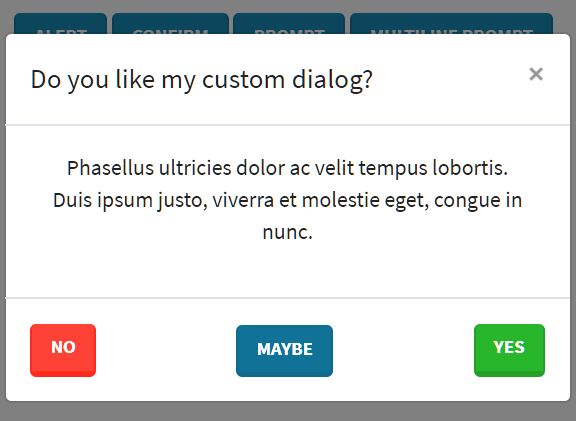
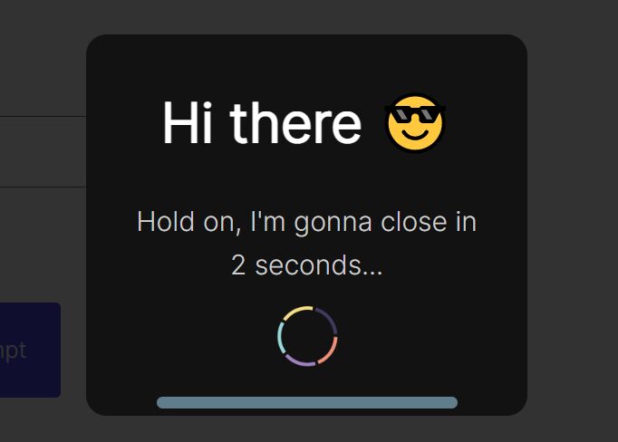
Yet another jQuery/Bootstrap plugin to create flexible, enhanced, customizable alert, confirmation, prompt, and generic dialog popups based on Bootstrap 4 modal component.
How to use it:
1. To use this plugin, make sure the latest jQuery library and Bootstrap 4 framework are properly loaded in the document.
<link rel="stylesheet" href="https://stackpath.bootstrapcdn.com/bootstrap/4.3.1/css/bootstrap.min.css" integrity="sha384-ggOyR0iXCbMQv3Xipma34MD+dH/1fQ784/j6cY/iJTQUOhcWr7x9JvoRxT2MZw1T" crossorigin="anonymous">
<script src="https://code.jquery.com/jquery-3.3.1.slim.min.js" integrity="sha384-q8i/X+965DzO0rT7abK41JStQIAqVgRVzpbzo5smXKp4YfRvH+8abtTE1Pi6jizo" crossorigin="anonymous"></script>
<script src="https://cdnjs.cloudflare.com/ajax/libs/popper.js/1.14.7/umd/popper.min.js" integrity="sha384-UO2eT0CpHqdSJQ6hJty5KVphtPhzWj9WO1clHTMGa3JDZwrnQq4sF86dIHNDz0W1" crossorigin="anonymous"></script>
<script src="https://stackpath.bootstrapcdn.com/bootstrap/4.3.1/js/bootstrap.min.js" integrity="sha384-JjSmVgyd0p3pXB1rRibZUAYoIIy6OrQ6VrjIEaFf/nJGzIxFDsf4x0xIM+B07jRM" crossorigin="anonymous"></script>
2. Create a basic alert popup box with default settings using the bsd.alert method.
bsd.alert('Alert Message Here',{

  // Callback : [null] | function
  callback: null,

  // The template used to generate dialog.
  template: "<div class=\"modal fade\" tabindex=\"-1\" role=\"dialog\" aria-hidden=\"true\"><div class=\"modal-dialog\" role=\"document\"><div class=\"modal-content\"><div class=\"modal-body\"><p class=\"lead bsd-message\"></p><div class=\"d-flex justify-content-center mt-3\"><button type=\"button\" class=\"btn bsd-close\" data-dismiss=\"modal\"></button></div></div></div></div></div>",

  // The close button text.
  closeText: "Validate",

  // A class to append to close button.
  closeClass: "btn-primary"

});
3. Create a basic confirmation popup box with default settings using the bsd.confirm method.
bsd.confirm('Are you sure?', {

  // Callback : function
  callback: function(confirmed, event) {
    return true;
  },

  // The template used to generate dialog.
  template: "<div class=\"modal fade\" tabindex=\"-1\" role=\"dialog\" aria-hidden=\"true\"><div class=\"modal-dialog\" role=\"document\"><div class=\"modal-content\"><div class=\"modal-body\"><p class=\"lead bsd-message\"></p><div class=\"d-flex justify-content-between mt-3\"><button class=\"btn bsd-cancel\" data-dismiss=\"modal\"></button><button class=\"btn bsd-confirm\"></button></div></div></div></div></div>",

  // The cancel button text.
  cancelText: "Cancel",

  // A class to append to cancel button.
  cancelClass: "btn-light",

  // The confirm button text.
  confirmText: "Validate",

  // A class to append to confirm button.
  confirmClass: "btn-primary"

});
4. Create a basic prompt popup box with default settings using the bsd.alert method.
bsd.prompt('Prompt Popup',{

  // Generate the prompt field : string | jQuery object | function (must return a jQuery object).
  // The prompt field MUST have the class "bsd-field".
  // If a function is provided, its return value MUST be compatible with jQuery "appendTo" function.
  field: function(multiline) {
    if (multiline) {
      return '<textarea class="form-control bsd-field"></textarea>';
    }
    return '<input type="text" class="form-control bsd-field"/>';
  },

  // Callback : function
  callback: function(value, event) {
    return true;
  },

  // The template used to generate dialog.
  template: "<div class=\"modal fade\" tabindex=\"-1\" role=\"dialog\" aria-hidden=\"true\"><div class=\"modal-dialog\" role=\"document\"><div class=\"modal-content\"><div class=\"modal-body\"><p class=\"lead bsd-message\"></p><div class=\"bsd-field-wrapper\"></div><div class=\"d-flex justify-content-between mt-3\"><button class=\"btn bsd-cancel\" data-dismiss=\"modal\"></button><button class=\"btn bsd-confirm\"></button></div></div></div></div></div>",

  // Is the prompt input multiline:  true | [false]
  multiline: false,

  // The cancel button text.
  cancelText: "Cancel",

  // A class to append to cancel button.
  cancelClass: "btn-light",

  // The confirm button text.
  confirmText: "Validate",

  // A class to append to confirm button.
  confirmClass: "btn-primary"

});
5. The global settings.
bsd.defaults.dialog = {

  // Callback : [null] | function
  callback: null,

  // An value to use as id attribute for the modal: [null] | string
  id: null,

  // Show the modal element when created : [true] | false | function
  // If a function is provided, the modal will be shown and the function will be used on show.bs.modal event.
  show: true,

  // Delete the modal element on hidden : [true] |false
  destroy: true,

  // Dialog size : [null] | 'modal-sm' | 'modal-lg' | 'modal-xl'
  size: null,

  // Include a backdrop element: [true] | false | 'static'
  // With static option, backdrop doesn't close the modal on click.
  backdrop: true,

  // Closes the dialog when escape key is pressed: [true] |false
  keyboard: true,

  // Center vertically the dialog in the window: true | [false]
  vcenter: false,

  // Center horizontally the dialog text: true | [false]
  hcenter: false,

  // Manage controls alignment: ['between'] | 'center' | 'start' | 'end' | 'around'
  controlsAlignment: 'between'

};
Changelog:
v2.0.0 (2020-05-02)
- Implemented webpack for library compilation
- Simplified package scaffolding
- Improved dialogs events management and callback invokation
- Added controls alignment management
2020-04-30
- Fix prompt value not passed to callback function
This awesome jQuery plugin is developed by bgaze. For more Advanced Usages, please check the demo page or visit the official website.