Gallery Lightbox for Images, Videos, PDF & More - jQuery ComponentViewer
| File Size: | 188 KB |
|---|---|
| Views Total: | 319 |
| Last Update: | |
| Publish Date: | |
| Official Website: | Go to website |
| License: | MIT |
ComponentViewer is a jQuery gallery lightbox plugin that displays images, video, audio, PDF files, inline source code, Markdown documents, and HTML content in a modal popup.
Features:
- Image zoom with slider control, mouse wheel zoom, and pinch-to-zoom on touch devices, with drag-to-pan at any zoom level.
- Adjacent image preloading for instant navigation between gallery items.
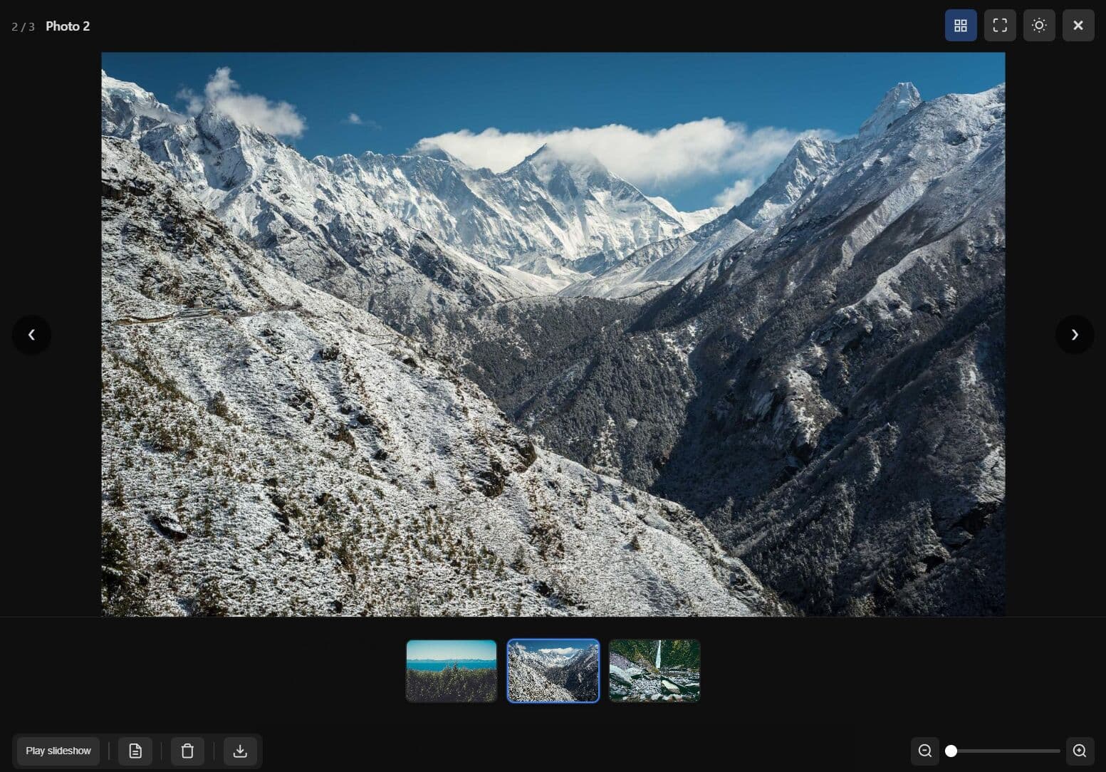
- Thumbnail carousel strip with prev/next controls on the strip when item count exceeds a configurable threshold.
- Slideshow mode with a configurable interval, optional auto-start, and media-end advance for video and audio.
- Dark and light theme toggle with a live callback on every change.
- Keyboard navigation with a built-in shortcuts popup listing only the active shortcuts for the current view and item type.
- PDF viewer with page navigation, thumbnails, zoom, rotation, and print through PDF.js, falling back to an iframe embed if PDF.js is absent.
- Syntax highlighting for inline source code via Highlight.js.
- Native browser fullscreen toggle via the Fullscreen API.
- WCAG accessibility mode with focus trapping, focus save and restore on open and close, and ARIA dialog attributes.
- Radio or checkbox poll selectors on individual items for in-context voting within a post or feed.
- Per-item comment thread overlay with prev/next navigation for multiple comments.
- Custom toolbar buttons with per-item visibility rules and optional single-key keyboard shortcuts.
- Lifecycle callbacks at the loading, open, complete, cleanup, and close stages of each item.
Use Cases:
- Create a product gallery where customers view images, videos, and spec sheets in one interface.
- Build a document review system that displays PDF files alongside image attachments.
- Generate a media portfolio with mixed content types and consistent navigation controls.
- Implement a support ticket system showing screenshots, video tutorials, and text notes together.
How to use it:
1. Install & download.
# NPM
$ npm install @sankaran-8600/component-viewer
2. Load the stylesheet before jQuery, then load the plugin after jQuery:
<!-- Plugin stylesheet -->
<link rel="stylesheet" href="component-viewer.css" />

<!-- jQuery is required -->
<script src="jquery.min.js"></script>

<!-- Optional: jPlayer for video and audio playback -->
<script src="jplayer.min.js"></script>

<!-- Optional: PDF.js for full PDF rendering -->
<script src="pdf.min.js"></script>
<script>pdfjsLib.GlobalWorkerOptions.workerSrc = 'pdf.worker.min.js';</script>

<!-- Optional: marked for full CommonMark Markdown support -->
<script src="marked.min.js"></script>

<!-- The plugin -->
<script src="component-viewer.js"></script>
3. Create a gallery container and add the media items. Use data-* attributes to specify the media type, source URL, and title. You can mix types freely in one container:
<div id="project-gallery">

  <!-- Image: src is read from the href attribute -->
  <a class="cv-item" data-type="image" data-title="Dashboard Overview" href="img/dashboard-full.jpg">
    <img src="img/dashboard-thumb.jpg" alt="Dashboard preview" />
  </a>

  <!-- PDF: src declared via data-src; data-ext sets the file type label -->
  <div class="cv-item" data-type="pdf" data-title="Technical Spec v3.pdf"
       data-src="docs/tech-spec-v3.pdf" data-ext="PDF">
    Technical Spec
  </div>

  <!-- Video: rendered by jPlayer when loaded, or native <video> as fallback -->
  <div class="cv-item" data-type="video" data-title="Onboarding Walkthrough"
       data-src="media/onboarding.mp4">
    Demo Video
  </div>

  <!-- Inline source code with syntax highlighting -->
  <div class="cv-item" data-type="inline" data-title="webpack.config.js"
       data-src="src/webpack.config.js" data-ext="js">
    webpack config
  </div>

  <!-- Markdown file: the .md extension auto-selects the markdown renderer -->
  <div class="cv-item" data-title="Release Notes" data-src="docs/release-notes.md">
    Release Notes
  </div>

</div>
4. Call .componentViewer() on the container element and pass any options you need
$('#project-gallery').componentViewer({
  toolbar: {
    download: true,
    zoom: true
  },
  pdf: {
    workerSrc: 'pdf.worker.min.js'
  },
  // more options here
});
5. The viewer intercepts clicks on all .cv-item elements inside #project-gallery and opens them in the shared overlay. You can store the jQuery object and call methods on it programmatically:
// Store the initialized gallery reference
var $gallery = $('#project-gallery').componentViewer();

// Open the third item (0-based index) without a user click
$gallery.componentViewer('open', 2);
6. All configuration options:
General options:
selector(string): CSS selector for items inside the container. Default:'.cv-item'.loop(boolean): Whentrue, prev from the first item goes to the last and next from the last goes to the first. Whenfalse, prev/next buttons hide at the boundaries. Default:true.overlayClose(boolean): Closes the overlay when the user clicks the backdrop. Default:true.keyboardNav(boolean): Activates keyboard navigation. Escape closes the overlay; Left and Right arrows move between items. Default:true.shortcutsPopup(boolean): Whentrue, pressing?opens a popup that lists all active shortcuts for the current item type. Default:true.showCounter(boolean): Shows a "1 / 6" counter in the overlay header. Default:true.preloadAdjacentImages(boolean): Preloads the next and previous items when they are images, so navigating to them is instant. Default:true.carousel(object): Carousel strip options. Setcarousel.enabled: trueto show a header button that toggles a thumbnail strip below the stage. Thecarousel.navThresholdproperty (default4) sets the item count above which prev/next buttons appear on the strip. Default:{ enabled: false, navThreshold: 4 }.slideshow(object | null): When set to an object withenabled: true, the viewer auto-advances to the next item on a timer. Sub-options:interval(seconds, default4),autoStart(defaulttrue),advanceMedia('interval'or'onEnd'). A Play/Pause slideshow button appears in the toolbar. Default:null.theme(string): Initial theme. Accepts'dark'or'light'. Default:'dark'.themeToggle(boolean): Shows the dark/light toggle button in the header. Default:true.fullscreen(boolean): Shows a header button to enter and exit native browser fullscreen. Default:true.onThemeChange(function):function(theme, viewer). Called whenever the theme changes.
PDF options:
pdf.workerSrc(string): Path to the PDF.js worker file. Required for PDF.js rendering. Default:null.pdf.cMapUrl(string): Optional CMap URL for extended font support. Default:null.pdf.cMapPacked(boolean): Uses packed CMaps. Default:true.pdf.annotations(boolean): Renders PDF annotations. Default:true.pdf.autoFit(boolean): Scales the page to fit the stage within the min/max scale bounds. Default:true.pdf.autoFitMinScale(number): Minimum scale whenautoFitis active. Default:0.75.pdf.autoFitMaxScale(number): Maximum scale whenautoFitis active. Default:2.5.pdf.twoPageView(boolean): Whentrue, adds a toolbar button for toggling single/two-page (spread) view. Default:false.
Media options (jPlayer):
supportedVideoFormats(string): Comma-separated jPlayer format strings for video (e.g.'m4v, webmv'). Default:null.supportedAudioFormats(string): Comma-separated jPlayer format strings for audio (e.g.'mp3, oga'). Default:null.
Inline and code options:
inline.syntaxHighlight(boolean): Whentrue, passes code throughwindow.hljsfor syntax highlighting. Highlight.js must be loaded on the page separately. Default:false.inline.getLanguage(function):function(item)returning a language string (e.g.'javascript'). Whennull, the plugin infers language from the file extension or item title. Default:null.onInlineHtml(function):function(content, item, viewer)returning custom HTML for the inline body. Overrides the built-in renderer when set. Default:null.
Toolbar options:
toolbar.download(boolean): Shows the built-in Download button where applicable. Default:true.toolbar.zoom(boolean): Shows the zoom widget for image items. Default:true.toolbarItems(array): Custom toolbar items. Each entry can be a button object{ id, icon, label, onClick, ... }, the string'separator', or a DOM node. Default:[].zoom.min(number): Minimum zoom level for image items. Default:1.zoom.max(number): Maximum zoom level for image items. Default:5.zoom.step(number): Slider step increment. Default:0.01.zoom.wheelStep(number): Zoom change per mouse wheel tick. Default:0.15.zoom.showPercentage(boolean): Shows the current zoom percentage (e.g. "150%") inside the zoom widget. Default:false.zoom.onZoom(function):function(zoomLevel, item, viewer). Called whenever the zoom level changes.
Accessibility options:
wcag(boolean): Whentrue, activates focus trapping, focus save and restore, initial focus on the close button, and ARIA dialog attributes on the overlay. Default:false.
Poll options:
pollOption(object | null): When set withenabled: true, items that carry a poll label show a radio or checkbox row above the toolbar. Default:null.pollOption.enabled(boolean): Must betrueto display the poll UI.pollOption.mode(string):'radio'for single selection or'checkbox'for multiple selection. Default:'radio'.pollOption.onSelect(function):function(item, selected, viewer). Called when the user toggles a poll option.selectedreflects the new checked state.showAttachmentComment(boolean): Whentrue, items that carry comment data show a compact overlay panel and a header button to toggle it. Comments must be an array of{ title?, author?, text }objects. Multiple comments display with in-panel prev/next navigation. Default:false.
Data and callback options:
itemData(function):function($el, defaultItem). Returns the item object for each element. Add properties todefaultItemand return it, or return a fully custom object from your data model. Whennull, the plugin builds the item from data attributes.onDownload(function):function(item, viewer). Called when the Download button is clicked. Overrides the default link download.onRender(function):function(item, $stage, viewer). Called before built-in rendering. Appending to$stageskips the built-in renderer. May return{ toolbar, destroy }.onToolbar(function):function(item, defaultToolbar, viewer). Called before the toolbar renders. Modify or replace the toolbar array.onLoading(function):function(item, viewer). Called before an item loads.onOpen(function):function(item, $stage, viewer). Called after the item is shown and the toolbar is built.onComplete(function):function(item, viewer). Called right after content displays, after any transition.onCleanup(function):function(item, viewer). Called at the start of the close process, before teardown.onClose(function):function(item, viewer). Called when the overlay has fully closed.
$('#project-gallery').componentViewer({
  /** When set to a non-empty array of item objects, used as the items list instead of collecting from DOM (selector). Each item: { type, title, src, ... }. */
  items: null,
  selector: '.cv-item',
  loop: true,
  overlayClose: true,
  keyboardNav: true,
  showCounter: true, // when false, hide the "1 / 6" counter in the header
  preloadAdjacentImages: true, // when true, preload next/prev item if image so navigation is instant (Colorbox-style)
  /** When true, hide header/footer; only stage and prev/next. Close via Escape/backdrop. Object: { enabled, hideNavigation }. */
  stageOnly: { enabled: false, hideNavigation: false },
  /** Carousel: thumbnails below stage. { enabled, navThreshold } (default 4). */
  carousel: { enabled: false, navThreshold: 4 },
  /** Slideshow: auto-advance. { enabled, interval, autoStart, advanceMedia: 'interval'|'onEnd', showProgress, hideSlideshowButton }. */
  slideshow: null,
  theme: 'dark',
  themeToggle: true,
  onThemeChange: null,
  /** When true, show a header button to toggle overlay fullscreen (native Fullscreen API). Does not affect video/audio fullscreen. Default true. */
  fullscreen: true,

  /** When true, horizontal touch swipe on the stage (e.g. on mobile) goes to prev/next item. Does not affect keyboard or button nav; desktop uses prev/next buttons or arrows. Default true. */
  swipeNav: true,

  /** When true, downward touch swipe on the stage (e.g. on mobile) closes the overlay. Only applies when overlayClose is true. Desktop unchanged. Default true. */
  swipeToClose: true,

  /** When true, show custom tooltips on hover for header/footer/toolbar buttons. When false, no tooltips. Tooltip text comes from defaultStrings (I18N) or, for custom toolbar items, from label (if given). Default true. */
  canShowTooltip: true,
  /** When true, viewer UI is rendered in RTL mode (layout, nav keys/swipe, carousel direction). Default false. */
  isRTL: false,
  /** Minimize mode. When enabled, header button minimizes viewer into a floating restore icon. */
  minimize: { enabled: false },

  toolbar: {
    download: true,
    zoom: true,
    extractText: false,
    /** When true and resolveMarkdownToggleUrl is set, html items with a .md-like extension and iframe src get a toolbar toggle (View Source / View Markdown) that swaps iframe URL. */
    toggleSource: false
  },

  zoom: {
    min: 1,
    max: 5,
    step: 0.01,
    wheelStep: 0.15,
    showPercentage: false,
    onZoom: null,
    loadHighResUrlAt: false // number (e.g. 1.25) or false; when zoom exceeds this, reload image from item.zoomUrl (itemData) or item.downloadUrl
  },

  pdf: {
    workerSrc: null,
    cMapUrl: null, // e.g. CDN URL for pdfjs cmaps (No I18N)
    cMapPacked: true,
    annotations: true, // render PDF annotations (links, highlights); compatible with PDF.js 2.2.x and 3.x (uses Util.normalizeRect when available, else internal fallback)
    autoFit: true, // if true, scale page to fit stage (width and height); if false, fit to width only
    autoFitMinScale: 0.75, // when autoFit is true, scale never goes below this so the PDF stays readable (default 0.75 = 75%)
    autoFitMaxScale: 2.5, // max scale when autoFit is true (cap zoom)
    twoPageView: false, // when true, show two pages side-by-side (spread) like a book
    extractText: false // when true, show the "Extract text" (text layer toggle) button for PDFs
  },

  /** When true, markdown items get a toolbar button to toggle between rendered markdown and raw/source view. Default false. */
  markdown: { toggleRawView: false },

  /**
   * Inline (source code) view: optional syntax highlighting via Highlight.js.
   * - syntaxHighlight: when true, use window.hljs if present (host must include highlight.js script + a theme CSS). Built-in uses v9 API: highlight(lang, code, ignore_illegals).
   * - getLanguage: function(item) returning language string (e.g. 'javascript', 'java'). If null, inferred from item.fileExt / item.title.
   * - onInlineHtml: function(content, item, inst) returning HTML for .cv-inline-body. When set, overrides built-in (e.g. custom highlighter).
   */
  inline: { syntaxHighlight: false, getLanguage: null },
  onInlineHtml: null,

  /**
   * Video (built-in jPlayer path only; not used when jPlayer is missing and the native video fallback runs).
   * See documentation for canShowHDButton and beforeVideoPlay (gateContent matches beforeOpen).
   */
  video: { onGetHdUrl: null, canShowHDButton: null, beforeVideoPlay: null },
  /** Supported media formats (e.g. 'm4v', 'mp3'); per-item override via item.supplied. */
  supportedVideoFormats: null,
  supportedAudioFormats: null,

  toolbarItems: [],

  /** onDownload(item, viewer): called when the user clicks Download. viewer is the ComponentViewer instance. If null, default link download. */
  onDownload: null,
  itemData: null,

  /**
   * resolveUrl(item, viewer, urlType): called before loading a URL. urlType tells which URL is needed:
   *   'src' — main content URL (image, video, audio, pdf, inline, html, markdown). Fallback: item.src.
   *   'zoomUrl' — high-res image when user zooms. Fallback: item.zoomUrl || item.downloadUrl || item.src.
   *   'thumbnailUrl' — poster/thumbnail (e.g. video poster, carousel thumb). Fallback: item.thumbnailUrl.
   * Return the URL string to use; if null/empty, the fallback is used. So the user can resolve the correct URL per use.
   */
  resolveUrl: null,

  /**
   * resolveMarkdownToggleUrl(item, viewer, isSource): optional. Used with toolbar.toggleSource for type html + markdown file (see isHtmlMarkdownFileItem logic).
   * When the user toggles, the plugin sets iframe src to the returned URL. isSource is true when switching to raw/source view, false when switching back to rendered markdown.
   * Return a non-empty string URL; return null/empty to cancel the toggle (button state unchanged).
   */
  resolveMarkdownToggleUrl: null,

  /** Full override: onRender renders into $stage; return { toolbar, destroy }. */
  onRender: null,
  /** onToolbar(item, defaultToolbar, viewer): modify toolbar; not called when onRender provides toolbar. */
  onToolbar: null,

  onLoading: null,
  onOpen: null,
  /** Fires right after the current item's content is displayed (after transition if any). Similar to Colorbox onComplete. */
  onComplete: null,
  /** Fires at the start of the close process, before teardown. Similar to Colorbox onCleanup. */
  onCleanup: null,
  onClose: null,

  /** onError({ type, message, item, $stage }): return true to handle and skip default error card. */
  onError: null,

  /**
   * When true, enables WCAG-oriented behavior: focus trap (Tab loops inside overlay),
   * save/restore focus on open/close, initial focus on close button, and aria-hidden toggling.
   */
  wcag: false,

  /**
   * When true, the shortcuts popup can be opened with ? and shows context-aware keyboard shortcuts.
   * Set to false to disable the popup (and the ? key opening it).
   */
  shortcutsPopup: true,

  /**
   * Poll-option UI: when enabled, shows option label + checkbox/radio above the toolbar
   * for items that have pollOptionLabel. Title remains the image name.
   *   enabled: boolean
   *   mode: 'radio' | 'checkbox'
   *   onSelect: function(item, selected, viewer, element) — selected is true/false; element is the DOM node to which the item was bound (the .cv-item element from which itemData was built). To get the parent to which the viewer is bound: viewer.$container (jQuery) or viewer.$container[0] (DOM).
   */
  pollOption: null,

  /**
   * When true, enables attachment comment/description: item.comment (or data-comment) is shown
   * in a panel below the stage, with a header toggle button to show/hide it (LC-Lightbox style).
   * Default false.
   */
  showAttachmentComment: false,

  /**
   * Image extract-text (OCR overlay).
   * canShowExtractText(item, inst): return true to show the "Extract text" toolbar button for the current image.
   * extractText(item, inst, doneCallback, errorCallback): host performs OCR and calls doneCallback(resp) on success
   *   or errorCallback(message) on failure. resp shape: { data: { lines: [ [ { box, word }, ... ], ... ] } }
   *   While waiting, a circle loader is shown; on error the loader is removed and a strip message shows the given message.
   *   Overlay is removed when the user zooms; click "Extract text" again to re-fetch.
   */
  canShowExtractText: null,
  extractText: null,

  /**
   * beforeOpen(item, element, proceed): optional. If set, the overlay opens immediately with a circle loader (footer toolbar hidden) while your logic runs. Call proceed() or proceed({}) to load the item; call proceed({ gateContent: { html, onProceed? } }) to show gate HTML in the stage instead (toolbar stays hidden until the item loads). Same for open() / click / static $.componentViewer(...).componentViewer('open', 0). For items-only usage, element may be an empty jQuery set if item.$el is missing.
   *   proceed(openOptions): gateContent shows gated UI; otherwise openOptions become inst._openContext for resolveUrl etc.
   */
  beforeOpen: null,

  /**
   * beforeCollectItems(viewer[, proceed]): optional. Runs immediately before each rebuild of the items list (DOM scan or opts.items slice).
   * Synchronous: function (viewer) { ... } — collection runs right after the function returns.
   * Asynchronous: function (viewer, proceed) { ...; proceed(); } — you must call proceed() when ready (same pattern as beforeOpen).
   * Omit this option to keep the default behavior (collect with no prior hook).
   * While this hook runs, viewer._beforeCollectContext is set and cleared after collection:
   *   { trigger: 'init'|'click'|'open'|'next'|'prev'|'goTo'|'refresh', $element?, originalEvent?, openArg? }
   * For user clicks, trigger is 'click', $element is the matched attachment node (closest opts.selector to the click), originalEvent is the native click event (e.target may be a child).
   */
  beforeCollectItems: null
});
6. API methods:
// Open the overlay at a specific index (0-based)
$('#project-gallery').componentViewer('open', 1);

// Close the overlay programmatically
$('#project-gallery').componentViewer('close');

// Navigate to the next item
$('#project-gallery').componentViewer('next');

// Navigate to the previous item
$('#project-gallery').componentViewer('prev');

// Jump directly to a specific index$('#project-gallery').componentViewer('goTo', 3);

// Retrieve the item object for the currently visible item
var current = $('#project-gallery').componentViewer('currentItem');
console.log(current.title, current.src);

// Switch the theme programmatically
$('#project-gallery').componentViewer('setTheme', 'light');

// Re-collect items and re-bind click handlers
// Call this after dynamically adding items to the container
$('#project-gallery').componentViewer('refresh');

// Remove the viewer and clean up all event bindings
$('#project-gallery').componentViewer('destroy');
7. Custom Toolbar Items. Pass an array of item objects to toolbarItems. Each object supports these properties:
id(string): Optional. Adds a CSS classcv-tb-[id]to the button.icon(string): An SVG string or a CSS class string (e.g.'fa fa-share'). HTML strings are sanitized before insertion.label(string): Text label. The plugin uses it as the tooltip whentooltipis not set.tooltip(string): Sets the buttontitleattribute. Withwcag: true, the plugin uses this value as the button'saria-label.showLabel(boolean): Whentrue, renders the label as visible text beside the icon. Default:false.className(string): Additional CSS classes applied to the button element.shortcutKey(string): A single character keyboard shortcut (e.g.'e'). Reserved keys (Escape, arrow keys, Space, M, R, Q, D, P, F, T, C, S, ?, +, -, =) are not available.visible(boolean | function): Whenfalseor when the function returnsfalse, the button does not render. Function signature:visible(item, viewer).onClick(function):function(item, viewer). Called when the button is clicked.
$('#project-gallery').componentViewer({
  toolbar: { download: true },

  toolbarItems: [
    {
      id:          'copy-link',
      icon:        '<svg xmlns="http://www.w3.org/2000/svg" viewBox="0 0 24 24">...</svg>',
      label:       'Copy link',
      shortcutKey: 'e', // Press 'e' to trigger this button; appears in the shortcuts popup
      onClick: function(item, viewer) {
        navigator.clipboard.writeText(item.src);
      }
    },
    'separator',
    {
      id:    'remove',
      label: 'Remove',
      // Show this button only for items where the current user has delete permission
      visible: function(item) {
        return item.canDelete === true;
      },
      onClick: function(item, viewer) {
        $(viewer).componentViewer('close');
        // Your delete logic here
      }
    }
  ],

  // Attach custom properties from your data model to each item
  itemData: function($el, defaultItem) {
    defaultItem.canDelete    = $el.data('can-delete') === true;
    defaultItem.attachmentId = $el.data('attachment-id');
    return defaultItem;
  }
});
8. Create advanced slideshows/carousels:
$('#project-gallery').componentViewer({
  // Auto-advance every 6 seconds; wait for video/audio to finish before advancing
  slideshow: {
    enabled:     true,
    interval:    6,
    autoStart:   true,
    advanceMedia: 'onEnd'
  },

  // Show a thumbnail strip; display strip navigation when gallery exceeds 3 items
  carousel: {
    enabled:      true,
    navThreshold: 3
  }
});
9. Syntax Highlighting for Inline Code. Load Highlight.js and a theme stylesheet on your page before initializing the viewer, then set inline.syntaxHighlight: true:
<!-- Highlight.js library and a theme of your choice -->
<script src="https://cdn.jsdelivr.net/gh/highlightjs/cdn-release/build/highlight.min.js"></script>
<link rel="stylesheet" href="https://cdn.jsdelivr.net/gh/highlightjs/cdn-release/build/styles/github.min.css">
$('#code-gallery').componentViewer({
  inline: {
    syntaxHighlight: true, // Calls window.hljs.highlight() when Highlight.js is present

    // Explicitly set the language for items that use a custom file extension
    getLanguage: function(item) {
      if (item.fileExt === 'ts') return 'typescript';
      if (item.fileExt === 'vue') return 'xml';
      return null; // Fall back to auto-detection from file extension
    }
  }
});
10. Keyboard Shortcuts:
| Key | Action |
|---|---|
| Escape | Close overlay |
| ← / → | Previous / next item |
| + / - | Zoom in / out (image items with zoom enabled) |
| Space | Play / Pause (plugin-rendered video or audio) |
| M | Mute / Unmute (plugin-rendered video or audio) |
| R | Cycle playback speed (0.5x → 0.75x → 1x → 1.25x → 1.5x → 2x) |
| Q | Toggle HD quality (video with HD source available) |
| D | Download (when the download button is visible) |
| P | Print (PDF view, when print button is visible) |
| F | Toggle native fullscreen |
| T | Toggle dark/light theme |
| C | Toggle carousel thumbnail strip |
| S | Play / Pause slideshow |
| ? | Show or hide the keyboard shortcuts popup |
Alternatives:
This awesome jQuery plugin is developed by sankaran-ns-8600. For more Advanced Usages, please check the demo page or visit the official website.