Create Dynamic Bootstrap 5/4 Dialogs With JavaScript
| File Size: | 11.6 KB |
|---|---|
| Views Total: | 1610 |
| Last Update: | |
| Publish Date: | |
| Official Website: | Go to website |
| License: | MIT |
A simple JavaScript (jQuery) extension to Bootstrap frameworks that allows users to dynamically create multifunctional Bootstrap 4 modals without having to write any HTML code.
How to use it:
1. Download the package and insert the core JavaScript bootstrap4dialog.js into your Bootstrap 4 project.
<link rel="stylesheet" href="/path/to/cdn/bootstrap.min.css" />
<script src="/path/to/cdn/jquery.min.js"></script>
<script src="/path/to/cdn/bootstrap.min.js"></script>
<script src="/path/to/dist/js/bootstrap4dialog.min.js"></script>
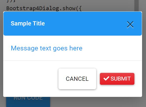
2. Create a basic dialog with title and message.
Bootstrap4Dialog.show({
  title: 'Sample Title 1',
  message: 'Message text goes here'
});
3. Create a toast-like notification box that automatically dismisses after 3 seconds.
Bootstrap4Dialog.show({
  message: 'Toast Message Here',
  duration: 5
});
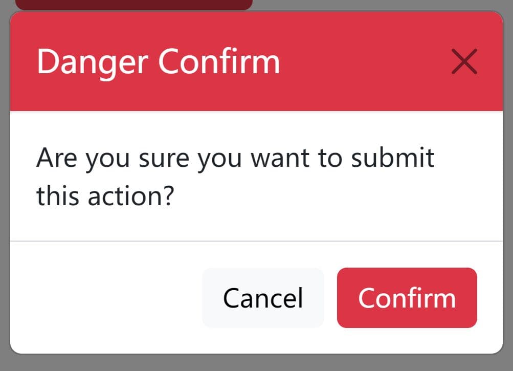
4. Create a modal window with custom buttons. Ideal for alert & confirmation dialog boxes.
Bootstrap4Dialog.show({
  title: 'Confirm Dialog',
  message: 'Are You Sure',
  buttons: [{
    id: 'btn-cancel',
    label: 'Cancel',
    cssClass: 'btn btn-light',
    action: function(dialog) {
      dialog.modal('hide');
    }
  },
  {
    id: 'btn-submit',
    label: ' Submit',
    cssClass: 'btn btn-sm btn-danger',
    action: function(dialog) {
      alert('fake form submittion..');
      dialog.modal('hide');
    }
  }]
})
5. Specify the type of the modal. All possible types:
Bootstrap4Dialog.TYPE_PRIMARY = "primary";
Bootstrap4Dialog.TYPE_SECONDARY = "secondary";
Bootstrap4Dialog.TYPE_SUCCESS = "success";
Bootstrap4Dialog.TYPE_DANGER = "danger";
Bootstrap4Dialog.TYPE_WARNING = "warning";
Bootstrap4Dialog.TYPE_INFO = "info";
Bootstrap4Dialog.TYPE_LIGHT = "light";
Bootstrap4Dialog.TYPE_DARK = "dark";
Bootstrap4Dialog.show({
  type: Bootstrap4Dialog.TYPE_LIGHT
})
6. Determine the size of the action buttons. All possible size options:
Bootstrap4Dialog.SIZE_SMALL = "modal-sm";
Bootstrap4Dialog.SIZE_MEDIUM = "";
Bootstrap4Dialog.SIZE_LARGE = "modal-lg";
Bootstrap4Dialog.SIZE_EXTRA_LARGE = "modal-xl";
Bootstrap4Dialog.show({
  size: Bootstrap4Dialog.SIZE_SMALL
})
7. Determine whether to show the backdrop. All possible options:
Bootstrap4Dialog.BACKDROP_YES = "true";
Bootstrap4Dialog.BACKDROP_NO = "";
Bootstrap4Dialog.BACKDROP_STATIC = "static";
Bootstrap4Dialog.show({
  backdrop: Bootstrap4Dialog.BACKDROP_NO
})
8. Determine whether to allow the 'Scrollable' behavior on the modal. Default: false.
Bootstrap4Dialog.show({
  scrollable: true
})
9. Determine whether to automatically destroy the modal after hidden. Default: true.
Bootstrap4Dialog.show({
  autodestroy: false
})
10. Trigger custom functions when the modal is closed and hidden. Default: true.
Bootstrap4Dialog.show({
  open: function() {
    // do something
  },
  close: function() {
    // do something
  }
})
11. Close the modal manually.
instance.modal('hide');
Changelog:
2023-03-09
- fix close button compatibility with Bootstrap 5, which is not compatible with Bootstrap 4
This awesome jQuery plugin is developed by SUXUMI. For more Advanced Usages, please check the demo page or visit the official website.