Create Top/Bottom/Side Drawers Using Bootstrap Modal Component
| File Size: | 4.55 KB |
|---|---|
| Views Total: | 23805 |
| Last Update: | |
| Publish Date: | |
| Official Website: | Go to website |
| License: | MIT |
A CSS extension to Bootstrap 4/5 framework that enables you to create top, bottom, and/or side drawers and fullscreen modal dialogs using the native Bootstrap 4/5 modal component.
The extension converts the Bootstrap 4/5 modal into a full-width or full-height modal window that slides out from the top/bottom/left/right side of the screen when toggled.
Requires jQuery library and Bootstrap 4/5 framework. Great for notification popup, off-canvas navigation, sticky footer section, side settings panel, floating social share widgets, and much more.
How to use it:
1. Load the required stylesheet bootstrap-side-modals.css in the Bootstrap project.
<!-- Stylesheet -->
<link rel="stylesheet" href="/path/to/cdn/bootstrap.min.css" />
<link rel="stylesheet" href="/path/to/bootstrap-side-modals.css" />
<!-- JavaScript -->
<script src="/path/to/cdn/jquery.slim.min.js"></script>
<script src="/path/to/cdn/bootstrap.min.js"></script>
2. Just add a position class to your Bootstrap modal instance and the library will do the rest.
- .modal-left
- .modal-right
- .modal-top
- .modal-bottom
- .modal-full
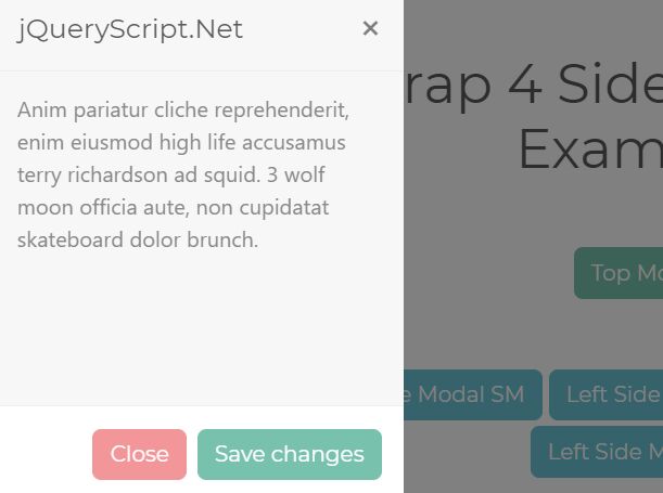
<!-- Trigger Button --> <button type="button" class="btn btn-primary" data-toggle="modal" data-target="#left_modal"> Left Side Modal SM </button> <!-- Modal Window --> <div class="modal modal-left fade" id="left_modal" tabindex="-1" role="dialog" aria-labelledby="left_modal"> <div class="modal-dialog" role="document"> <div class="modal-content"> <div class="modal-header"> <h5 class="modal-title">Modal Title</h5> <button type="button" class="close" data-dismiss="modal" aria-label="Close"> <span aria-hidden="true">×</span> </button> </div> <div class="modal-body"> Modal Content Here </div> <div class="modal-footer modal-footer-fixed"> <button type="button" class="btn btn-secondary" data-dismiss="modal">Close</button> <button type="button" class="btn btn-primary">Save changes</button> </div> </div> </div> </div>
Changelog:
2021-03-26
- CSS update
2021-02-25
- Class names changed to .modal-*
2020-11-17
- Update bootstrap-side-modals.css
2020-06-14
- Updated CSS
2020-05-24
- Added XS Left & Right modal windows.
2020-05-13
- Updated styles
2020-05-11
- Added Fullscreen Modal support
This awesome jQuery plugin is developed by xcm2030. For more Advanced Usages, please check the demo page or visit the official website.