Cross-platform Responsive Navigation With jQuery - menuBreaker
| File Size: | 100 KB |
|---|---|
| Views Total: | 15176 |
| Last Update: | |
| Publish Date: | |
| Official Website: | Go to website |
| License: | MIT |
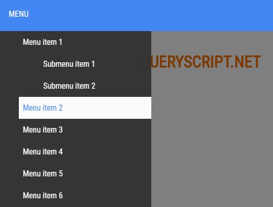
menuBreaker is a responsive, cross-platform, multi-level navigation plugin for jQuery that auto collapses the regular horizontal nav into an off-canvas toggle menu on mobile devices.
How to use it:
1. Create the desktop and mobile nav menus from nested HTML unordered lists. And then insert them together with the mobile menu toggle button into a nav element like these:
<nav id="navbar">
  <div class="menu">
    <ul class="desktop">
      <li><a href="#">Menu item 1</a>
        <ul class="submenu">
          <li><a href="#">Menu 1-1</a></li>
          <li><a href="#">Menu 1-2</a></li>
        </ul>
      </li>
      <li><a href="#">Menu item 2</a></li>
      <li><a href="#">Menu item 3</a></li>
      ...
    </ul>
    <ul class="mobile">
      <li><a href="#">Menu item 1</a>
        <ul class="submenu">
          <li><a href="#">Menu 1-1</a></li>
          <li><a href="#">Menu 1-2</a></li>
        </ul>
      </li>
      <li><a href="#">Menu item 2</a></li>
      <li><a href="#">Menu item 3</a></li>
      ...
    </ul>
  </div>
  <div id="openMenu">MENU</div>
</nav>
2. Create an overlay element that will be used to overlay the main container when the mobile menu is opened.
<div class="overlay"></div>
3. The primary CSS styles for the desktop menu.
#navbar {
  z-index: 100;
  position: relative;
  height: 70px;
  background-color: #4286f4;
}

.menu {
  border: 0;
  max-height: 70px;
  float: left;
  width: 100%;
  text-align: center;
}

.desktop {
  font-size: 0;
  min-height: 70px;
  background: none;
  padding-left: 10px;
  padding-right: 10px;
  float: none;
}

.desktop li {
  border: 0;
  margin-left: 1px;
  margin-right: 1px;
  height: 70px;
  display: inline-block;
  float: none;
  list-style: none;
  padding: 0;
  position: relative;
}

.desktop li a {
  transition: all 300ms ease;
  color: #ffffff;
  font-weight: 700;
  text-decoration: none;
  font-size: 15px;
  margin: 0 auto;
  text-transform: uppercase;
  display: inline-block;
  height: 70px;
  padding: 27px 13px;
}

.desktop li a:hover { background-color: #00c0ff; }

.desktop .submenu {
  position: absolute;
  display: block;
  margin-top: 0;
  padding: 0;
  min-height: 100px;
  width: 200px;
  height: initial;
  visibility: hidden;
  text-align: left;
  -ms-transform-origin: 50% 0;
  transform-origin: 50% 0;
  -webkit-transform-origin: 50% 0;
  -webkit-transition: transform 300ms ease, opacity 300ms ease;
  -moz-transition: transform 300ms ease, opacity 300ms ease;
  -ms-transition: transform 300ms ease, opacity 300ms ease;
  -o-transition: transform 300ms ease, opacity 300ms ease;
  transform: scaleY(0);
  -ms-transform: scaleY(0);
  -webkit-transform: scaleY(0);
}

.desktop li a:hover + .submenu, .desktop li a + .submenu:hover {
  visibility: visible;
  opacity: 0.95;
  transform: scaleY(1);
  -ms-transform: scaleY(1);
  -webkit-transform: scaleY(1);
}

.desktop .submenu li {
  border: 0;
  font-size: 0;
  line-height: 1;
  text-align: left;
  width: 200px;
  height: initial;
  margin: 0 auto;
}

.desktop .submenu .submenu {
  visibility: hidden;
  opacity: 0;
  position: absolute;
  -webkit-transform: scaleY(1);
  -ms-transform: scaleY(1);
  transform: scaleY(1);
  top: 0;
  width: 200px;
}

.desktop .submenu .submenu li { width: 200px; }

.desktop .submenu li a {
  display: block;
  background-color: #00c0ff;
  min-height: 45px;
  height: auto;
  border: 0;
  line-height: 1;
  text-align: left;
  margin: 0 auto;
  margin-bottom: 0;
}

.desktop .submenu li a:hover {
  background-color: #f77300;
  -webkit-transition: all 300ms ease;
  -o-transition: all 300ms ease;
  transition: all 300ms ease;
}
4. The primary CSS styles for the mobile menu.
#openMenu {
  cursor: pointer;
  color: #ffffff;
  position: absolute;
  top: 27px;
  left: 20px;
  display: none;
}

.mobile {
  opacity: 0.95;
  background-color: #4286f4;
  text-align: left;
  margin: 0 auto;
  overflow-y: scroll;
  transition: all 300ms ease;
  width: 300px;
  position: absolute;
  top: 70px;
  left: -300px;
}

.open {
  opacity: 0.97;
  display: block;
  left: 0px;
}

.mobile li { display: block; }

.mobile li a {
  padding: 12px 8px;
  display: block;
  color: #ffffff;
  text-decoration: none;
}

.mobile li a:hover {
  color: #4286f4;
  background-color: #ffffff;
}

.overlay {
  cursor: pointer;
  width: 100%;
  height: calc(100% - 70px);
  position: absolute;
  display: none;
  background-color: rgba(0, 0, 0, 0.5);
}
5. Import jQuery library and the menuBreaker.js script into the document.
<script src="https://code.jquery.com/jquery-3.3.1.min.js"></script>
<script src="js/menuBreaker.js"></script>
<!-- Or From A CDN -->
<script src="https://unpkg.com/menu-breaker/"></script>
6. Enable the menuBreaker plugin.
$('.desktop').menuBreaker();
$(window).on('load resize', function () {
  $('.mobile').height($(window).height() - $('nav').height());
});
7. Possible options to customize the menuBreaker plugin.
$('.desktop').menuBreaker({
  settings: {

    // max height of navbar
    'navbar-height': 70,

    // Name of class added to mobile menu, after click data-open or data-open-close element
    'open-class': 'open',

  }
});
8. Callback functions.
$('.desktop').menuBreaker({
  callbacks: {

    // call function on init
    onInit: null

    // call function on mobile menu open
    onMenuOpen: null,

    // call function on mobile menu close
    onMenuClose: null,

    // call function when is mobile menu
    isMobile: null,

    // call function when is desktop menu
    isDesktop: null

  }
});
Changelog:
v2.2.1 (2020-05-21)
- clean up
v2.1.0 (2020-01-01)
- renamed data-mobile to data-menu-breaker-mobile
- renamed data-open to data-menu-breaker-open
- renamed data-close to data-menu-breaker-close
- renamed data-open-close to data-menu-breaker-toggle
v2.0.2 (2019-06-22)
- added full access to library methods for jQuery
v2.0.1 (2019-03-22)
- fixed CDN undefined bug
v2.0.0beta1 (2019-03-06)
- splitted options prop into settings and callbacks
- added onInit callback
- renamed method settings() to extendSettings() to avoid conflict with variable settings
v1.1.5beta1 (2018-12-11)
- added onInit callback
- renamed method settings() to extendSettings() to avoid conflict with variable settings
v1.1.4 (2018-11-24)
- Improvements
v1.1.3 (2018-11-11)
- fixed bug with window global variable in Node.js
v1.1.2 (2018-11-05)
- update dependency
v1.1.1 (2018-10-06)
- update dependency
v1.1.0 (2018-09-01)
- changed some global variables to const
- changed for loops to for-of
- code cleaned up
v1.0.1 (2018-07-06)
- updated devDependencies
- small internal improvements
v1.0.0 (2018-05-01)
- renamed jQuery plugin from MenuBreaker() to menuBreaker()
- fixed bug with mobile menu after resize (now menu reacts every time on data-open and data-close click)
- added data-open-close (the same input to close and open mobile menu)
- removed overlay
- added callbacks onMenuOpen, onMenuClose, isMobile, isDesktop
- added open-class option
- fixed bug with jQuery and Node.js compatibility
2018-04-15
- redesigned demo page (new header view, dark theme)
- updated README.md
- added CHANGELOG.md
- renamed jQuery plugin from MenuBreaker() to menuBreaker()
- fixed bug with mobile menu after resize (now menu reacts every time on data-open and data-close click)
- added data-open-close (the same input to close and open mobile menu)
- removed overlay
- added callbacks onMenuOpen, onMenuClose, isMobile, isDesktop
- added open-class option
- fixed bug with jQuery and Node.js compatibility
This awesome jQuery plugin is developed by menu-breaker-js. For more Advanced Usages, please check the demo page or visit the official website.


