Minimal Clean Responsive Dropdown Menu With jQuery
| File Size: | 2.49 KB |
|---|---|
| Views Total: | 3474 |
| Last Update: | |
| Publish Date: | |
| Official Website: | Go to website |
| License: | MIT |
A lightweight, clean, responsive, SEO-friendly dropdown menu codes with jQuery, Font Awesome, and plain HTML/CSS.
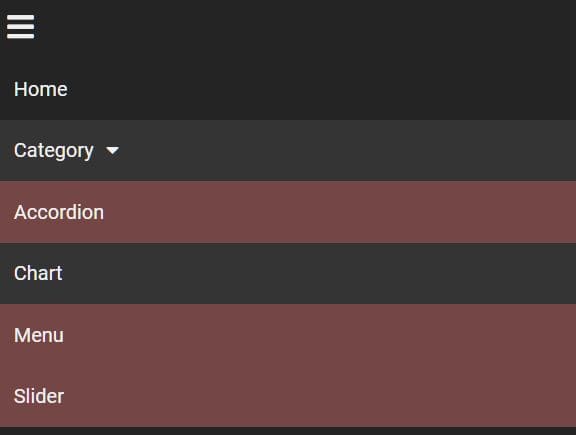
It uses CSS media queries to detect the screen size and collapses the horizontal navigation bar into a hamburger toggle menu according to the current viewport size.
On the mobile view, the users are able to collapse and expand sub-menus just like an accordion.
How to use it:
1. Load the necessary jQuery library and Font Awesome iconic font in the html file.
<link rel="stylesheet" href="/path/to/FONTAWESOME.css">
<script src="/path/to/jquery.min.js"></script>
2. Create the dropdown menu from a nesting nav list.
<nav>
  <div>
    <i class="fas fa-bars"></i>
  </div>
  <ul>
    <li><a href="#">Home</a></li>
    <li><a href="#">Category<i class="fas fa-caret-down"></i></a>
      <ul>
        <li><a href="#">Accordion</a></li>
        <li><a href="#">Chart</a></li>
        <li><a href="#">Menu</a></li>
        <li><a href="#">Slider</a></li>
      </ul>
    </li>
    <li><a href="#">Web Design<i class="fas fa-caret-down"></i></a>
      <ul>
        <li><a href="#">HTML5</a></li>
        <li><a href="#">CSS3</a></li>
        <li><a href="#">JavaScript</a></li>
      </ul>
    </li>
    <li><a href="#">About</a></li>
    <li><a href="#">Contact</a></li>
  </ul>
</nav>
3. The primary CSS/CSS3 styles for the dropdown menu.
ul {
  list-style-type: none;
  background-color: rgb(36, 36, 36);
  position: relative;
}

ul li {
  display: inline-block;
  position: relative;
}

ul li:hover {
  background-color: rgba(68, 68, 68, 0.479);
}

ul li a {
  color: rgb(240, 240, 240);
  text-decoration: none;
  font-size: 16px;
  padding: 15px;
  display: block;
}

ul ul {
  position: absolute;
  min-width: 200px;
  background-color: rgb(36, 36, 36);
  display: none;
}

ul ul li {
  display: block;
  background-color: rgb(116, 70, 70);
}

ul li:hover ul {
  display: block;
}

.fa-caret-down {
  margin-left: 10px;
}

nav div {
  background-color: rgb(36, 36, 36);
  color: rgb(240, 240, 240);
  font-size: 24px;
  padding: 10px;
  cursor: pointer;
  display: none;
}
4. Use CSS media queries to toggle CSS properties based on the screen size.
@media(max-width: 768px) {
  nav div {
    display: block;
  }
  ul {
    display: none;
    position: static;
    background-color: rgb(36, 36, 36);
  }

  ul li {
    display: block;
  }
  ul ul {
    position: static;
    background-color: rgb(36, 36, 36);
  }
}
5. Enable the dropdown menu with sliding animations.
$('nav div').click(function() {
  $('ul').slideToggle();
  $('ul ul').css('display', 'none');
});

$('ul li').click(function() {
  $('ul ul').slideUp();
  $(this).find('ul').slideToggle();
});
6. Remove the styles when the window is resized to more than 768 pixels.
$(window).resize(function() {
  if($(window).width() > 768) {
    $('ul').removeAttr('style');
  }
});
This awesome jQuery plugin is developed by radzikow. For more Advanced Usages, please check the demo page or visit the official website.


