Attractive and Practical Wizard Plugin with jQuery - wizard.js
| File Size: | 289 KB |
|---|---|
| Views Total: | 4051 |
| Last Update: | |
| Publish Date: | |
| Official Website: | Go to website |
| License: | MIT |
wizard.js is a simple yet powerful jQuery plugin which allows you to display form fields, tabs, or content panels in a step by step wizard interface. Compatible with Bootstrap framework and jQuery FormValidation plugin (for form wizard).
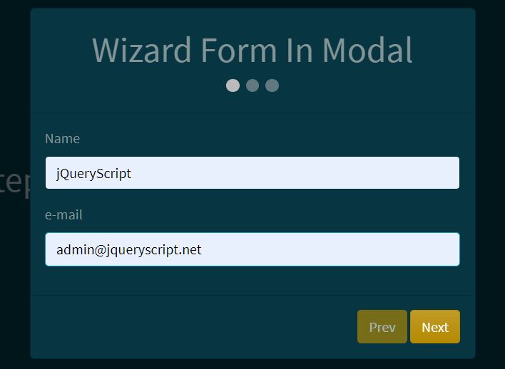
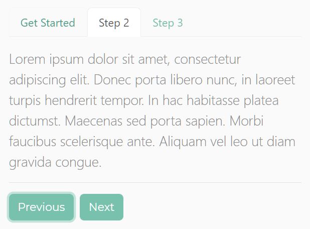
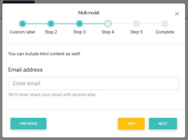
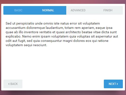
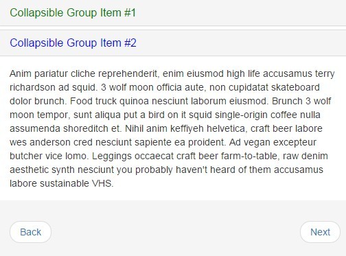
More examples:
Basic usage:
1. Include jQuery library and the jQuery wizard.js plugin's JS and CSS files on the web page.
<!-- jQuery Wizard Stylesheet -->
<link rel="stylesheet" href="css/wizard.css">

<!-- jQuery v1.9.1 or higher -->
<script src="//code.jquery.com/jquery-1.11.3.min.js"></script>

<!-- jQuery Wizard JS -->
<script src="dist/jquery-wizard.js"></script>
2. Include Twitter's Bootstrap 3 and the jQuery FormValidation plugin on the web page as needed.
<!-- Bootstrap CSS -->
<link rel="stylesheet" href="bootstrap.min.css">

<!-- Bootstrap JS -->
<script src="bootstrap.min.js"></script>

<!-- FormValidation plugin and the class supports validating Bootstrap form -->
<script src="formvalidation/formValidation.min.js"></script>
<script src="formvalidation/bootstrap.min.js"></script>
3. Create the Html for a basic wizard interface.
<div id="demo" class="wizard">
  <ul class="wizard-steps" role="tablist">
    <li class="active" role="tab"> Step 1 </li>
    <li role="tab"> Step 2 </li>
    <li role="tab"> Step 3 </li>
  </ul>
  <div class="wizard-content">
    <div class="wizard-pane active" role="tabpanel">
      Step 1
    </div>
    <div class="wizard-pane" role="tabpanel">
      Step 2
    </div>
    <div class="wizard-pane" role="tabpanel">
      Step 3
    </div>
  </div>
</div>
4. Initialize the plugin and done.
$('#demo').wizard();
5. Default settings and callbacks.
step: '.wizard-steps > li',

getPane: function getPane(index, step) {
  return this.$element.find('.wizard-content').children().eq(index);
},

buttonsAppendTo: 'this',
templates: {
  buttons: function buttons() {
    var options = this.options;

    return '<div class="wizard-buttons"><a class="wizard-back" href="#' + this.id + '" data-wizard="back" role="button">' + options.buttonLabels.back + '</a><a class="wizard-next" href="#' + this.id + '" data-wizard="next" role="button">' + options.buttonLabels.next + '</a><a class="wizard-finish" href="#' + this.id + '" data-wizard="finish" role="button">' + options.buttonLabels.finish + '</a></div>';
  }
},

classes: {
  step: {
    done: 'done',
    error: 'error',
    active: 'current',
    disabled: 'disabled',
    activing: 'activing',
    loading: 'loading'
  },

  pane: {
    active: 'active',
    activing: 'activing'
  },

  button: {
    hide: 'hide',
    disabled: 'disabled'
  }
},

autoFocus: true,
keyboard: true,

enableWhenVisited: false,

buttonLabels: {
  next: 'Next',
  back: 'Back',
  finish: 'Finish'
},

loading: {
  show: function show(step) {},
  hide: function hide(step) {},
  fail: function fail(step) {}
},

cacheContent: false,

validator: function validator(step) {
  return true;
},

onInit: null,
onNext: null,
onBack: null,
onReset: null,

onBeforeShow: null,
onAfterShow: null,
onBeforeHide: null,
onAfterHide: null,
onBeforeLoad: null,
onAfterLoad: null,

onBeforeChange: null,
onAfterChange: null,

onStateChange: null,

onFinish: null
Change logs:
2017-09-19
- v0.4.4
2016-09-02
- ES5 --> ES6
2015-05-07
- fix buttons append issue
2015-05-05
- add state change event
This awesome jQuery plugin is developed by thecreation. For more Advanced Usages, please check the demo page or visit the official website.