jQuery Colorpicker Plugin For Bootstrap 5/4/3
| File Size: | 190 KB |
|---|---|
| Views Total: | 29271 |
| Last Update: | |
| Publish Date: | |
| Official Website: | Go to website |
| License: | MIT |
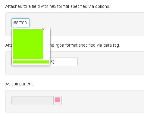
A Colorpicker Plugin For Bootstrap 5/4/3 frameworks that allow you to add a color picker to an input field field or to any other element with multiple formats: hex, rgb, rgba, hsl, hsla.
You might also like:
- Beautiful jQuery Color Picker For Bootstrap - Pick-a-Color
- Customizable and Touch-Friendly jQuery Color Picker Plugin - spectrum
- jQuery Color Picker Plugin - wColorPicker
- Simple Color Picker Plugin - colorselector
- Smooth Color Picker Plugin with jQuery and Bootstrap - jqolor
Installation:
# Yarn
$ yarn add bootstrap-colorpicker

# NPM
$ npm install bootstrap-colorpicker --save
How to use it:
1. Include jQuery script and bootstrap-colorpicker.js
<script src="js/jquery.js"></script>
<script src="js/bootstrap-colorpicker.js"></script>
2. Include CSS before </head>.
<link href="css/bootstrap.css" rel="stylesheet">
<link href="css/colorpicker.css" rel="stylesheet">
3. Call the function on target element.
$('.colorpicker').colorpicker();
4. Default plugin options.
/**
 * If true, loads the Debugger extension automatically into the current instance
 * @type {boolean}
 * @default false
 */
debug: false,
/**
 * Forces a color, ignoring the one from the elements value or data-color attribute.
 *
 * @type {(String|Color|boolean)}
 * @default false
 */
color: false,
/**
 * Forces an specific color format. If false, it will be automatically detected the first time,
 * but if null it will be always recalculated.
 *
 * Note that the ending 'a' of the format meaning "alpha" has currently no effect, meaning that rgb is the same as
 * rgba excepting if the alpha channel is disabled (see useAlpha).
 *
 * @type {('rgb'|'rgba'|'prgb'|'prgba'|'hex'|'hex3'|'hex6'|'hex8'|'hsl'|'hsla'|'hsv'|'hsva'|'name'|boolean)}
 * @default false
 */
format: false,
/**
 * Horizontal mode layout.
 *
 * If true, the hue and alpha channel bars will be rendered horizontally, above the saturation selector.
 *
 * @type {boolean}
 * @default false
 */
horizontal: false,
/**
 * Forces to show the colorpicker as an inline element
 *
 * @type {boolean}
 * @default false
 */
inline: false,
/**
 * Children input CSS selector
 *
 * @type {String}
 * @default 'input'
 */
input: 'input',
/**
 * Colorpicker container CSS selector. If given, the colorpicker will be placed inside this container.
 * If true, the colorpicker element itself will be used as the container.
 *
 * @type {String|boolean}
 * @default false
 */
container: false, // container selector
/**
 * Children color component CSS selector.
 * If it exists, the child <i> element background will be changed on color change.
 *
 * @type {String|boolean}
 * @default '.add-on, .input-group-addon'
 */
component: '.add-on, .input-group-addon',
/**
 * Fallback color to use when the given color is invalid.
 * If false, the latest valid color will be used as a fallback.
 *
 * @type {String|Color|boolean}
 * @default false
 */
fallbackColor: false,
/**
 * If enabled, the input content will be replaced always with a valid color,
 * if not enabled the invalid color will be left in the input, but valid in the internal color object.
 *
 * @type {boolean}
 * @default false
 */
autoInputFallback: false,
/**
 * If true a hash will be prepended to hexadecimal colors.
 * If false, the hash will be removed.
 * This only affects the input values.
 *
 * @type {boolean}
 * @default false
 */
useHashPrefix: true,
/**
 * If true or false the alpha adjustment bar will be displayed no matter what.
 * If false it will be always hidden and alpha channel won't be allowed programmatically for this instance,
 * so the selected or typed color will be always opaque.
 *
 * @type {boolean}
 * @default true
 */
useAlpha: true,
/**
 * This only applies when the color format is hexadecimal.
 * If true, the alpha channel will be allowed for hexadecimal formatted colors, making them having 4 or 8 chars
 * (RGBA or RRGGBBAA). This format is not yet supported in all modern browsers, so it is disabled by default.
 * If false, rgba will be used whenever there is an alpha change different than 1 and the color format is
 * automatic.
 *
 * @type {boolean}
 * @default true
 */
enableHex8: false,
/**
 * Vertical sliders configuration
 * @type {Object}
 */
sliders: {
  saturation: {
    maxLeft: 100,
    maxTop: 100,
    callLeft: 'setSaturationRatio',
    callTop: 'setBrightnessRatio'
  },
  hue: {
    maxLeft: 0,
    maxTop: 100,
    callLeft: false,
    callTop: 'setHueRatio'
  },
  alpha: {
    maxLeft: 0,
    maxTop: 100,
    callLeft: false,
    callTop: 'setAlphaRatio'
  }
},
/**
 * Horizontal sliders configuration
 * @type {Object}
 */
slidersHorz: {
  saturation: {
    maxLeft: 100,
    maxTop: 100,
    callLeft: 'setSaturationRatio',
    callTop: 'setBrightnessRatio'
  },
  hue: {
    maxLeft: 100,
    maxTop: 0,
    callLeft: 'setHueRatio',
    callTop: false
  },
  alpha: {
    maxLeft: 100,
    maxTop: 0,
    callLeft: 'setAlphaRatio',
    callTop: false
  }
},
/**
 * Colorpicker popup alignment.
 * For now only right is supported.
 *
 * @type {('right')}
 * @default 'right'
 */ // TODO: add 'left' and 'auto' support.
align: 'right',
/**
 * Custom class to be added to the colorpicker element
 *
 * @type {String}
 */
customClass: null,
/**
 * Colorpicker widget template
 * @type {String}
 * @example
 * <!-- This is the default template: -->
 * <div class="colorpicker">
 *   <div class="colorpicker-saturation"><i class="colorpicker-guide"><i></i></i></div>
 *   <div class="colorpicker-hue"><i class="colorpicker-guide"></i></div>
 *   <div class="colorpicker-alpha"><i class="colorpicker-guide"></i></div>
 *   <div class="colorpicker-color"><div /></div>
 * </div>
 */
template: '<div class="colorpicker">\n    <div class="colorpicker-saturation"><i class="colorpicker-guide"><i /></div>\n    <div class="colorpicker-hue"><i class="colorpicker-guide"></i></div>\n    <div class="colorpicker-alpha"><i class="colorpicker-guide"></i></div></div>',
/**
 *
 * Associative object with the extension class name and its config.
 * Colorpicker comes with many bundled extensions: debugger, palette, preview and swatches (a superset of Palette).
 *
 * @type {Object}
 * @example
 *   extensions: [
 *     {
 *       name: 'swatches'
 *       colors: {
 *         'primary': '#337ab7',
 *         'success': '#5cb85c',
 *         'info': '#5bc0de',
 *         'warning': '#f0ad4e',
 *         'danger': '#d9534f'
 *       },
 *       namesAsValues: true
 *     }
 *   ]
 */
extensions: [{
  name: 'preview',
  showText: false
}]
Changelog:
v3.4.0 (2021-06-04)
- Add Bootstrap 5 compatibility with popover.js
v3.3.0 (2021-04-24)
- Package audit fixes
- Fixes .RemoveData() in colorpicker destroy doesn't remove the color data
- Adds new option to allow hex3 values
v3.2.0 (2019-05-11)
- Add popoverjs as dependency
v3.1.2 (2019-05-11)
- Fix: source maps for CSS and JS dist files had parsing issues because of the license header.
- Fix: mouse dragging was causing the underlying text to be selected in Firefox.
v3.1.1 (2019-04-03)
- Fixes jQuery issues in node
- Fixes exception when fallbackColor is null
- fallback option is now "auto" by default instead of null. This way, the format of the instance is automatically determined by the first assigned color, which is a more expected behavior. This may require code adjustments.
- Improved guides UI
- fix: colorpicker not working after emptying the input
- improved preview extension UI
- preview extension has text enabled by default
v3.0.3 (2018-11-13)
- ui: improve guides visibility
- allow overriding SASS variables before import
- fix: unnecessary .call()
- fix jQuery require issues with nodejs
v3.0.0 (2018-07-26)
- fix: Uncaught TypeError when emptying input field on Preview extension.
- fix: use deep options merge instead of Object.assign.
- feat: use CSS3 gradient backgrounds, improve code readability with early returns.
- supports Bootstrap 4.1.2
- refactor: revamped show/hide mechanism + addon focus support
- fix: wrong slider bounds
- refactor: decouple addon into AddonHandler class
- fix: prevent autofocus on creation
v3.0.0 (2017-11-19)
- Removes support for: Bower, less styles (in favor of sass), Grunt, JSHint, Jasmine
- Adds support for: ES6 modules, webpack, babel, Gulp, eslint, AVA
- Changes the license to MIT, since the changes are considerably different from the original project code from 2012.
- Color class has been now simplified and is using tinycolor internally
- Minimum jQuery version is 2.1
- Removed options: fallbackColorFormat
- Renamed options: hexNumberSignPrefix -> useHashPrefix, colorSelectors -> colorPalette
- New options: useAlpha, enableHex8
- New classes: $.colorpicker.Color, $.colorpicker.TinyColor
- $.colorpicker.prototype.update* methods no longer accept or return values
- $.colorpicker.prototype.color object is now an alias of $.colorpicker.prototype.element.data('color') for both get and set
- Alpha channel is now supported in hexadecimal colors (hex8)
- Supported formats are now: "rgb", "prgb", "hex"/"hex6", "hex3", "hex8", "hsl", "hsv"/"hsb", "name".
- More tests for the Color class
- Better consistency with the color and format usage inside the widget
- dist folder is not longer commited in the repository, but still distributed in the npm package
- Images are removed since they were not used (they are encoded in the css as base64)
- Fix: adds checks for color object existence
- Fix: height of color bar
- Fix: algolia search new key
- refactor: events revamp, extensions support and generalized styles
v2.5.2 (2017-09-25)
- JS Update
v2.5.1 (2017-02-06)
- Fix colors not being displayed hexNumberSignPrefix=false
v2.4.0 (2016-12-29)
- Bootstrap is no longer a bower dependency
- Fixed some demos and updated docs with new options
- Fixed color selectos display problem
- Added some useful rules for visibility classes
- Is now possible to initialize the plugin using another parent than main window
- Fixed cancellation of input change event and colorpicker child element events
- New options for setting the fallback color and format (before it was always black and hex)
- Fixed click/tap on mobile devices
- Other UI fixes and improvements (like saturation disappearing)
2016-11-07
- v2.3.6
2016-04-05
- preventing hidePicker to be fired twice
2015-11-22
- v2.3.0
This awesome jQuery plugin is developed by itsjavi. For more Advanced Usages, please check the demo page or visit the official website.