Execute An Event Based On Window Width Using jQuery - responsiveChange
| File Size: | 5.76 KB |
|---|---|
| Views Total: | 561 |
| Last Update: | |
| Publish Date: | |
| Official Website: | Go to website |
| License: | MIT |

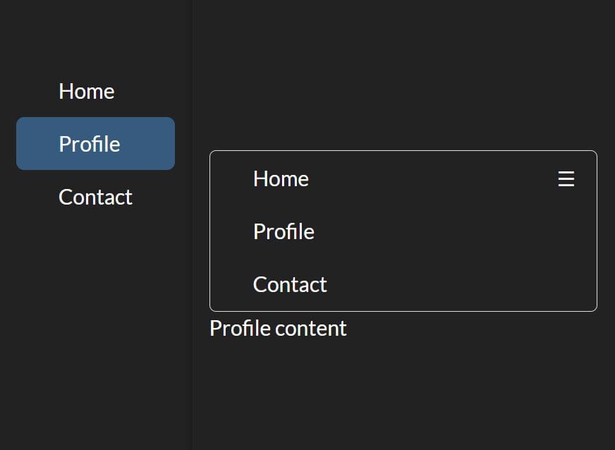
responsiveChange is a jQuery plugin used to execute a Javascript function based on the pre-defined breakpoints as your resize the window.
How to use it:
1. Include jQuery library and the jQuery responsiveChange plugin in the document.
<script src="//code.jquery.com/jquery-1.11.1.min.js"></script>
<script src="jquery.responsiveChange.js"></script>
2. Usage.
$.responsiveChange({
  breakpoints: {
    // breakpoint names
    sp:480,
    pb:768,
    tb:1024,
    pc:'none'
  },
  unit: 'px'
});
3. Methods.
// $element.responsiveChange(breakpointName, callbacks)
$('div').responsiveChange('tb', {
    enter: function() {}
});

// $element.responsiveChange(mediaQuery, callbacks)
$('div').responsiveChange('only screen and (min-width:321px) and (max-width:480px)', callbacks);

// destroy
$('div').responsiveChange('sp', 'destroy');
4. Callback events.
$('div').responsiveChange('tb', {

  once: function() {
    // once the screen size reaches the breakpoint
  },

  enter: function() {
  },

  resize: function() {
  },

  exit: function() {
  }

});
5. Callback arguments.
optionsOptions. e.g. $.responsiveChange(options)isAfterOncereturn trueisAfterEnterreturn truebreakpoint.maxThe maximum value of the breakpointsbreakpoint.minThe minimum value of the breakpointsbreakpoint.namebreakpoint namemediaQueryCSS media queires
$('div').responsiveChange('tb', {

  once: function() {
    console.log('once tb');
  },

  enter: function(e) {
    if (e.isAfterOnce) return;
    console.log('enter tb');
  },

  resize: function(e) {
    if (e.isAfterEnter) return;
    console.log('resize tb');
  }

});
This awesome jQuery plugin is developed by somy-jp. For more Advanced Usages, please check the demo page or visit the official website.