Flexible Robust Modal & Dialog Plugin For jQuery - Modal.js
| File Size: | 24.7 KB |
|---|---|
| Views Total: | 1459 |
| Last Update: | |
| Publish Date: | |
| Official Website: | Go to website |
| License: | MIT |
Modal.js is a simple, flexible, powerful jQuery popup plugin which lets you create nice-looking modal windows & dialog boxes with tons of customization options and API.
How to use it:
1. Include the following CSS files of your choice in the head section of the html page.
<!-- Icon -->
<link href="src/icons/icons.css" rel="stylesheet" type="text/css">

<!-- Base -->
<link href="src/themes/default/base.css" rel="stylesheet" type="text/css">

<!-- Modal body -->
<link href="src/themes/default/body.css" rel="stylesheet" type="text/css">

<!-- Modal button -->
<link href="src/themes/default/buttons.css" rel="stylesheet" type="text/css">

<!-- Modal footer -->
<link href="src/themes/default/footer.css" rel="stylesheet" type="text/css">

<!-- Modal header -->
<link href="src/themes/default/header.css" rel="stylesheet" type="text/css">

<!-- Modal overlay -->
<link href="src/themes/default/overlay.css" rel="stylesheet" type="text/css">

<!-- For Step-by-step modal -->
<link href="src/themes/default/steps.css" rel="stylesheet" type="text/css">
2. Include jQuery library and the modal.js at the bottom of the html page.
<script src="//code.jquery.com/jquery.min.js"></script>
<script src="src/js/modal.js"></script>
3. Create an alert dialog using the alert ( tip, title, callback ) method.
- tip: message
- title: dialog title
- callback: callback function
<script src="//code.jquery.com/jquery.min.js"></script>
<script src="src/js/modal.js"></script>
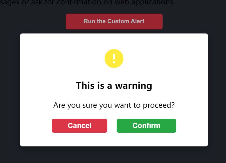
4. Create a warning dialog popup using the Modal.tipWarning( options ) method.
Modal.tipWarning({
  tip: 'Warning!',
  width: 300,
  height:80,
  delay: 3500 // for auto close
});
5. Create a dialog box & modal window with full options.
Modal.dialog({

  parent: document.body,

  title: 'Dialog Title',

  content: 'Dialog Content',

  hasClose: true,

  hasOverlay: true,

  autoDisplay: true,

  beforeBuild: function(modal){
    // do something
  },

  afterBuild: function(modal){
    // do something
  },

  beforeOpen: function(modal){
     // do something
  },

  afterOpen: function(modal){
    // do something
  },

  beforeResize: function(modal){
     // do something
  },

  afterResize: function(modal){
     // do something
  },

  beforeUpdatePosition: function(modal){
    // do something
  },

  afterUpdatePosition: function(modal){
    // do something
  },

  beforeClose: function(modal){
    // do something
  },

  afterClose: function(modal){
    // do something
  },

  beforeDestroy: function(modal){
    // do something
  },

  afterDestroy: function(modal){
    // do something
  },

  buttons: [{

      text: 'Okey',

      action: 'enter',

      autoClose: true,

      btnCls: 'modal-button-primary',

      callback: function(options, modal){
          alert('You just clicked on Okey')
      }
  },{
      text: 'Cancel',
      action: 'cancel',
      btnCls: 'modal-button-secondary',
      callback: function(options, modal){
          alert('You just clicked Cancel')
      }
  }],

  TMPL_WRAP: '<div class="modal-wrap ' + CLS_HIDE + '" id="modal-{id}"></div>',

  TMPL_HEADER: '<div class="modal-header"></div>',

  TMPL_TITLE: '<h2 class="modal-title">{title}</h2>',

  TMPL_CLOSE: '<div class="modal-close"><i class="icon-cross" title="关闭"></i></div>',

  TMPL_BODY: '<div class="modal-body"></div>',

  TMPL_CONTENT: '<div class="modal-content"></div>',

  TMPL_INFORMATION: '<div class="modal-information"></div>',

  TMPL_FOOTER: '<div class="modal-footer"></div>',

  TMPL_BUTTON: '<button type="button" data-action="{action}" class="modal-button">{text}</button>',

  TMPL_OVERLAY: '<div class="modal-overlay"></div>',

  delay: 6000,

  width: 600,

  height: 360

})
6. Create a compact dialog box with full options.
Modal.tip({
 tip: "Title",
 width: 280,
 height: 140,
 hasClose: true,
 hasHeader: true,
 hasOverlay: true,
 delay: 3000,
 buttons: [{
      text: 'Okey',
      action: 'enter',
      autoClose: true,
      btnCls: 'modal-button-primary',
      callback: function(options, modal){
          alert('You just clicked on Okey')
      }
  },{
      text: 'Cancel',
      action: 'cancel',
      btnCls: 'modal-button-secondary',
      autoClose: true,
      callback: function(options, modal){
          alert('You just clicked on Cancel')
      }
  }]
});
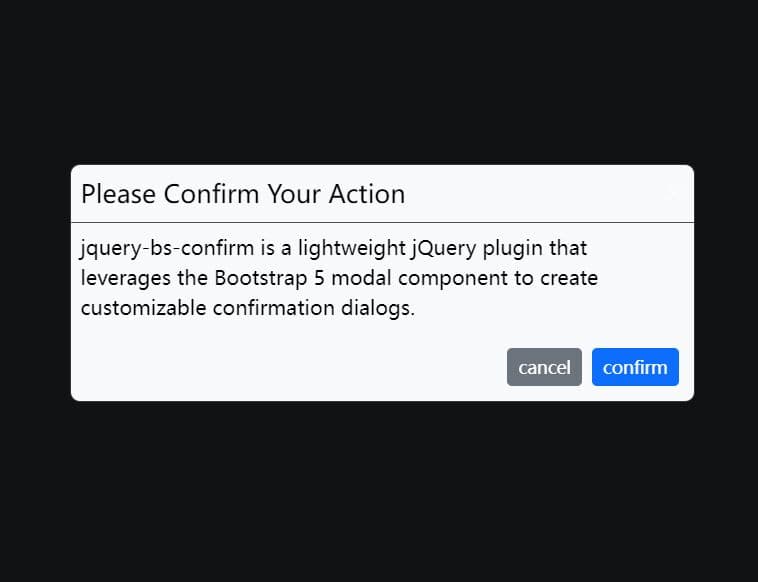
7. Create a confirmation dialog box.
Modal.confirm({
  title: "Okey",
  tip: "Modal.confirm(),Are You Sure",
  enterCallback: function(options, modal){
      console.log(options);
  },
  cancelCallback: function(options, modal){
      console.log(options);
  }
});
8. Create error/info/success dialog boxes.
- tip: message
- title: dialog title
- callback: callback function
Modal.error( tip, title, callback )
Modal.tipError({
  tip: "Title",
  width: 400,
  height: 100,
  delay: 10000,
  hasClose: true,
  afterClose: function(modal){
    // do something
  }
})

Modal.info( tip, title, callback )
Modal.tipInfo({
  tip: "Title",
  width: 400,
  height: 100,
  delay: 10000,
  hasClose: true,
  afterClose: function(modal){
    // do something
  }
})

Modal.success( tip, title, callback )
Modal.tipSuccess({
  tip: "Title",
  width: 400,
  height: 100,
  delay: 10000,
  hasClose: true,
  afterClose: function(modal){
    // do something
  }
})
9. Insert an iframe into the dialog.
Modal.frame({
  scrolling: "no",
  hasHeader: true,
  hasClose: true,
  title: 'IFRAME',
  url: 'index.html',
  width:800,
  height:400,
  delay: 3000,
  buttons: [{
      text: 'Okey',
      action: 'enter',
      autoClose: true,
      btnCls: 'modal-button-primary',
      callback: function(options, modal){
          alert('You just clicked on Okey')
      }
  },{
      text: 'Cancel',
      action: 'cancel',
      btnCls: 'modal-button-secondary',
      callback: function(options, modal){
          alert('You just clicked on Cancel')
      }
  }]
});
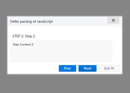
10. Create a step-by-step wizard in the dialog.
Modal.steps({
  title: 'Defer parsing of JavaScript',
  stepsJSON: [
      {
          title: 'Step 1',
          contents: [
              'Step Content 1'
          ]
      },
      {
          title: 'Step 2',
          contents: [
              'Step Content 2'
          ]
      },
      {
          title: 'Step 3',
          contents: [
              'Step Content 3'
          ]
      },
      {
          title: 'Step 4',
          contents: [
              'Step Content 4'
          ]
      }
  ]
});
11. More API methods.
// initialize attributes
on ( evtName, callback );

// set attributes
set ( config );

// init
init ( config );

// resize modal
resize ();

// re-position modal
updatePosition ();

// open modal
open ();

// close modal
close ();

// hide modal
hide ();

// check if is opend
isOpen ();
12. Events.
- build: before rendering
- afterBuild: after rendering
- open: before opening
- afterOpen: after opening
- resize: before resizing
- afterResize: after reszing
- afterUpdatePosition: after re-positioning
- close: before closing/hiding
- afterClose: after closing/hiding
- destroy: before distroying
- afterDestroy: after distroying
This awesome jQuery plugin is developed by yaohaixiao. For more Advanced Usages, please check the demo page or visit the official website.