Generic Picker Plugin with jQuery and Bootstrap
| File Size: | 40.7 KB |
|---|---|
| Views Total: | 3927 |
| Last Update: | |
| Publish Date: | |
| Official Website: | Go to website |
| License: | MIT |
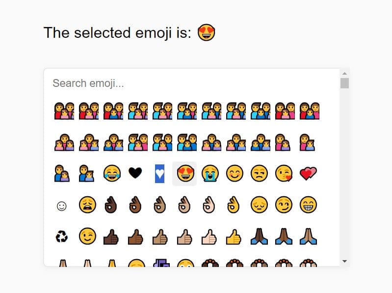
A jQuery plugin used to create a picker widget that allows you to pick stuffs (e.g. icons, times, dates, list items, etc...) from a Bootstrap popover interface.
How to use it:
1. Include bootstrap-picker.min.css and the Bootstrap's CSS in the head section of the web page.
<link rel="stylesheet" href="http://netdna.bootstrapcdn.com/bootstrap/3.1.1/css/bootstrap.min.css">
<link href="dist/css/bootstrap-picker.min.css" rel="stylesheet">
2. Include jQuery library together with jQuery Bootstrap Popover Picker plugin and Boostrap's Javascript at the bottom of the web page.
<script src="http://ajax.googleapis.com/ajax/libs/jquery/1.11.1/jquery.min.js"></script>
<script src="http://netdna.bootstrapcdn.com/bootstrap/3.1.1/js/bootstrap.min.js"></script>
<script src="dist/js/bootstrap-picker.js"></script>
3. Call the plugin on the element where you want to build a popover picker.
$('.demo').picker();
4. Available options with default settings.
// Popover title (optional) only if specified in the template
title: false,

// use this value as the current item and ignore the original
selected: false,

// use this value as the current item if input or element item is empty
defaultValue: false,

// WIP (has some issues with auto and CSS). auto, top, bottom, left, right
placement: 'bottom',

// If true, the popover will be repositioned to another position when collapses with the window borders
collision: 'none',

// enable animation
animation: true,

// hide picker automatically when a value is picked. it is ignored if mustAccept is not false and the accept button is visible
hideOnSelect: false,

// show footer
showFooter: false,

// If true, the search will be added to the footer instead of the title
searchInFooter: false,

// only applicable when there's an picker-btn-accept button in the popover footer
mustAccept: false,

// Appends this class when to the selected item
selectedCustomClass: 'bg-primary',

// List of valid items
items: ['0', '1', '2', '3', '4', '5', '6', '7', '8', '9', 'A', 'B', 'C', 'D', 'E', 'F'],

// Defines which property will be accessed to show the value, in case of the items be an array of objects.
itemProperty: null,

// children input selector
input: 'input',

// children component jQuery selector or object, relative to the parent element
component: '.input-group-addon',

// WIP.  Appends the popover to a specific element. If true, appends to the jQuery element.
container: false,

// If false, it will not update the content in the component
updateComponentOnChange: true,

// Defines the selector class of the picker item
pickerItemClass: "picker-item",

// Defines the selector of the element that contains the value of an item
itemValueSelector: "i",

// Plugin templates:
templates: {
  popover: '<div class="picker-popover popover"><div class="arrow"></div>' +
          '<div class="popover-title"></div><div class="popover-content"></div></div>',
  footer: '<div class="popover-footer"></div>',
  buttons: '<button class="picker-btn picker-btn-cancel btn btn-default btn-sm">Cancel</button>' +
          ' <button class="picker-btn picker-btn-accept btn btn-primary btn-sm">Accept</button>',
  search: '<input type="search" class="form-control picker-search" placeholder="Type to filter" />',
  picker: '<div class="picker"><div class="picker-items"></div></div>',
  pickerItem: '<div class="picker-item"><i></i></div>',
}
Change logs:
2016-06-23
- Implements pickerItemClass and itemValueSelector options.
- Fix problem when defines a different pickerItem template.
2014-06-17
- fixed some errors
2014-06-16
- fix maxHeight
This awesome jQuery plugin is developed by farbelous. For more Advanced Usages, please check the demo page or visit the official website.