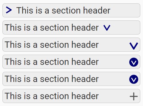
Add SVG Arrows To Folded Content - jQuery folding-arrow
| File Size: | 63.4 KB |
|---|---|
| Views Total: | 1667 |
| Last Update: | |
| Publish Date: | |
| Official Website: | Go to website |
| License: | MIT |
folding-arrow is a jQuery plugin that automatically adds CSS/SVG based arrow indicators to folded/collapsed content such as accordion panels, tree structure, folder tree, etc.
Basic usage:
1. Insert jQuery JavaScript together with the jQuery folding-arrow plugin's files into the html file.
<link rel="stylesheet" href="jquery-folding-arrow-icon.css">
<script src="https://code.jquery.com/jquery-3.2.1.min.js"></script>
<script src="src/jquery-folding-arrow-icon.js"></script>
2. Add the CSS/SVG based arrow indicators to an HTML list based hierarchical tree.
<ul id="demo" class="folding-arrows">
  <li id="g1"><a href="#!">Test list item</a>
    <br>
    Second line
    <ul>
      <li>sub</li>
      <li>list</li>
    </ul>
  </li>

  <li id="g1b" class="showing">
    <a href="#!">Test list item</a>
    <br>
    Second line
    <ul class="folding-arrows">
      <li>sub<br>still sub</li>
      <li>list</li>
    </ul>

  </li>
</ul>
$("#demo > li, #demo ul.folding-arrows > li").prependFoldingArrowIcon();
3. Apply your own CSS styles to the arrow icons.
#g1 .folding-arrow-icon path {
  stroke: none;
  fill: silver;
}

#g1b .folding-arrow-icon path {
  stroke: none;
  fill: #a00
}
4. Default plugin options for the appendFoldingArrowIcon and prependFoldingArrowIcon. Some of these options also apply to setupFoldingArrowIconTransformation.
/**
* Option svgClass: The generated inline SVG element will be equipped
* with a class attribute, and this option defines its value.
* This class can be used to select the SVG icons, which is especially
* needed for applying CSS styles.
*/
svgClass: "folding-arrow-icon",
/**
* Option containerClass: This class name will be added to the class attribute
* of the container element (parent element of the inserted SVG node),
* i.e. any element of the jquery resultset on which the
* append-/prependFoldingArrowIcon() plug-in has been applied.
* When used in unordered lists, the containers are the <li> elements.
* This class can also be used for CSS formatting, especially in combination
* with the 'showing' class defining the state toggle, see included CSS file:
*/
containerClass: "folding-arrow",
/**
* Option separator: This string is inserted between the SVG icon and the
* container node's original content. So, when you call prependFoldingArrowIcon,
* the SVG followed by this separator string are prepended to the node's content,
* when you call appendFoldingArrowIcon, the separator string followed by the
* SVG icon are appended to the node's content.
* The default separator is an ensp, i.e. a space character of exactly
* 1en = 0.5em width. The included default stylesheet for unordererd lists
* relies on this width!
*/
separator: " ",
/**
* Options viewboxRadius and viewboxMargin:
* The generated SVG will be equipped with a viewBox attribut which defines a
* the visible square region of the SVG's coordinate system centered around the
* point (0, 0).
* Let r be the sum of both options: r := viewboxRadius + viewboxMargin.
* Then the CSS will have the following viewBox: "-r -r 2*r 2*r".
* The individual values are not used by the plug-in, only the sum of both is
* evaluated. The only reason why there are _two_ options is for better
* readability: The use of these two values is intended as follows:
* viewboxRadius should describe half the width and height of the actual icon,
* such that any coordinate used to describe the graph (i.e. point of a path,
* edge of a polygon, endpoint of a line etc.) should be contained in the square
* (-viewboxRadius, -viewboxRadius) / (viewboxRadius, viewboxRadius).
* The option viewboxMargin can then be used to define the width of a margin
* around the actual icon. A margin may be essential, if you don't just create
* a filled graph without stroke, but if you have a stroke greater than zero:
* If graph points touch the edge of the viewboxRadius square, the stroke will
* then extend into the margin and would be clipped without one.
* Also, during rotation transitions the transition paths of some of the
* graph's points may easily leave the main graph region defined by the
* viewboxRadius.
* The default values define a 10-by-10-pixel area for the graph and a 1px margin
* around that. Whenever you use the graph option to define your own graph and
* you don't want to describe your graph with coordinate of this 10x10 area,
* you have to override the viewboxRadius option accordingly to your graph's area.
* The viewboxMargin option should be increased if you plan to use larger
* stroke-width values in CSS.
*/
viewboxRadius: 5,
viewboxMargin: 1,
/**
* Option graph: Defines the actual graph. (The default graph is not initialized
* at this place, but is copied from the preset "arrow-right".)
* A graph has to be an array of node definitions.
* A node definition (element of the graph array) is an object with two properties
* 'element' and 'attributes':
* Property 'element' has to be a string defining an SVG element name (e.g. "line",
* "circle" or "path").
* Property 'attributes' has to be an object of key-value-pairs of type string
* defining the attributes of the SVG element.
* Example:
* `graph: [{element: "circle", attributes: {"cx": "0", "cy": "0", "r": "3"}}]`
* defines a graph consisting of just one SVG element, namely a circle around the
* point (0,0), which is the center of the viewBox, and with a radius of 3.
*/
graph: undefined,
/**
* Option closePath:
* If the graph option contains at least one `path` element which is not yet closed,
* i.e. its start point and its end point differ, then this option defines whether
* a "z" is appended to the path (which is a flag defining the path should be
* closed by a line connecting start and end point).
* The default graph is actually not a closed triangle, but a path shaped like
* a grater than sign. Thus, while you use the default graph, and if you draw
* a stroke (via CSS) this option controls whether that stroke is a closed triangle
* or "just a chevron".
* If the graph does not contain any unclosed path element, the option has no
* effect.
*/
closePath: true,
/**
* Option preset:
* If you don't specify the graph neither the preset option, a default graph
* (right-pointing triangle) will be used. You may override that by specifying
* the graph option and thus defining your own graph.
* But you may also simply load alternative graphs in the form of so-called
* presets. A preset is simply a bundle of options which can be loaded all at
* once by setting this 'preset' option. You may load the included presets as
* well as create and use your own onces.
* The value of this option has to be either...
* - a string: the name of a preset or...
* - an instance of class PresetCopy, obtained by calling the function
* $.fn.prependFoldingArrowIcon.copyOfPreset(presetName) and modifying
* that copy via its instance methods.
* (For an example, see demo page, section "Combine preset with circle").
*/
preset: undefined
5. Default options for the transformFoldingArrowIcon. If you want to override these options, use the jQuery setupFoldingArrowIconTransformation() function with an object enumarating the options you want to override. This setup has to be called just once, and the transformFoldingArrowIcon() function will then always use this setup.
/**
 * Option ifIsSelector:
 * The transformFoldingArrowIcon function will add or remove a transition to
 * the selected nodes, depending on their state. This state is determined by
 * `jqr.is(opts.ifIsSelector)`: If the node matches the jQuery selector defined
 * by this string, the transformation is added, otherwise it's removed.
 * This is also used to switch titles, if defined.
 */
ifIsSelector: ".showing",

/**
 * Option transformations: Defines the transformation(s) the plug-in function
 * transformFoldingArrowIcon should apply to (or remove from) the SVG.
 * The value of this option has to be an array of single transformations.
 * A single transformation (element of that array) has to be an object of
 * key-value-pairs of type string. Each key is to be a selector and its value
 * a transformation rule.
 * The default is: [{"> g": "rotate(90)"}], which means:
 * A single transformation will be added to the SVG, more specifically
 * a transformation attribute will be added to the SVG's child node of type
 * `g`(SVG group), and the content of that attribute will be "rotate(90)".
 * To understand that, it's important to know that all graph elements defined
 * by the `graph` option (see above) will be grouped by a single `g` element,
 * this this transformation rule means: Rotate the whole graph by 90 degrees.
 * Of course you may also define transitions for individual child nodes of that
 * group, see presets "burger" or "plus-minus".
 */
transformations: [
  {
    "> g": "rotate(90)"
  }
],

/**
 * Option titleShowing: Defines a title to be added to the graph when the
 * ifIsSelector is matching (unfolded state). That title may be displayed by
 * the browser whenever the mouse cursor hovers over the icon.
 */
titleShowing: undefined,

/**
 * Option titleHidden: Defines a title to be added to the graph when the
 * ifIsSelector is not matching.
 */
titleHidden: undefined
v1.0.3 (2018-10-08)
- Added width and height attributes
v1.0.2 (2018-03-23)
- FIX and improved demos
v1.0.1 (2018-03-23)
- FIX: SVG doesn't need to be direct child of toggle
2018-02-12
- Added new static icon presets.
2018-01-22
- FIX copyOfPreset, more examples
2018-01-16
- added title support
This awesome jQuery plugin is developed by isg-software. For more Advanced Usages, please check the demo page or visit the official website.