Additional Components & Styles For Bootstrap 4 - BS4 Helper
| File Size: | 21.9 KB |
|---|---|
| Views Total: | 467 |
| Last Update: | |
| Publish Date: | |
| Official Website: | Go to website |
| License: | MIT |
The BS4 Helper library provides a set of additional UI components and CSS styles for the latest Bootstrap 4 framework.
Features:
- Growing/Shrinking progress bars.
- Scroll position indicator.
- Additional heading styles.
- Text highlighting.
- Enhanced tooltip.
- Additional sizes and colors.
- Rotatable component.
- Timer bar component.
- And much more.
How to use it:
1. Import the BS4 Helper's JavaScript and Stylesheet in your Bootstrap project.
<!-- Bootstrap Framework -->
<link rel="stylesheet" href="/path/to/cdn/bootstrap.min.css" />
<script src="/path/to/cdn/jquery.slim.min.js"></script>
<script src="/path/to/cdn/bootstrap.min.js"></script>
<!-- BS4 Helper -->
<link rel="stylesheet" href="bs4-helper.css" />
<script src="bs4-helper.js"></script>
2. Load the following CSS files for more colors and background colors:
<link rel="stylesheet" href="bs4-helper-colors.css" />
<link rel="stylesheet" href="bs4-helper-bg-colors.css" />
3. To enable the rotatable components, load the bs4-helper-rotations.css stylesheet:
<link rel="stylesheet" href="bs4-helper-rotations.css" />
4. Create Growing/Shrinking progress bars.
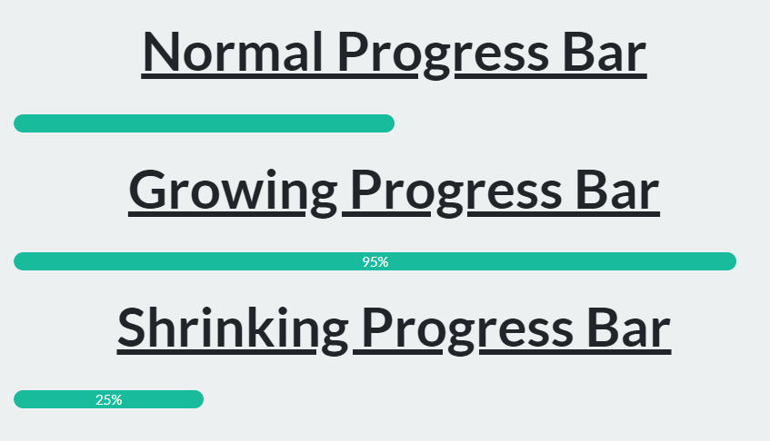
<!-- Growing Progress Bar -->
<div class="progress">
  <div class="progress-bar bg-success" data-progress="grow" data-transition=10 data-max-width=95 show-percentage="true"></div>
</div>

<!-- >Shrinking Progress Bar -->
<div class="progress">
  <div class="progress-bar bg-success" data-progress="shrink" data-transition=10 data-min-width=25 show-percentage="true"></div>
</div>
5. Create a timer (countdown) bar.
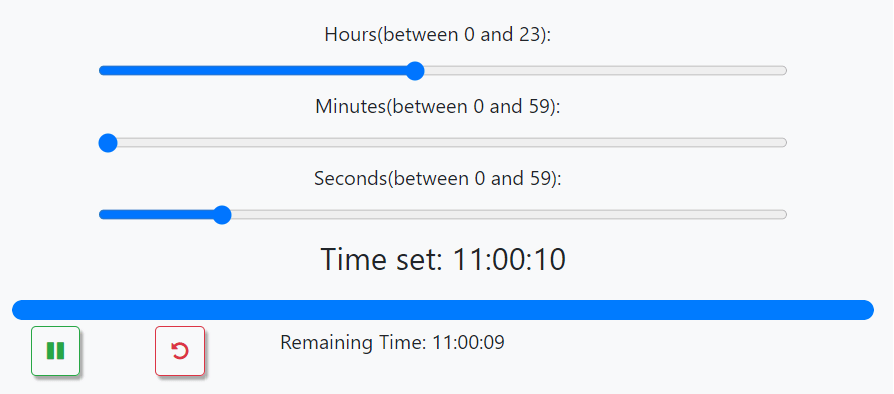
<div class="progress">
  <div class="progress-bar bg-success" data-progress="timer" data-time=120 toggle-btn="mybtn" reset-btn="myresetbtn" show-label="myp"></div>
</div>
<div class="row">
  <button class="btn btn-outline-success timer-btn float-left" id="mybtn"></button>
  <button class="btn btn-outline-light timer-btn float-left" id="myresetbtn"></button>
  <p class="text-white timer-label" style="text-align: right" id="myp">Remaining Time: 00:02:00</p>
</div>
6. Create a bottom progress bar indicating the current scroll progress.
<div class="scroll-container">
  <div class="scroll-indicator bg-danger"></div>
</div>
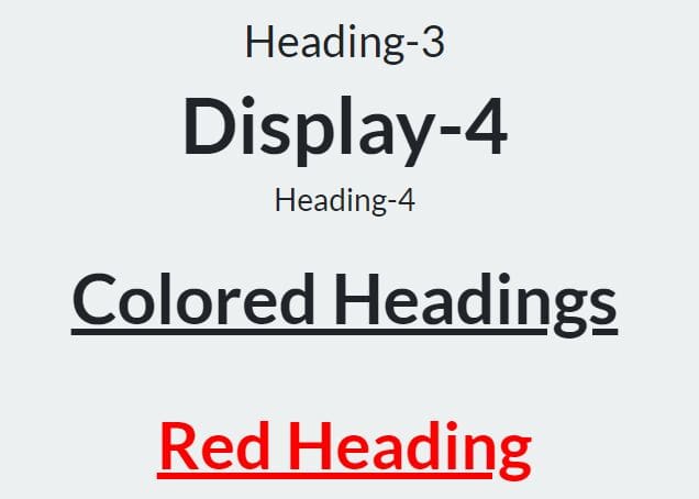
7. Additional heading styles.

<h1 class="heading heading-medium">BS4 Helper Headings</h1>
<h1 class="display-1">Display-1</h1>
<h1>Heading-1</h1>
<h2 class="display-2">Display-2</h2>
<h2>Heading-2</h2>
<h3 class="display-3">Display-3</h3>
<h3>Heading-3</h3>
<h4 class="display-4">Display-4</h4>
<h4>Heading-4</h4>
<h2 class="heading heading-small">Colored Headings</h2>
<h1 class="heading heading-red">Red Heading</h1>
<h1 class="heading heading-orange">Orange Heading</h1>
<h1 class="heading heading-yellow">Yellow Heading</h1>
<h1 class="heading heading-green">Green Heading</h1>
<h1 class="heading heading-cyan">Cyan Heading</h1>
<h1 class="heading heading-blue bg-red">Blue Heading</h1>
<h1 class="heading heading-indigo bg-red">Indigo Heading</h1>
<h1 class="heading heading-violet bg-red">Violet/Purple Heading</h1>
8. Highlight the text.
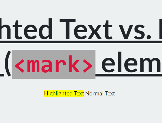
<mark>Highlighted Text</mark>
9. Additional Text Sizes and Colors.
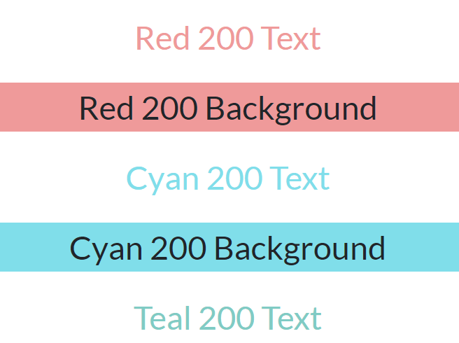
<p class="text-xl">Extra Large Text</p>
<p class="text-large">Large Text</p>
<p class="text-medium">Medium Text</p>
<p class="text-small">Small Text</p>
<p class="text-xs">Extra Small Text</p>
<p class="text-red">Red Text</p>
<p class="text-orange">Orange Text</p>
<p class="text-yellow">Yellow Text</p>
<p class="text-green">Green Text</p>
<p class="text-cyan">Cyan Text</p>
<p class="text-blue">Blue Text</p>
<p class="text-indigo">Indigo Text</p>
<p class="text-violet">Violet Text</p>
<p class="text-comment">These sizes and colors can be combined as follows:</p>
<p class="text-xl text-orange">Extra Large Orange Text</p>
<p class="text-large text-red">Large Red Text</p>
<p class="text-medium text-yellow">Medium Yellow Text</p>
<p class="text-small text-green">Small Green Text</p>
<p class="text-xs text-blue">Extra Small Blue Text</p>
<p class="text-comment">...and other possible combinations.</p>
<p class="text-large color-red-200">Red 200 Text</p>
<p class="text-large bg-red-200">Red 200 Background</p>
<p class="text-large color-cyan-200">Cyan 200 Text</p>
<p class="text-large bg-cyan-200">Cyan 200 Background</p>
<p class="text-large color-teal-200">Teal 200 Text</p>
<p class="text-large bg-teal-200">Teal 200 Background</p>
<p class="text-large color-red-900">Red 900 Text</p>
<p class="text-large bg-red-900 color-white">Red 900 Background</p>
<p class="text-large color-cyan-900">Cyan 900 Text</p>
<p class="text-large bg-cyan-900 color-white">Cyan 900 Background</p>
<p class="text-large color-teal-900">Teal 900 Text</p>
<p class="text-large bg-teal-900 color-white">Teal 900 Background</p>
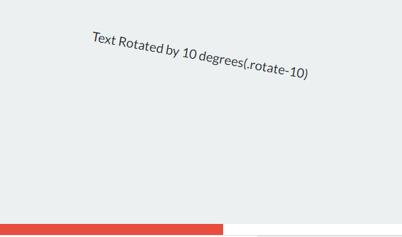
10. Create rotatable elements.
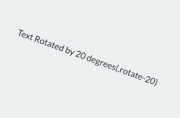
<p class="rotate-10">Text Rotated by 10 degrees(.rotate-10)</p>
<p class="rotate-20">Text Rotated by 20 degrees(.rotate-20)</p>
<p class="rotate-30">Text Rotated by 30 degrees(.rotate-30)</p>
<p class="rotate-40">Text Rotated by 40 degrees(.rotate-40)</p>
<p class="rotate-50">Text Rotated by 50 degrees(.rotate-50)</p>
<p class="rotate-60">Text Rotated by 60 degrees(.rotate-60)</p>
<p class="rotate-70">Text Rotated by 70 degrees(.rotate-70)</p>
<p class="rotate-80">Text Rotated by 80 degrees(.rotate-80)</p>
<p class="rotate-90">Text Rotated by 90 degrees(.rotate-90)</p>
<p class="rotate-100">Text Rotated by 100 degrees(.rotate-100)</p>
<p class="rotate-200">Text Rotated by 200 degrees(.rotate-200)</p>
<p class="rotate-300">Text Rotated by 300 degrees(.rotate-300)</p>
<p class="rotate-310">Text Rotated by 310 degrees(.rotate-310)</p>
<p class="rotate-320">Text Rotated by 320 degrees(.rotate-320)</p>
<p class="rotate-330">Text Rotated by 330 degrees(.rotate-330)</p>
<p class="rotate-340">Text Rotated by 340 degrees(.rotate-340)</p>
<p class="rotate-350">Text Rotated by 350 degrees(.rotate-350)</p>
<p class="rotate-360">Text Rotated by 360 degrees(.rotate-360)</p>
Changelog:
2022-02-12
- Updated JS
v1.5.0 (2022-01-29)
- Added Copy button component.
v1.4.0 (2021-10-12)
- Added text editor component which can be used for typing comments, emails etc.
v1.3.4 (2021-10-06)
- Added .form-inner class.
v1.3.3 (2021-09-30)
- Added .shadow-inset-* classes.
v1.3.2 (2021-09-09)
- Added an active imprint on headers of shown accordion cards.
v1.3.1 (2021-09-08)
- Added captcha component.
v1.3.0 (2021-09-07)
- Added random functions.
v1.2.6 (2021-09-05)
- Added password visibility control component.
v1.2.5 (2021-09-01)
- Added input clear button component.
v1.2.4 (2021-08-31)
- Adjusted themes for cards.
v1.2.3 (2021-08-14)
- Added location sensor component.
v1.2.2 (2021-08-12)
- Added many fixing classes like .fixed-left, .fixed-top-right etc.
v1.2.0 (2021-08-07)
- Added repeated html components.
v1.1.7 (2021-07-07)
- CSS & JS Updated
This awesome jQuery plugin is developed by bhogi7589. For more Advanced Usages, please check the demo page or visit the official website.