Make Wide Tables More Readable On Mobile - jQuery Responsive Tables
| File Size: | 7.72 KB |
|---|---|
| Views Total: | 3522 |
| Last Update: | |
| Publish Date: | |
| Official Website: | Go to website |
| License: | MIT |
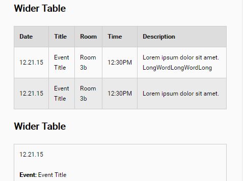
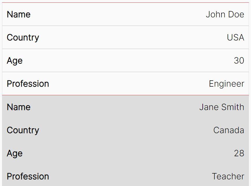
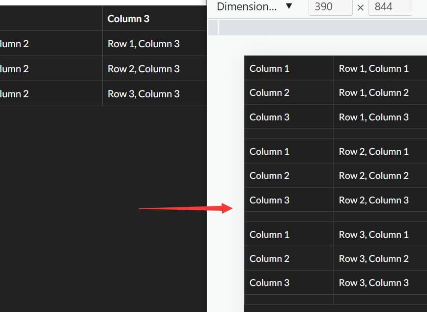
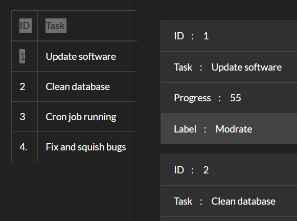
Yet another jQuery responsive table plugin which converts the wide table into vertically stacking blocks for more readable on mobile devices.
How to use it:
1. Include the stylesheet responsivetables.css in the header, and the JavaScript file responsivetables.js at the end of the html document.
<link rel="stylesheet" href="css/responsivetables.css">
<script src="//code.jquery.com/jquery.min.js"></script>
<script src="js/responsivetables.js"></script>
2. Initialize the plugin on document ready.
$(window).load( function() {
  $(document).responsiveTables();
});
3. Add the CSS class 'rwd-table' to your html table. Done.
<table class="rwd-table">
  ...
</table>
4. If you want to automatically generate headers from table's thead:
<table class="rwd-table" data-autogen-headers="true">
  ...
</table>
5. You can also specify the header for each cell in the data-title attribute like this:
<td data-title="Event">Event Title</td>
This awesome jQuery plugin is developed by kthornbloom. For more Advanced Usages, please check the demo page or visit the official website.