Feature-rich Datatime Picker Plugin With jQuery - JTSage-DateBox
| File Size: | 373 KB |
|---|---|
| Views Total: | 8383 |
| Last Update: | |
| Publish Date: | |
| Official Website: | Go to website |
| License: | MIT |
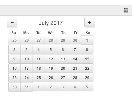
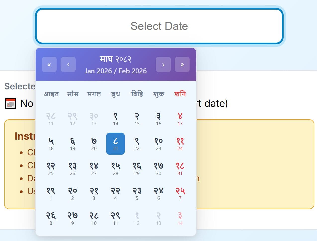
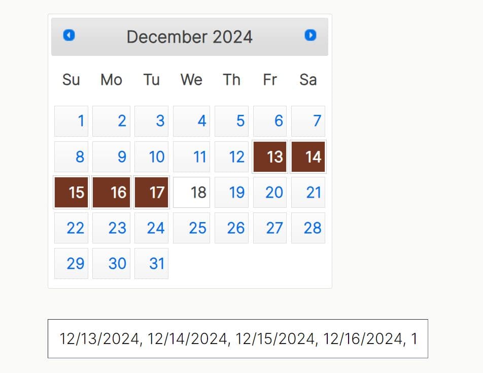
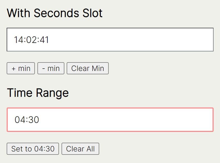
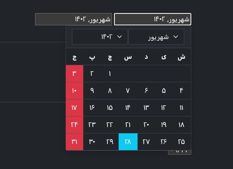
JTSage-DateBox is a full featured, mobile-friendly and highly customizable jQuery date/time/duration picker plugin that works perfectly with jQuery mobile, jQuery UI and Bootstrap 3/4 frameworks.
Key features:
- Android and iOS styles.
- Popup, dropdown, inline and slider modes.
- Tons of configuration options.
- Supports 40+ languages.
- Supports Bootstrap, Bulma, Foundation and UIKit frameworks.
Installation it via NPM:
# NPM
$ npm install jtsage-datebox
How to use it:
1. Load the following JavaScript and CSS files of your choice in the document.
<!-- Required -->
<script src="/path/to/jquery.min.js"></script>
<script src="/path/to/jquery-ui.min.js"></script>

<!-- For jQuery Mobile -->
<script src="https://cdn.jtsage.com/jtsage-datebox/latest/jtsage-datebox.jqm.min.js"></script>

<!-- For Bootstrap 3 -->
<script src="http://cdn.jtsage.com/jtsage-datebox/latest/jtsage-datebox.bootstrap.min.js"></script>

<!-- For Bootstrap 4 -->
<script src="http://cdn.jtsage.com/jtsage-datebox/latest/jtsage-datebox.bootstrap4.min.js"></script>

<!-- For Bulma -->
<script src="http://cdn.jtsage.com/jtsage-datebox/latest/jtsage-datebox.bulma.min.js"></script>

<!-- For Fomantic UI -->
<script src="http://cdn.jtsage.com/jtsage-datebox/latest/jtsage-datebox.fomanticui.min.js"></script>

<!-- For Foundation 6 -->
<script src="http://cdn.jtsage.com/jtsage-datebox/latest/jtsage-datebox.foundation6.min.js"></script>

<!-- For UI Kit -->
<script src="http://cdn.jtsage.com/jtsage-datebox/latest/jtsage-datebox.uikit.min.js"></script>

<!-- No 3rd Framework -->
<script src="http://cdn.jtsage.com/jtsage-datebox/latest/jtsage-datebox.noframe.min.js"></script>
2. Load a language of your choice in the document.
<script src="https://cdn.jsdelivr.net/npm/jtsage-datebox-i18n/jquery.mobile.datebox.i18n.en_US.utf8.js"></script>
3. Create a basic date picker for the input field you specify. There're 2 methods to initialize the date picker: via data attribute or JavaScript:
<input type="text"
       data-role="datebox"
       data-options='{OPTIONS}'
>
// or
$('#input').datebox({
  // options here
});
4. You MUST specify the mode for the Datetime picker. All possible modes:
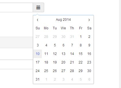
- datebox
- timebox
- datetimebox
- calbox
- flipbox
- timeflipbox
- datetimeflipbox
- slidebox
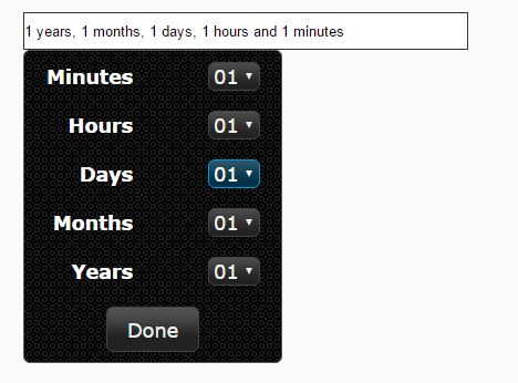
- durationbox
- durationflipbox
$('#input').datebox({
  mode: 'datebox'
});
5. All possible plugin options with default values.
/* display-form options */

// hide the original input
hideInput: false,

// lock the original input
lockInput: true,

// show initial value in the input
showInitialValue: false,

// open the control on focus
useFocus: false,

// auto fill the placeholder
usePlaceholder: false,

// show an open button inside the input field
useButton: true,

/* display control options */

// date, timebox, datetimebox, calbox, flipbox, timeflipbox, datetimeflipbox, slidebox, durationbox, durationflipbox
mode: false,

// breakpoint at which window size the control should stretch to fill the screen
breakpointWidth: "567px",

// hide the calendar header
calNoHeader: false,

// show days
calShowDays: true,

// show the underrun / overrun dates from the previous and next month
calOnlyMonth: false,

// show week numbers
calShowWeek: false,

// show date list
calShowDateList: false,

// show a month and year select box above the calendar grid
calUsePickers: false,

// the lower limit for the year select box.
// Integer > 1,800 : Hard coded year
// Integer < 1,800 : Number of years from current year or current selection.
// String "NOW" : Today's year
calYearPickMin: -6,

// the upper limit for the year select box.
calYearPickMax: 6,

// when true, the year picker min/max are relative to the currently visible date
calYearPickRelative: true,

// control width
controlWidth: "290px",

// added to the style block in the head. " !important", if nessesary for the framework
controlWidthImp: "",

// dropdown, inline, blind, or modal
displayMode: "dropdown",

// topLeft, topMiddle, topRight, centerLeft, centerMiddle, centerRight, bottomLeft, bottomMiddle, bottomRight
displayDropdownPosition: "bottomRight",

// dismiss on click outside
dismissOutsideClick: true,

// dismiss by pressing on ESC key
dismissOnEscape: false,

// vertical shift of lens
flipboxAdjustLens: false,

// override the size of the flip element
flipSizeOverride: false,

// use natural sort for flipbox
fboxNatural: "default",

// widget header follows the label text
headerFollowsLabel: true,

// widget header follows the placeholder text
headerFollowsPlaceholder: true,

// widget header follows the input title
headerFollowsTitle: true,

// show a month and year select box above the slide grid
slideUsePickers: false,

// hide the standard calendar header
slideNoHeader: false,

// the lower limit for the year select box.
// Integer > 1,800 : Hard coded year
// Integer < 1,800 : Number of years from current year or current selection.
// String "NOW" : Today's year
slideYearPickMin: -6,

// the upper limit for the year select box.
slideYearPickMax: 6,

// when true, the year picker min/max are relative to the currently visible date
slideYearPickRelative: true,

// show date list
slideShowDateList: false,

// show cancel button
useCancelButton: false,

// show clear button
useClearButton: false,

// merge today, tomorrow, clear, close, and set buttons into a single line
useCollapsedBut: false,

// show header controls
useHeader: true,

// select the current active langauge
useLang: "default",

// show date set button
useSetButton: true,

// show today button
useTodayButton: false,

// show tomorrow button
useTomorrowButton: false,

// z-index property
zindex: "1100",

/* theme options */

// button icon classes here
buttonIcon: false,

// highlight dates out of bounds
calHighOutOfBounds: true,

// highlight currently selected date
calHighPicker: true,

// highlight today
calHighToday: true,

// highlight selected date
calHighSelected: true,

// highlight selected dates out of bounds
calSelectedOutOfBounds: true,

// disabled class
disabledState: "disabled",

// left, right, or center
displayInlinePosition: "center",

// an array of [ top, left ], expected in px, or any value that the jQuery .css() function will accept.
displayForcePosition: false,

// highlight today
slideHighToday: true,

// highlight selected date
slideHighPick: true,

// default theme classes
theme_clearBtn: [ "clear", "outline-secondary" ],
theme_closeBtn: [ "check", "outline-secondary" ],
theme_cancelBtn: [ "cancel", "outline-secondary" ],
theme_tomorrowBtn: [ "goto", "outline-secondary" ],
theme_todayBtn: [ "goto", "outline-secondary" ],
theme_dropdownContainer: "bg-light border border-dark mt-1",
theme_modalContainer: "bg-light border border-dark p-2",
theme_inlineContainer: "bg-light border border-dark my-2",
theme_headerTheme: "bg-dark",
theme_headerBtn: [ "cancel", "outline-secondary" ],
theme_openButton: "secondary",
theme_cal_Today: "info",
theme_cal_DayHigh: "outline-warning",
theme_cal_Selected: "success",
theme_cal_DateHigh: "outline-warning",
theme_cal_DateHighAlt: "outline-danger",
theme_cal_DateHighRec: "outline-warning",
theme_cal_Default: "outline-primary",
theme_cal_OutOfBounds: "outline-secondary border-0",
theme_cal_NextBtn: [ "next", "outline-dark" ],
theme_cal_PrevBtn: [ "prev", "outline-dark" ],
theme_cal_Pickers: false,
theme_cal_DateList: false,
theme_dbox_NextBtn: [ "plus", "outline-dark" ],
theme_dbox_PrevBtn: [ "minus", "outline-dark" ],
theme_dbox_Inputs: false,
theme_fbox_Selected: "success",
theme_fbox_Default: "light",
theme_fbox_Forbidden: "danger",
theme_fbox_RollHeight: "135px",
theme_slide_Today: "outline-info",
theme_slide_DayHigh: "outline-warning",
theme_slide_Selected: "outline-success",
theme_slide_DateHigh: "outline-warning",
theme_slide_DateHighAlt: "outline-danger",
theme_slide_DateHighRec: "outline-warning",
theme_slide_Default: "outline-primary",
theme_slide_NextBtn: [ "plus", "outline-dark border-0" ],
theme_slide_PrevBtn: [ "minus", "outline-dark border-0" ],
theme_slide_NextDateBtn: [ "next", "outline-dark border-0" ],
theme_slide_PrevDateBtn: [ "prev", "outline-dark border-0" ],
theme_slide_Pickers: false,
theme_slide_DateList: false,
theme_backgroundMask: {
  position: "fixed",
  left: 0,
  top: 0,
  right: 0,
  bottom: 0,
  backgroundColor: "rgba(0,0,0,.4)"
},
theme_headStyle: false,
theme_spanStyle: false,

/* operation options */

// click event
clickEvent: "click",

// close the control when click the Today button
closeTodayButton: false,

// close the control when click the Tomorrow button
closeTomorrowButton: false,

// initial date value
defaultValue: false,

// disable mouse wheel
disableWheel: false,

// step size of duration mode
durationStep: 1,
durationSteppers: {
  d: 1,
  h: 1,
  i: 1,
  s: 1
},

// height of rollers
flen: {
  y: 25,
  m: 24,
  d: 40,
  h: 24,
  i: 30,
  s: 30,
  a: 30
},

// step size for minutes
minuteStep: 1,

// -1 : Down
// 1 : Up
// 0 : "Standard Rounding"
minuteStepRound: 0,

// i.e. - December + 1 = January of next year
rolloverMode: {
  m: true,
  d: true,
  h: true,
  i: true,
  s: true
},

// enable safe edit
safeEdit: true,

// length of sliders
slen: {'y': 5, 'm': 6, 'd': 15, 'h': 12, 'i': 30 },

// offsets
startOffsetYears: false,
startOffsetMonths: false,
startOffsetDays: false,

// where the century change happens
twoDigitYearCutoff: 38,

// update the input on each change
useImmediate: false,

/* Callbacks */

// called before open
beforeOpenCallback: false,

// extra args to pass to the beforeOpenCallback
beforeOpenCallbackArgs: [],

// define a custom function that is called on the generated calbox grid box of each date
calBeforeAppendFunc: function(t) {
  return t;
},

// a function that should return the prefered text for the calendar grid date
// calFormatter: false,

// called after close
// parameters:
// date : The JavaScript date object of the current (choosen) date - Always defined, even if meaningless.
// initDate : The JavaScript date object that holds the widget creation time/date. Always defined.
// duration : The last entered duration, in seconds for duration modes - undefined if not.
// cancelClose : [Close only] - If the close action was triggered by a user cancel (true), or by setting the date (false)
closeCallback: false,

// extra args to pass to the closeCallback
closeCallbackArgs: [],

// a function that overrides the built in icons
// it recieves a single argument, which it the value of the icon portion of the theme setting
iconFactory: false,

// a jQuery selector of the field(s) that you want to fill with the selected date when chosen
// uses linkedFieldFormat as the format.
linkedField: false,

// any valid format string that linkedField will be populated with
linkedFieldFormat: "%J",

// called after open
// parameters:
// date : The JavaScript date object of the current (choosen) date - Always defined, even if meaningless.
// initDate : The JavaScript date object that holds the widget creation time/date. Always defined.
// duration : The last entered duration, in seconds for duration modes - undefined if not.
// cancelClose : [Close only] - If the close action was triggered by a user cancel (true), or by setting the date (false)
openCallback: false,

// extra args to pass to the openCallback
openCallbackArgs: [],

// a function that will recieve an object containing:
// oldDate - the Date that existed prior to the control closing. The internal date
// origDate - last confirmed, good, user set date. Does not reflect changes in the control prior to a set button being clicked.
// newDate - should the input be re-read, this is the date the control thinks it is.
// isGood - the input was be succesfully processed
// isBad - the input was NOT be succesfully processed
// input - Value of the input
runOnBlurCallback: false,

/* Limits module options */

// selected date must be after today
afterToday: false,

// selected date must be before today
beforeToday: false,

// an array of ISO-8601 (YYYY-MM-DD) dates that are to be considered invalid.
// e.g. ["2020-01-01", "2019-12-31", "2019-12-25", "2019-12-24"]
blackDates: false,

// a list of recurring dates that are to be consided invalid.
// (Chrismas, Christmas Eve, New Years Eve, and New Years Day, Every Year)
// [ [-1,0,1], [-1,11,31], [-1,11,25], [-1,11,24] ]
blackDatesRec: false,

// an array of days of the week that are to be considered invalid.
// e.g. [ 0, 6 ] = weekends
blackDays: false,

// list of 2-element arrays to show in a special pick list
// e.g. [ ["1980-04-25", "JT's Date of Birth"], ["1809-02-12", "Lincoln's Birthday"] ]
calDateList: false,

// e.g. [ "2000-12-31", "2000-12-25", "2000-12-24" ]
enableDates: false,

// an alternate array of dates to highlight
highDatesAlt: false,

// an array of days of the week that are to be highlighted
// e.g. [ 0, 6 ]
highDays: false,

// an array of dates to highlight
highDates: false,

// a list of recurring dates to highligh
highDatesRec: false,

// a list of periodic dates to highlight
// e.g. [ "2019-09-11", 14 ]
highDatesPeriod: false,

// ISO date time strings
maxDate: false,
minDate: false,
maxDays: false,
minDays: false,
maxYear: false,
minYear: false,
maxDur: false,
minDur: false,
minHour: false,
maxHour: false,
minTime: false,
maxTime: false,

// allows those dates that are not the true value of the client's today (new Date(); at widget open) to be selected.
notToday: false,

// a list of 2-element arrays to show in a special pick list
// e.g. [ ["1980-04-25", "JT's Date of Birth"], ["1809-02-12", "Lincoln's Birthday"] ]
slideDateList: false,

// an array of ISO-8601 (YYYY-MM-DD) dates that are to be considered valid always
whiteDates: false,

// an array of valid hours to choose (24hr based)
// e.g. [ 9, 10, 11, 12, 13, 14, 15, 16, 17 ]
validHours: false,

// i18n
lang: {
  default: {
      setDateButtonLabel: "Set Date",
      setTimeButtonLabel: "Set Time",
      setDurationButtonLabel: "Set Duration",
      todayButtonLabel: "Jump to Today",
      tomorrowButtonLabel: "Jump to Tomorrow",
      titleDateDialogLabel: "Set Date",
      titleTimeDialogLabel: "Set Time",
      daysOfWeek: [ "Sunday", "Monday", "Tuesday", "Wednesday", "Thursday", "Friday", "Saturday" ],
      daysOfWeekShort: [ "Su", "Mo", "Tu", "We", "Th", "Fr", "Sa" ],
      monthsOfYear: [ "January", "February", "March", "April", "May", "June", "July", "August", "September", "October", "November", "December" ],
      monthsOfYearShort: [ "Jan", "Feb", "Mar", "Apr", "May", "Jun", "Jul", "Aug", "Sep", "Oct", "Nov", "Dec" ],
      durationLabel: [ "Days", "Hours", "Minutes", "Seconds" ],
      durationDays: [ "Day", "Days" ],
      timeFormat: 24,
      headerFormat: "%A, %B %-d, %Y",
      tooltip: "Open Date Picker",
      nextMonth: "Next Month",
      prevMonth: "Previous Month",
      dateFieldOrder: [ "m", "d", "y" ],
      timeFieldOrder: [ "h", "i", "a" ],
      datetimeFieldOrder: [ "y", "m", "d", "h", "i", "s", "a" ],
      slideFieldOrder: [ "y", "m", "d" ],
      dateFormat: "%Y-%m-%d",
      datetimeFormat: "%Y-%m-%dT%k:%M:%S",
      useArabicIndic: false,
      isRTL: false,
      calStartDay: 0,
      clearButton: "Clear",
      cancelButton: "Cancel",
      durationOrder: [ "d", "h", "i", "s" ],
      meridiem: [ "AM", "PM" ],
      timeOutput: "%k:%M",
      durationFormat: "%Dd %DA, %Dl:%DM:%DS",
      calDateListLabel: "Other Dates",
      calHeaderFormat: "%B %Y"
  }
},
Changelog:
2019-11-26
- v5.3.3: Fix rounding error
2019-11-11
- v5.3.1: Add blackDatesPeriod
2019-11-10
- v5.3.0: add option: highDatesPeriod - periodic recurring highlight.
2019-10-19
- v5.2.0
2019-10-16
- v5.1.6
2019-07-16
- v5.1.5: Add +/- string support for defaultValue
2019-06-11
- v5.1.4: Update
2019-05-31
- v5.1.3: Update
2019-05-22
- v5.1.2: Update
2019-05-21
- v5.1.1: Add option: disableWheel.
2019-04-10
- v5.1.0: bugfix; new options.
2019-04-02
- v5.0.0
2019-02-28
- v4.4.2
2018-06-08
- v4.4.1
2018-05-09
- updated for Bootstrap 4
2017-11-27
- Bump to v4.3.0
2017-09-29
- Bump to v4.2.3, add option extraInputClass
2017-06-21
- Version bump to include "twoDigitYearCutoff"
This awesome jQuery plugin is developed by jtsage. For more Advanced Usages, please check the demo page or visit the official website.