Easy Accessible jQuery Accordion Plugin
| File Size: | 84.3 KB |
|---|---|
| Views Total: | 2461 |
| Last Update: | |
| Publish Date: | |
| Official Website: | Go to website |
| License: | MIT |

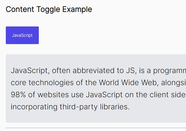
A simple to use jQuery plugin intended to create responsive, cross-browser, accessible, highly customizable & styleable accordions with support for keyboard interaction and WAI-ARIA.
How to use it:
1. Include jQuery library and the jQuery Accessible Accordion plugin on your webpage.
<script src="//code.jquery.com/jquery-1.11.2.min.js"></script>
<script src="jquery.accAccordion.js"></script>
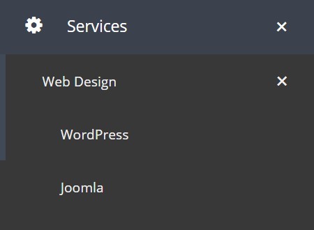
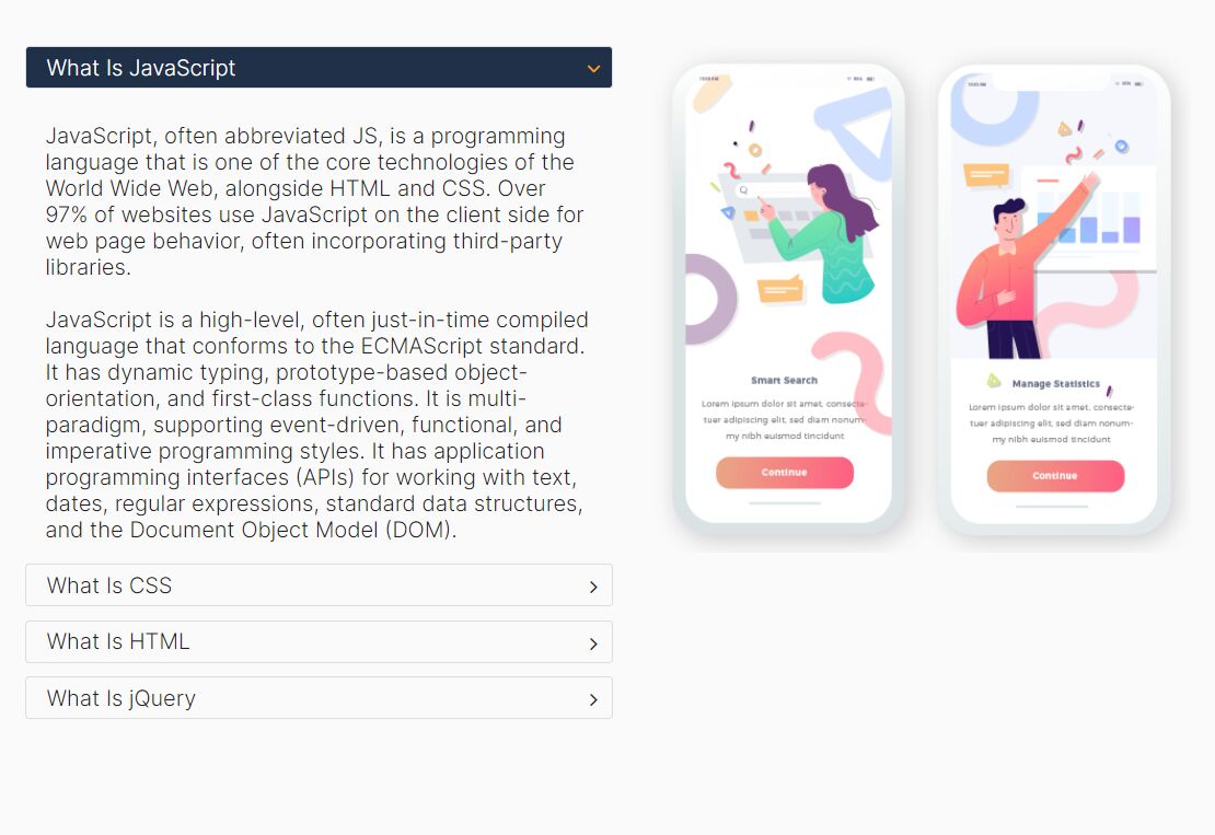
2. Create accordion headers and expandable panels with plain Html.
<div class="accordion example">
  <h3>Tab 1</h3>
  <div>
    <p>Panel 1</p>
  </div>
  <h3>Tab 2</h3>
  <div>
    <p>Panel 2</p>
  </div>
  <h3>Tab 3</h3>
  <div>
    <p>Panel 3</p>
  </div>
  <h3>Tab 4</h3>
  <div>
    <p>Panel 4</p>
  </div>
  <h3>Tab 5</h3>
  <div>
    <p>Panel 5</p>
  </div>
</div>
3. Call the plugin on the parent container to generate a vertical accordion with default settings.
$('.example').accAccordion();
4. The sample CSS to style the accordion. You can change the CSS rules in any way you like.
.js-btn,
.js-hide-show_btn {
  background: rgb(255,255,255); /* Fallback */
  background: linear-gradient(to bottom, rgba(255,255,255,1) 0%, rgba(243,243,243,1) 50%, rgba(237,237,237,1) 51%, rgba(243,243,243,1) 100%);
  border: 1px solid #dfdfdf;
  border-radius: 5px;
  box-shadow: 0 1px 3px rgba(000,000,000,0.1), inset 0 0 3px rgba(255,255,255,1);
  cursor: pointer;
  display: inline-block;
  font-size: 1em;
  font-weight: 400;
  line-height: 1em;
  margin: 1em 5px;
  padding: 5px 1em;
  text-shadow: 0 -1px 0 rgba(000,000,000,0.2), 0 1px 0 rgba(255,255,255,1);
}

.js-accordion {
  margin: 0;
  overflow: hidden;
  box-sizing: border-box;
  -ms-box-sizing: border-box;
}

.js-accordion .js-accordion_control {
  background: url('glass-arrow-down.png') no-repeat 98% 50% #003466;
  color: #E7E7E7;
  box-sizing: border-box;
  -ms-box-sizing: border-box;
  border-bottom: 1px solid #E7E7E7;
  font-size: 1.25em;
  margin-top: 0;
  margin-bottom: 0;
  position: relative;
  text-align: left;
  text-decoration: none;
}

.js-accordion .js-accordion_control--active {
  background-image: none;
  background-color: #E7E7E7;
  border-color: #E7E7E7;
  color: #003466;
  font-weight: 700;
}

.js-accordion .js-accordion_control.active-hidden {
  position: absolute;
  left: -999em;
}

.js-accordion .js-accordion_control span {
  display: block;
  padding: 15px;
}

.js-accordion .js-accordion_control:hover,
.js-accordion .js-accordion_control:active,
.js-accordion .js-accordion_control:focus {
  cursor: pointer;
  background-color: #E7E7E7;
  color: #003466;
  transition: background-color .33s;
}

.js-accordion .js-accordion_panel {
  background: #E7E7E7;
  overflow: hidden;
  border-bottom: 3px solid #E7E7E7;
  box-sizing: border-box;
  -ms-box-sizing: border-box;
}

.js-accordion .accordion_section_inner { padding: 0 20px; }

.js-accordion .accordion_section_heading {
  font-size: 1.25em;
  font-weight: bold;
  margin: 10px 18px;
}
5. Default plugin settings.
// Should the active tab be hidden off-screen
activeControlHidden: false,

// Specify which panel to open by default using 0-based position
defaultPanel: false,

// Callback when the plugin is created
callbackCreate: function() {},

// Callback when the plugin is destroyed
callbackDestroy: function() {},

// A class for the accordion
containerClass: 'js-accordion',

// A class for when the accordion is horizontal
containerClassHorizontal: 'js-accordion--horizontal',

// Should the accordion be horizontal
horizontal: false,

// Class to be applied to the panel
panelClass: 'js-accordion_panel',

// Ids for panels should start with the following string
panelId: 'js-accordion_panel--',

// Class to apply to each panel control
panelControlClass: 'js-accordion_control',

// A class applied to the active panel control
panelControlActiveClass: 'js-accordion_control--active',

// A class applied if the panel control is hidden.
// Only used when the activeControlHidden & horizontal options are true
panelControlHiddenClass: 'js-accordion_control--hidden',

// Ids for panel controls should start with the following string
panelControlId: 'js-accordion_control--',

// Class applied to panel titles.
// Only used when the activeControlHidden & horizontal options are true
panelTitleClass: 'js-accordion_panel-title',

// The width of the panel in % for horizontal accordion
panelWidth: 33
This awesome jQuery plugin is developed by nomensa. For more Advanced Usages, please check the demo page or visit the official website.