Simple Responsive jQuery Tabs/Accordion Plugin
| File Size: | 7.48 KB |
|---|---|
| Views Total: | 4124 |
| Last Update: | |
| Publish Date: | |
| Official Website: | Go to website |
| License: | MIT |
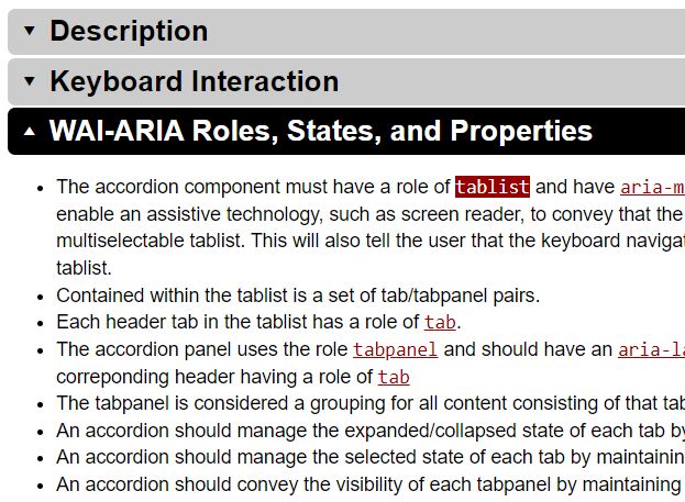
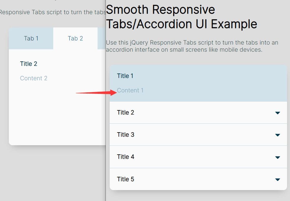
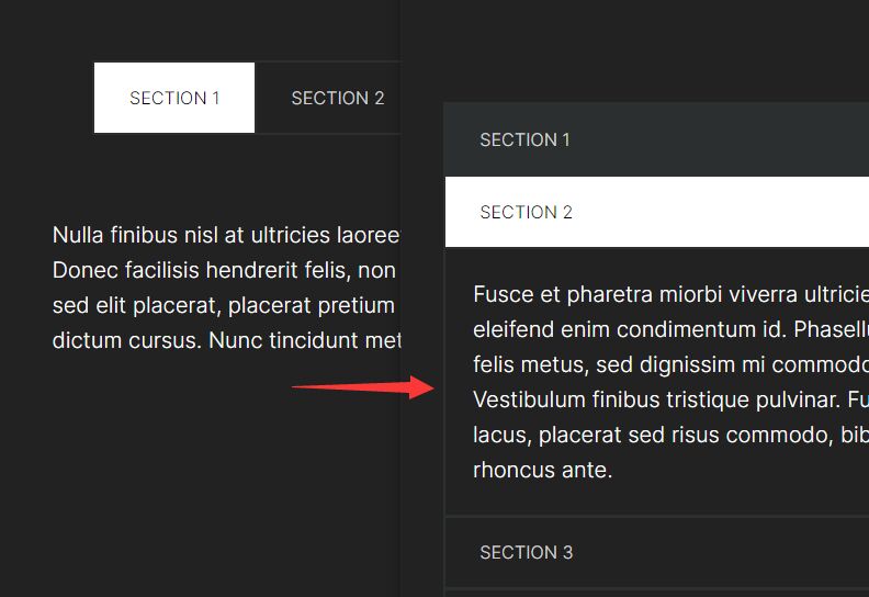
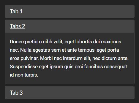
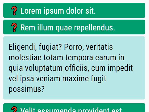
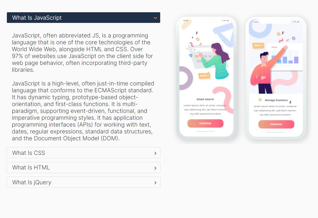
A simple, responsive tabbed interface plugin that acts as an accordion in mobile views and becomes a tabbed interface as the available viewport width increases.
How to use it:
1. Include the responsivetabs.css for the core CSS styles.
<link href="css/responsivetabs.css" rel="stylesheet">
2. Create the tabs and tab panels.
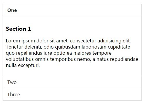
<div data-responsive-tabs>
  <nav>
    <ul>
      <li> <a href="#one">One</a> </li>
      <li> <a href="#two">Two</a> </li>
      <li> <a href="#three">Three</a> </li>
    </ul>
  </nav>
  <div class="content">
    <section id="one">
      <h3>Section 1</h3>
      <p>Content 1</p>
    </section>
    <section id="two">
      <h3>Section 2</h3>
      <p>Content 2</p>
    </section>
    <section id="three">
      <h3>Section 3</h3>
      <p>Content 3</p>
    </section>
  </div>
</div>
3. Include jQuery library the responsivetabs.js at the bottom of the web page.
<script src="//ajax.googleapis.com/ajax/libs/jquery/1.11.2/jquery.min.js"></script>
<script src="js/responsivetabs.js"></script>
4. Initialize the plugin with default settings.
$('[data-responsive-tabs]').responsivetabs({});
5. Customize the plugin. These are default plugin options:
$('[data-responsive-tabs]').responsivetabs({

// tabs, accordion, or responsive
type: 'responsive',

// CSS breakpoint
breakpoint  : 768,

// transition speed
speed       : 500,

// initial panel
initial     : 0,

// collapsible
collapsible : false,

// keep open
keepOpen    : false

});
Change log:
2015-03-06
- Added public api open method & updated example
This awesome jQuery plugin is developed by ryanknights. For more Advanced Usages, please check the demo page or visit the official website.