Minimal Responsive Photo Gallery Plugin For jQuery - xGallerify
| File Size: | 14.3 KB |
|---|---|
| Views Total: | 9177 |
| Last Update: | |
| Publish Date: | |
| Official Website: | Go to website |
| License: | MIT |
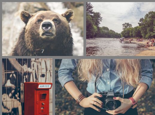
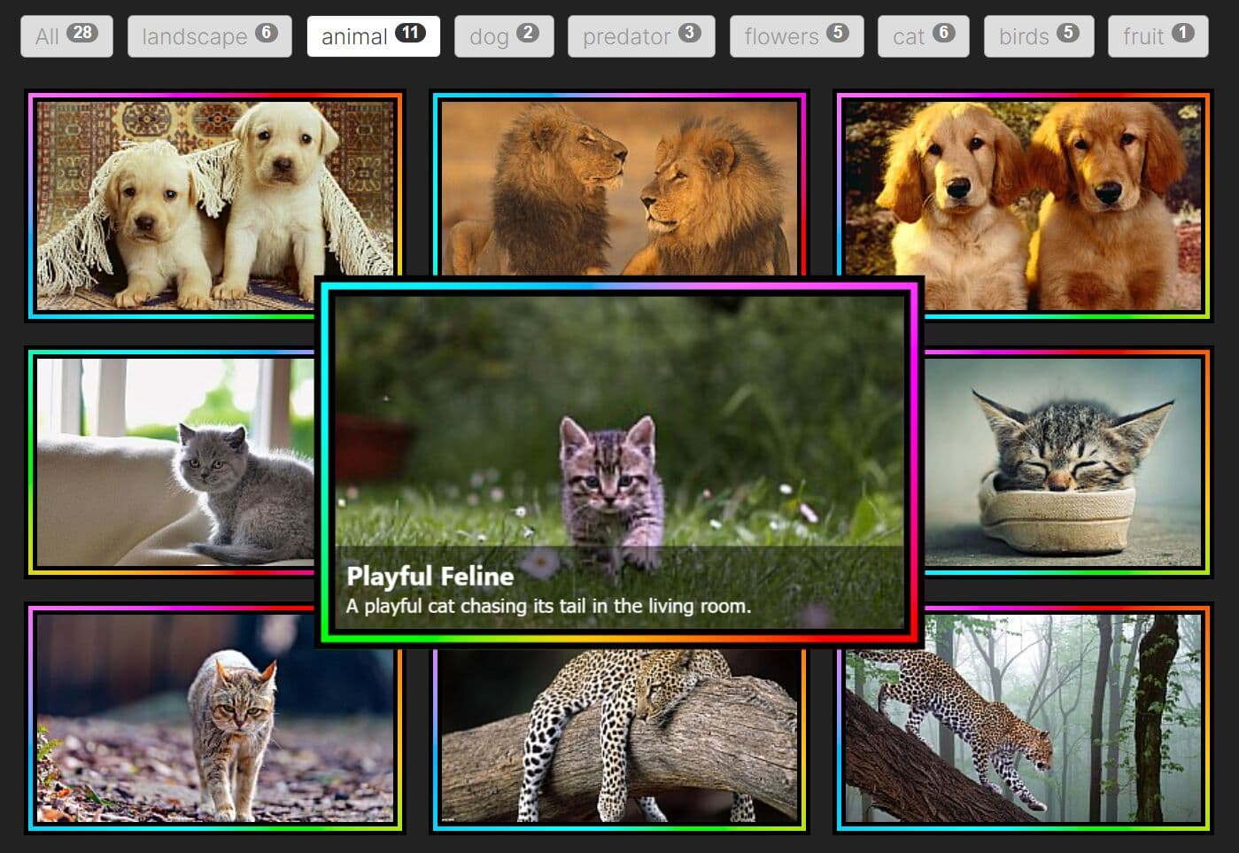
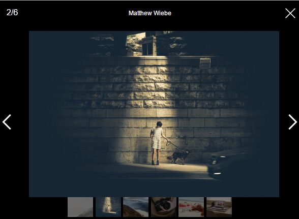
xGallerify is a lightweight jQuery gallery plugin that takes a group of images and automatically arranges them in a compact, equal height, fully responsive mosaic grid.
Features:
- Allows to specify the space between images.
- Allows to specify the number of images to show per row.
- 3 predefined layouts: default, Bootstrap and Flickr.
- Supports any images with different height.
- Without writing any additional CSS rules.
How to use it:
1. Include jQuery library on the webpage.
<script src="/path/to/jquery.min.js"></script>
2. Make sure to include the xGallerify jQuery plugin after jQuery library.
<script src="dist/xgallerify.js"></script>
3. Markup html structure.
<div class="photos">
  <div class="photo">
    <img src="1.jpg">
  </div>
  <div class="photo">
    <img src="2.jpg">
  </div>
  <div class="photo">
    <img src="3.jpg">
  </div>
</div>
4. Initialize the plugin to render a responsive gallery with default settings.
$('.photos').gallerify({
   // options here
});
5. Configuration options to customize the gallery.
$('.photos').gallerify({

  // the space between images
  margin:5,

  // 'default', 'bootstrap' or 'flickr'
  mode:'default',

  // 'fullwidth' or 'adjust'
  lastRow:'fullwidth',

});
Change log:
2017-08-08
- jQuery 3+ support
- Remove Unnecessary param debounceLoad
2016-09-16
- small fix for mobile view and hidden last row feature
2015-12-08
- removing underscore, introducing debounceLoad, documentation, bug fixing
2015-12-04
- Async and fixes
2015-12-04
- Smoothnes fixes
2015-12-03
- many fixes and tweaks
2015-12-01
- last row fix, switch layout to adjust
- remove underscore support
This awesome jQuery plugin is developed by xremix. For more Advanced Usages, please check the demo page or visit the official website.